Behaviour Dashboard (Beta)
It's important to understand your app's active users and converted users, where they are coming from, what app version they are on, what devices they are using and so on and these are indeed key metrics that every app owner will find useful.
Smartech now offers a Behavior Dashboard to help you exactly do this - understand your active users and converted users of your apps in great depth. This document summarizes what you can expect to see in this dashboard.
Note
Behavior dashboard currently shows the behavior of app users only. It implies that you must have a Smartech SDK integrated in your apps in order to see the data on the dashboard.
You can access Behavior Dashboard from Insights > Dashboards & Reports Menu
Active Users
.

First thing that you will see here, are the date range and contacts filter options.
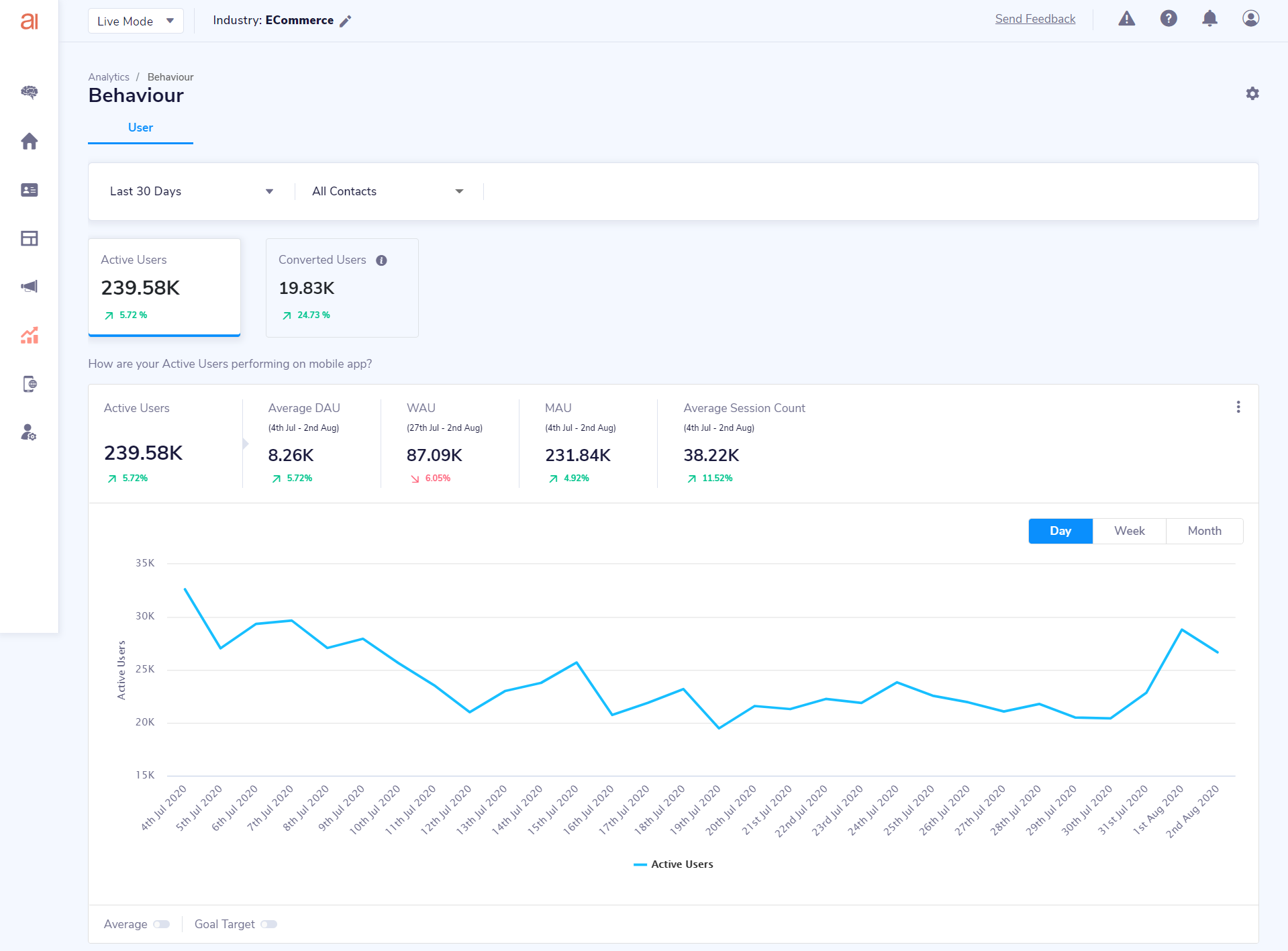
At a very first glance, you can see the Active users count and Converted Users count. Comparison of these two in the previous period is also provided so that you know if you did better or worse in the current duration.
Active users are defined as unique users who did the app launch during the selected duration and is an industry standard metric of knowing how many users out of entire installed user base are opening your app.
Next widget gives you a bit more detailed view of your active users with various metrics such as Average DAU, WAU, MAU, Average Session Count. It also gives you trend line graph of active users, so that you can see how you are doing day on day , week on week or month on month.
Active Users Key Metrics
- Active Users: Unique users count who did app launch activity at least once during the specified duration
- DAU: Unique users who did the app launch activity at least once on a given day. Average DAU is the average of all DAUs of specified duration
- WAU: Unique users who did the app launch activity at least once in last 7 days from the 'To' date of selected duration
- MAU: Unique users who did the app launch activity at least once in last 30 days from the 'To' date of selected duration
- Average Session Count: This is the average of unique session counts of these active users over the specified duration
Converted Users
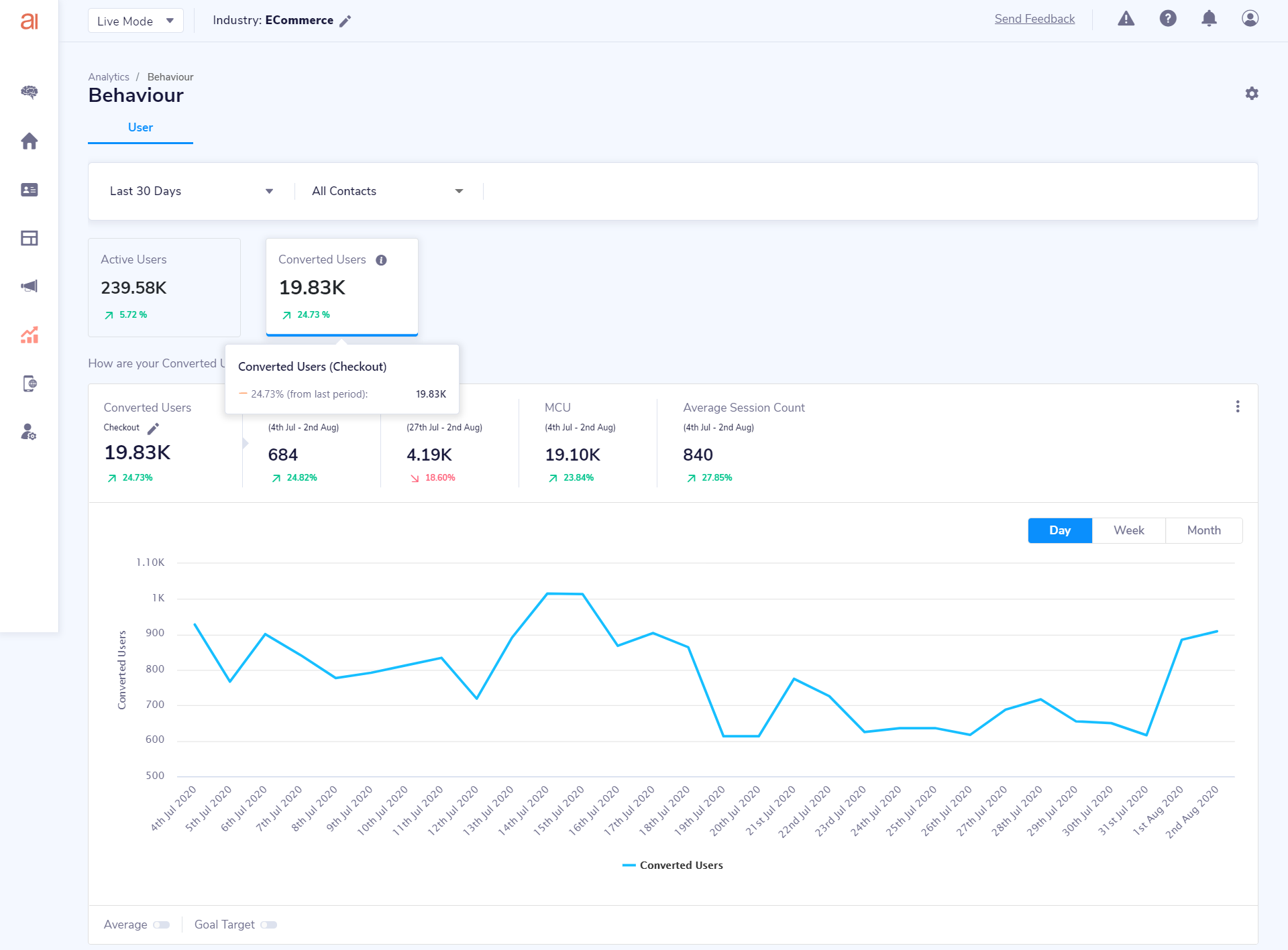
In Converted users tab, you get to select the conversion activity which represents the conversion for your business.
Converted users are the unique users who did this specified conversion activity at least once during the selected duration.

Once selected, you will start seeing Widget of Converted users which has metrics such as Average DCU, WCU, MCU and Average Session Count. You will also see a trend line graph of these converted users.
Converted Users Key Metrics
- Converted Users: Unique users count who did the specified conversion activity at least once during the specified duration
- DCU: Unique users who did the conversion activity at least once on a given day. Average DCU is the average of all DCUs of specified duration
- WCU: Unique users who did the conversion activity at least once in last 7 days from the 'To' date of selected duration
- MCU: Unique users who did the conversion activity at least once in last 30 days from the 'To' date of selected duration
- Average Session Count: This is the average of unique session counts of these converted users over the specified duration
Enabling Average marker and Goal Target marker
If you want see what your average has been like for the trend that you see on your graph, you can simply enable the "Average" toggle and your set.
Enable the "Goal Target" marker to visually track your goals on the graph. Once you enable the toggle, you would be asked for your daily goal, enter it (Eg: 800,000). When you are in the Week Wise view on the graph, your daily goal would be converted to your weeks goal and your months goal would be similarly shown on the month wise view.
Bifurcations by Platform, User Type & App Versions
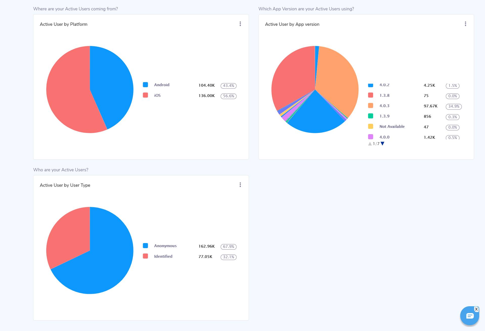
For both Active Users and Converted Users. Smartech will give you detailed pie charts of split for following:
- Platform - to see whether users are coming from Android or iOS platform
- User type - to see whether users are anonymous or identified
- App versions - to see which app versions these users are using.

Alternation visualizations and exporting graphs
You can change the visualization style of the graph from a trend line to a bar graph or vice versa, as you see fit.
You can also export your graphs as JPEG, PNG and PDF from the same action buttons.
Updated about 5 years ago
