App Push Template
Learn to create an App push template using the Netcore CE dashboard.
The App Push Template section contains all the templates you have previously created for your campaigns. You can easily browse these templates or create new, customized ones to suit your specific campaign needs.
To get started, log in to the Netcore CE dashboard and navigate to Content > App Push to create or use existing templates.
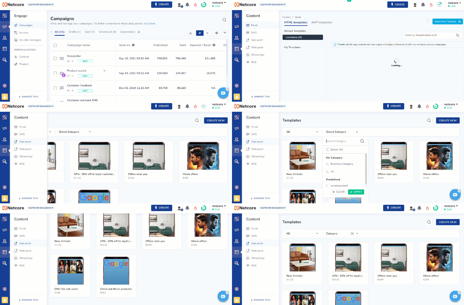
Navigate to App Push Template
Available Features
To filter, use, or edit the existing templates, refer to the table for the available options.
| Option | Description |
|---|---|
| Select Category | Choose the relevant category for your template. |
| Select Platform | Pick the specific platform (for example, Android, iOS) where the template will be used. |
View  | Preview the template before using it. |
Edit  | Modify the existing template. |
Use  | Use the template directly in your campaign. |
| Search | Search for existing templates. |
Create New Template
Click Create New in the top right corner to open the Create a New App Push Template screen. There are two tabs: Setup and Content.
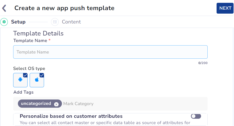
Create a New App Push Template
Setup
Refer to the table below for details on the sections under Setup.
| Sections | Description |
|---|---|
| Template Name | Enter a unique name for this template. |
| Select OS Type | Select the platform you are creating the template (Android, iOS or both). |
| Add tags | Add relevant tags to organize and categorize your template. You can add only one tag per template. |
| Personalize based on customer attributes | Tailor your template using user details like name, location, and preferences to create relevant and engaging messages. Note: You can select all contact master or specific data table as source of attributes for personalization. |
Fill in all the required sections and proceed.
Content
After the basic setup and adding the template details, Content is the section where you can create your template. You can Create new layout or select from the Advance layouts listed on this screen.
Several layouts are available to suit your message and audience. Here is an explanation of each layout.
| Layout | Description | Use Case |
|---|---|---|
| Overlay on image | This layout allows you to display a message over an image. | Promote a new product with a captivating image and a call to action. |
| Timer | This layout allows you to add a countdown timer to create urgency. | Notify users that a flash sale will be ending soon. |
| Carousel (E2E) | This layout lets users swipe through multiple images or messages. | Showcase a series of related products or features. |
| Edge to edge | This layout allows you to expand the notification to cover the entire width of the screen. | Highlight a major update or announcement with maximum visibility. |
| Rating | This layout allows you to include a rating option for quick feedback. | Ask users to rate their experience after completing a purchase. |
| Small image | This layout allows you to show a small image alongside the notification text. | Share a product image with a quick update or offer. |
| Progress bar | This layout allows you to display a bar indicating progress toward a goal. | Inform users of their progress in a download or achievement. |
| Multi-icon | ||
| Quick reply |
Using Timer and Progress Bar in Journeys
Ensure to follow these points while using Timer and Progress Bar layouts.
- The journey end time must be less than or equal to the timer or progress bar end-time.
- The timer can run for a maximum of 24 hours. If the journey exceeds this, users may receive expired timer notifications.
- The TTL (Time To Live) must not exceed the timer or progress bar endtime. If it does, notifications may be delivered after the timer has expired, showing the timer end message to users.
When you create or select an Advanced layout, the Customize Your Template screen appears. Here, you can add and customize app push notification content. The left pane updates the mobile preview on the right, showing how it will appear to users.
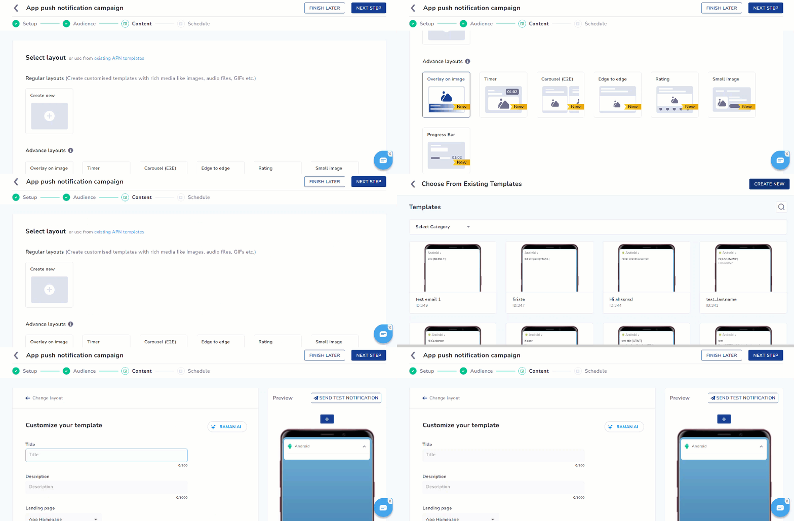
Customize your App Push Template
Toggle on Enable APN Interactions to include rich media elements, action buttons, sound, deep links, and more.
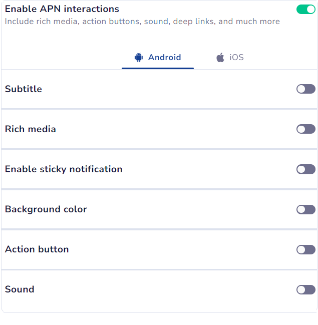
Enable APN Interactions to include rich media, sound, and so on
Refer to the table below to learn about all the options available to customize your app push template.
| Options | Descriptions | Available for |
|---|---|---|
| Title | Allows you to add the title of your push notification. You can also add formatting such as bold, italics, underline, text color, and background color here. 📘 Text formatting is supported only on Android SDK. | Overlay on image, Timer, Carousel (E2E), Edge to edge, Rating, Small image, Progress Bar |
| Description | Allows you to add the message content of your push notification. | Overlay on image, Timer, Carousel (E2E), Edge to edge, Rating, Small image, Progress Bar |
| Landing page | Allows you to redirect the user to your preferred location when the user clicks the notification. The options available here are:
| Overlay on image, Timer, Carousel (E2E), Edge to edge, Rating, Small image, Progress Bar |
| Add Image | Allows you to insert an image. Upload File: Drag and drop the file or select it from your computer. Media URL: Allows you to add an image URL. 📘 PNG and JPEG file formats are supported. URL must include an HTTPS protocol ending with a supported file format. Example: https://website.com/image.png | Overlay on image, Timer, Carousel (E2E), Edge to edge, Rating, Small image, Progress Bar |
| Overlay Color | Allows you to customize the color applied to the background overlay behind an app push. | Overlay on image, Timer, Carousel (E2E), Edge to edge, Rating, Small image, Progress Bar |
| Background Color | Allows you to set the background color. Add a solid color or use a gradient option to define a two-colored gradient effect. | Overlay on image, Timer, Carousel (E2E), Edge to edge, Rating, Small image, Progress Bar |
| Sticky Notification | A notification that stays visible until the user clicks  button. It cannot be removed by swiping or using the Clear All option in the notification tray. button. It cannot be removed by swiping or using the Clear All option in the notification tray. | Overlay on image, Timer, Carousel (E2E), Edge to edge, Rating, Small image, Progress Bar |
| Sound | Define the tone played when a notification arrives on the device. You can choose between the default device sound or a custom sound. Here are the requirements for setting a custom sound:
| Overlay on image, Timer, Carousel (E2E), Edge to edge, Rating, Small image, Progress Bar |
| Carousel Type | This option allows you to select between Manual and Automatic carousel transitions. In Automatic, set the timer for image transitions between 2 and 10 seconds. 📘 Ensure the important part of the image is not in the lower portion. Users can add up to five images with a 2:1 aspect ratio and a maximum file size of 40KB. | Carousel (E2E) |
| Text/Emoji | Allows you to add words or emojis as rating options. | Rating |
| Rating Scale | Allows you to select the number of rating options to provide between two, three, or five. | Rating |
| Timer Settings | Timer | |
| Progress Bar Settings | Progress Bar |
Toggle on Add-on options to enable custom key value and collapse notifications.

Enable custom key value and collapse notifications
- Collapse Notification
This feature is used by FCM (Firebase Cloud Messaging) and APNS (Apple Push Notification Service) to update older notifications that have already been delivered. When multiple notifications share the same collapse key, only the most recent one will appear in the user's notification tray.
For example, if you send a series of cricket match score updates, you can set score_updates as the collapse key. This ensures that only the latest score update is visible in the user's notification tray.
- Custom Key-Value Pairs
In this section, you can define custom key-value pairs specific to the operating system. These pairs trigger actions within the app when a user interacts with a notification, enabling personalized experiences.
For example, a shopping app can use a key-value pair like Key: category and Value: shoes to direct users to the shoes section when they click a notification about a shoe sale.
Note
- At least one operating system must be selected.
- You can add up to 49 key-value pairs
Once you have finished adding content to the template, you can either Save Template or directly Use in Campaign.
To learn how to create an app push campaign step-by-step, check out this document.
Overview
CE enables you to create templates which can be used for future campaigns.
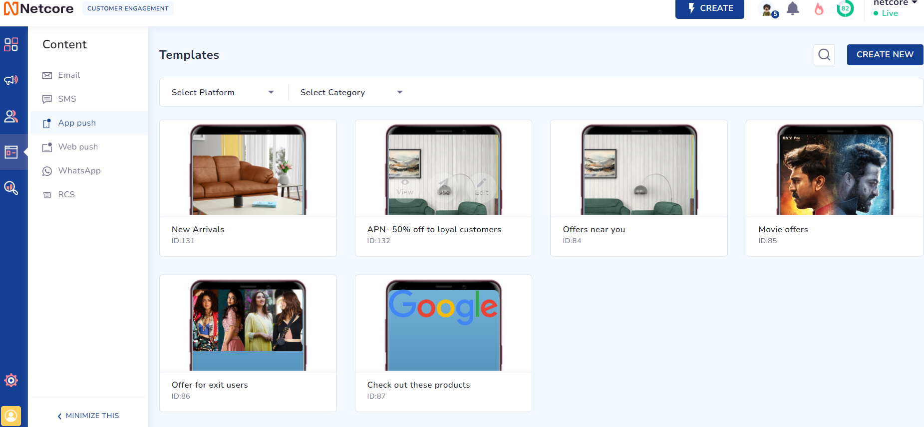
View App Push Templates
Setup
To create a new template, click on the CREATE button which will bring you to the setup section.
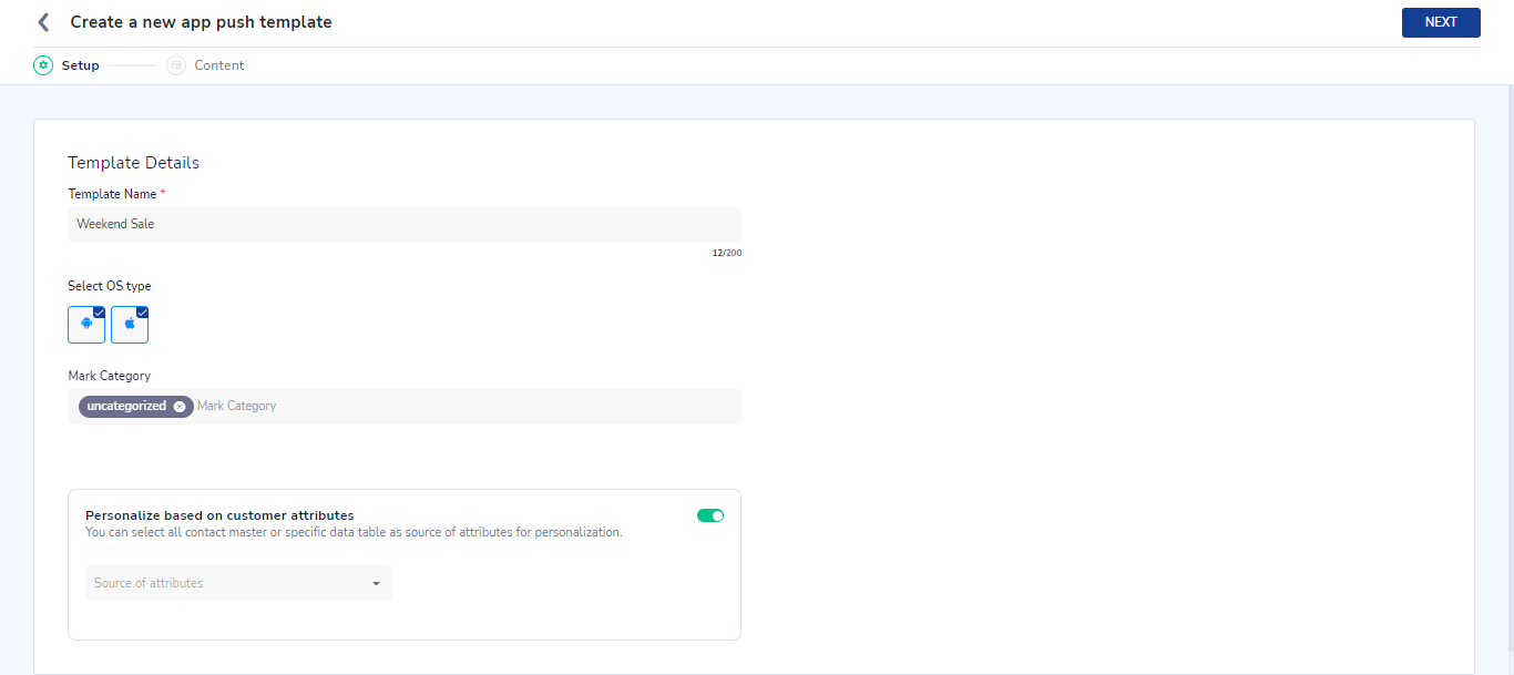
Create a new App Push template
-
Template Name - Give a unique name to your APN template
-
Select OS type - Select the platform for which the template is to be created. i.e. Android, iOS or both
-
Mark category - Assign or add a new category to the template. It is optional.
-
Personalize based on custom attributes - You can use attributes present on your panel to be used for personalization of your template.
Click on 'Save & Next' to go to the Content section.
Content
After the basic setup is done, 'Content' is the section where all the action happens!
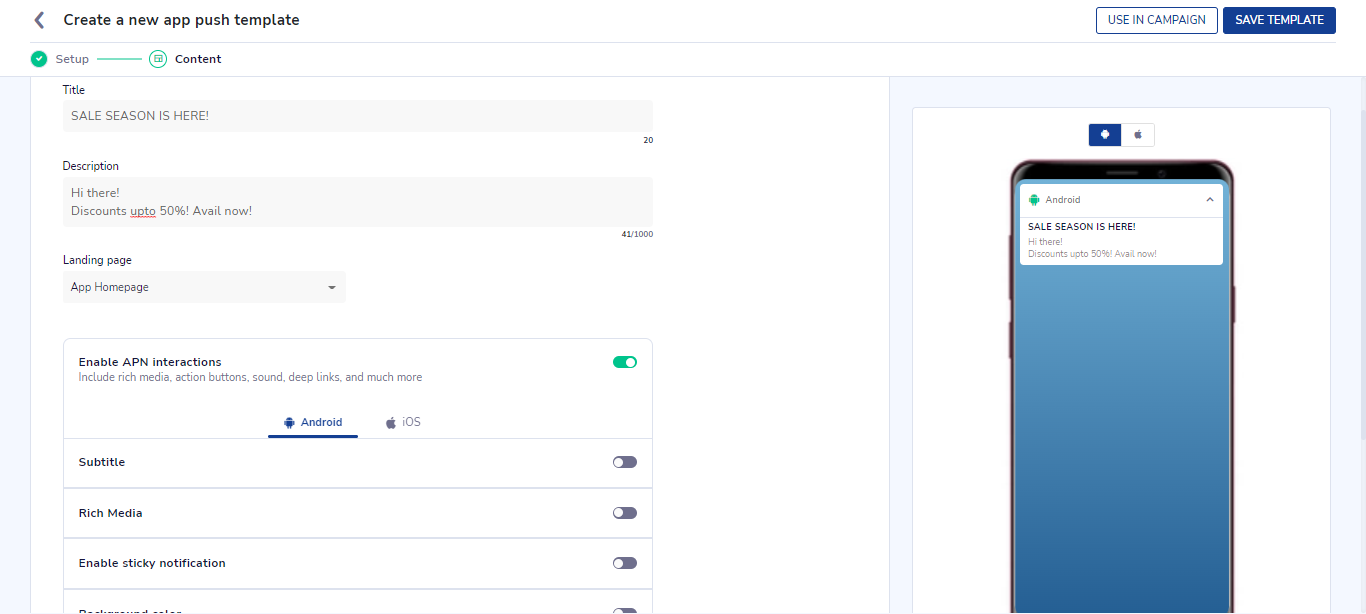
Create Content for App Push template.
- Title - Add the title of your push notification. You can also add formatting such as bold, italics, underline, text color, text background color, subscript, and superscript here. However, text formatting is supported only on Android SDK.
- Description - Add the message content of your push notification. You can also add formatting such as bold, italics, underline, text color, text background color, subscript, and superscript here. However, text formatting is supported only on Android SDK.
- Landing page - You can choose the app homepage, deep link, or URL as a landing page for your push notification. This value is used for redirection when the user clicks anywhere on the notification.
Enable APN interactions
Here you can add and customize amazing interactions to your android or iOS notification content. These options are mentioned below:
-
Subtitle - You can add a subtitle to your notification. You can also add formatting such as bold, italics, underline, text color, text background color, subscript, and superscript here. However, text formatting is supported only on Android SDK.
-
Rich media - You can add 4 types of rich media to your notification:
- Image - An image can be added using a URL or directly uploading an image from your system for both
Android and iOS. - Carousel - A slideshow of multiple images. For each slice in a carousel, you can add an image, title, CTA, and a deep link URL.
- Audio, Video & GIF -To add either of these three rich media, only the URL needs to be provided.
Please note: Video is not available for Android.
- Image - An image can be added using a URL or directly uploading an image from your system for both
Note
Supported file formats:
- Image supported formats - .jpeg, .jpg and .png with max 40KB size. Image should be in 2:1 aspect ratio
- Carousel supported formats - Maximum of 5 slide images of format .jpeg, .jpg and .png with max 40KB size for carousel slice images. The landscape carousel image should be in 2:1 aspect ratio and the portrait carousel should be in 1:1 aspect ratio
- If you wish to use larger size images, you can provide the self-hosted image URL.
- Audio supported formats - .mp3, .aiff, and .wav with max 3MB size.
- Video supported formats - m4v, .mp4, and .mov with max 3MB size and 2:1 aspect ratio
- GIF supported formats - .gif with max 3MB size and 2:1 aspect ratio
Character Limits:
- Max 50 characters for Title and 1000 characters for message.
- Max 30 characters for Title and 50 characters for message for each carousel image slide.
- CTA URL - Maximum character limit is 1000.
-
Enable sticky notification - Enabling this feature would pin your notification in the notification tray of the device. Such notification will not be cleared by swiping it out or the 'clear all notifications' button. It can only be dismissed by clicking on provided x icon.
-
Background color - You can add background color to your notification as well as customize the degree of opacity of the color. You have the option to add a solid color or use a gradient option where you can define a two-colored gradient effect with a customizable angle setting.
Please note: Background color support is available only from Netcore Android Base SDK 3.2.30 & Android Push SDK 3.2.16 onwards
. -
Action button
A maximum of 3 Action buttons can be added for push notification which consists of- Action button title
- Call-to-action - Open within app, Open in browser, Close, Copy text, Remind me later.
- URL or deeplink needs to be provided when open within app or open in browser option is selected above
- For Copy text action - you can specify the text to be copied. This text can also be personalized
- For remind me later action- you can specify reminder time. The notification will be dismissed and show again once this reminder time is reached when user clicks on this action button.
The content Preview is available on the right side of the screen.
- Sound
Here you can define the message tone played when a notification gets delivered to the device. You have the option to play the default device sound or a custom sound.
Below are the specifications for Sound file name that you need to enter for the custom sound field.- Android versions below version 8 : - Specify the name of the sound file which is included in your app bundle. Supported file formats are .mp3, .ogg, .wav.
- Android versions 8 & above - Specify the name of the notification channel id. Refer to SDK integration documentation to know how to setup notification channel
- iOS - Specify the name of the sound file which is included in your app bundle. Supported file formats are
.aiff, .wav, or .caf.
Please note: Sound file name that you are entering must be present in the app bundle. If not present, the default sound as per the user's device will be played.
Click on 'Save template' button to save the template and close
Updated 8 months ago
