
Engagement Dashboard
Learn to use Engagement dashboard to identify user behavior and increase engagement.
Overview
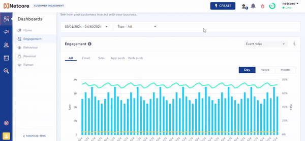
The Engagement Dashboard allows you to track user engagement easily. You can monitor how users interact with your campaigns daily, weekly, and monthly. This helps you identify trends and patterns in user behavior, adjust your strategies based on real-time data, and make your marketing efforts effective. This dashboard is currently available for Email, SMS, Web Push, and App Push.
View Engagement Dashboard
To use the engagement dashboard, follow the given steps:
- Log in to the Netcore CE dashboard.
- Navigate to Dashboards > Engagement. The Engagement dashboard appears.
- The following functionalities are available in the Engagement dashboard. Click
 to know more about your preferred functionality.
1. Select Duration
Select Duration
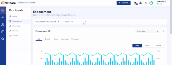
Choose the desired duration to view data. Available options in the dropdown menu are:
- Last 7 Days
- Last 30 Days
- Last 90 Days
- Custom Range: The duration is capped at 90 days.
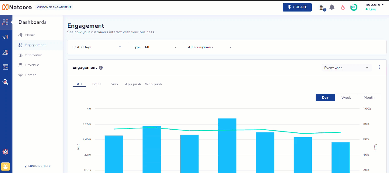
Select Duration to View Data
2. Communication Type
Communication Type
Select the communication type to filter the data. Available options in the dropdown menu are:
- All: Shows data for both Campaigns and Journeys.
- Campaigns: Email, SMS, Web Push, App Push
- Journey: Email, SMS, Web Push, App Push
Select Communication Type to Filter Data
3. Contact Filter
Contact Filter
The Filter feature lets you analyze data for specific segments, lists, and identified and anonymous users. You can also search for specific lists and segments. After selecting an option from the dropdown, the widgets update to display data based on your choice.
The dropdown menu includes the following options:
- All: Shows data from Master, List, and Segment combined. It includes everything present in these categories.
- Master: Shows data for all contacts, including identified and anonymous users.
- List: Allows you to select and analyze specific lists.
- Segment: Allows you to choose and analyze particular segments.
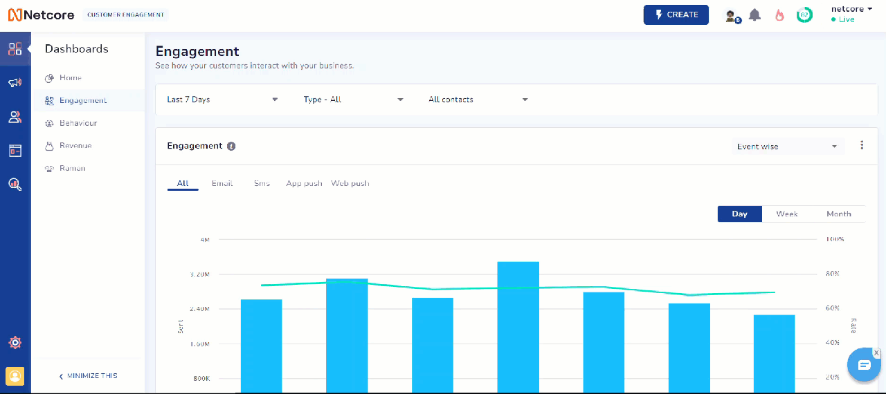
Filter Data based on your choice
4. View Data
View Data
View your data according to two types to gain insights into your Campaigns. Available options in the dropdown menu are:
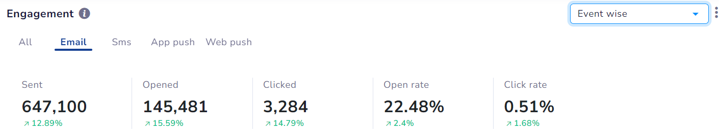
- Event wise: It tracks the performance of specific events or actions triggered by your communications.
- User wise: It provides insights into individual user interactions with your communications.

View Data for User or Event
5. Export Data
Export Data
Download your data in various formats. Click  to export data as per your preference. Available export options are:
- Export as PDF
- Export as PNG
- Export as JPEG
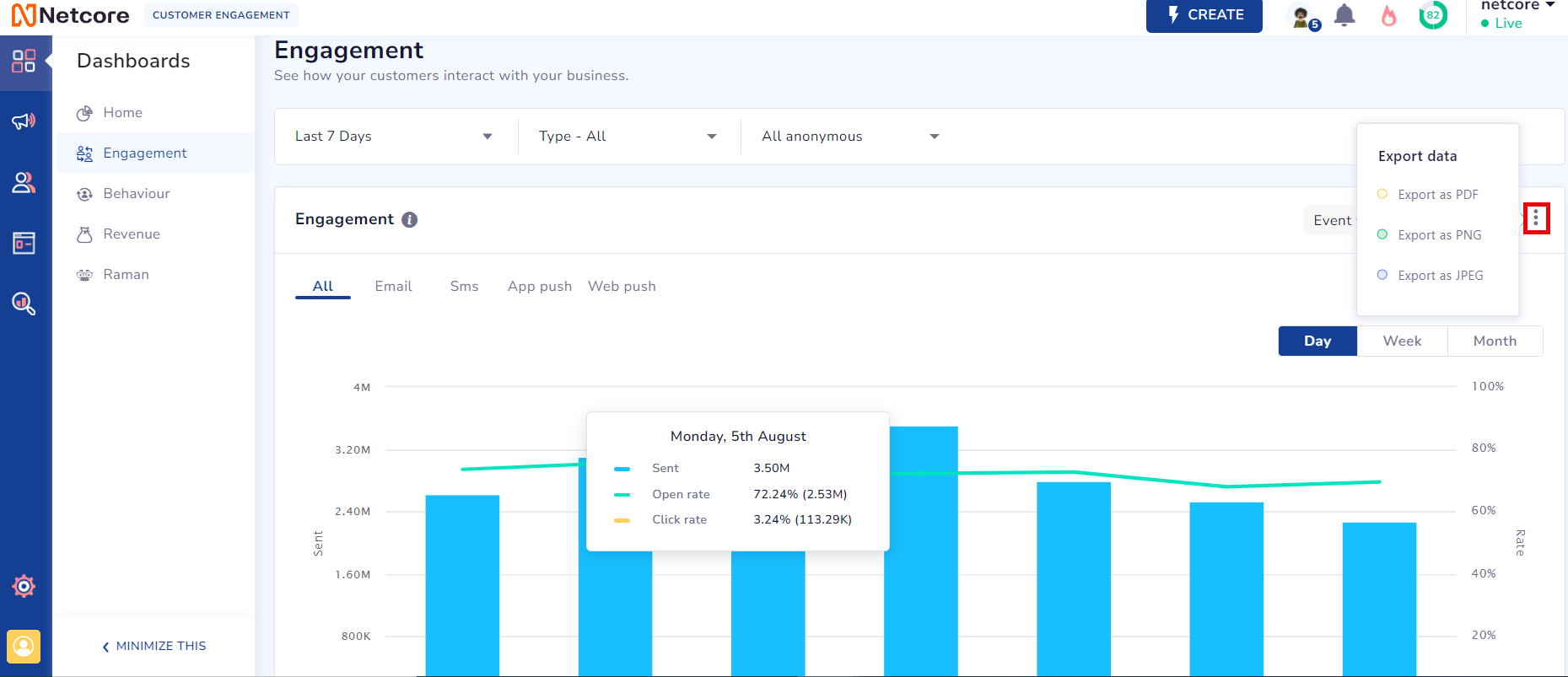
Export Data as PDF, PNG, or JPEG
6. Data Display
Data Display
View Data
View the data in different formats. Available data display options are:
- Day
- Week
- Month
7. Aggregate Numbers for Push Channels
Aggregate Numbers for Push Channels
Aggregate numbers in the image below are available only for Event wise filtering. They are limited to push channels (Email, SMS, Web Push, App Push) and aren't accessible via the All tab.
Aggregate Numbers for Event
Take a look at the table below to learn about the metrics.
| Metrics | Description | Channels available for |
|---|---|---|
| Sent | Represents the number of campaigns sent. | Email, SMS, Web Push, App Push |
| Delivered | Represents the number of campaigns delivered successfully. | SMS, Web Push, App Push |
| Clicked | Represents the number of delivered campaigns that were clicked. | Email, SMS, Web Push, App Push |
| Opened | Represents the number of delivered campaigns that were opened. | Email, SMS, Web Push, App Push |
| Click Rate | Represents the percentage of recipients who clicked on a link in your campaign. | Email, SMS, Web Push, App Push |
| Delivery Rate | Represents the percentage of sent campaigns that were successfully delivered. | SMS, Web Push, App Push |
| Open Rate | Represents the percentage of delivered emails that recipients opened. |
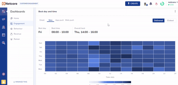
8. Best Day and Time Insights
Best Day and Time Insights
NoteThe Best Day and Time insights widget has been hidden from the Engagement dashboard. To get it enabled, please raise a ticket to Support on [email protected]
The Best Day and Time feature helps you determine the ideal day and time to send your campaigns based on historical data. This feature enables you to understand campaign performance and identify the best periods for sending campaigns. This leads to improved engagement and more effective marketing strategies.
Here are the key benefits of the Best Day and Time feature.
- Optimized Send Times: Identify the best days and times to maximize open and click rates.
- Data-Driven Decisions: Make informed choices based on historical performance data.
- Increased Engagement: Schedule campaigns when your audience is most active.
- Customizable Analysis: Tailor data views and date ranges to meet your needs.
Determine the best time to send your campaign
Refer to the GIF to understand this feature. The Y-axis shows days from Monday to Sunday, and the X-axis shows time ranges (0-24 hrs) throughout each day. The image highlights that Friday is the best day to send an email, and 8:00 - 10:00 is the best time to send for peak engagement. Additionally, it shows that the highest engagement occurs on Thursday from 14:00 - 16:00. Blocks are color-coded for performance, with darker shades of color indicating higher performance. Hover your cursor over any block to view the time range and CTR.
Use Cases
The Best Day and Time feature helps you make better decisions and plan strategically. It enhances scheduling and outreach efforts. The table below explores its potential across various use cases.
| Use Case | Scenario | Example | Outcome |
|---|---|---|---|
| Promoting Flight Deals | A travel company wants to promote its latest flight deals. | They analyze past data and find Tuesdays at 10:00 AM have high engagement. | They schedule the campaign for Tuesday morning for better engagement. |
| Launching a new product | An e-commerce company launches a new product line. | They review data and see Thursday evenings have peak engagement. | They schedule the launch email for Thursday evening to drive sales. |
| Launching a new financial service | A finance company aims to announce new financial services to its clients. | After analyzing data, they noticed that Wednesday afternoons show higher open rates. | They will email the announcement on Wednesday afternoon to maximize client engagement with the new services. |