
Email: Unified Content Editor
Learn how to design and customize email templates using the Unified Content Editor.
Overview
The Unified Content Editor lets you create and design simple, efficient, and visually appealing email templates. You can create responsive, personalized, and brand-compliant emails, ensuring a better experience and engagement.
This guide will walk you through the different features of the UCE, including product blocks, customization options, and how to save and reuse content across emails.
Key Features
The UCE offers a range of features to help marketers build effective email templates. Some of the key features are:
- Product Display: Display products in emails by selecting them directly from your catalog or from users' abandonment carts.
- Customization Options: Easily adjust text, background colors, images, and more to match your brand.
- Responsiveness: Ensure your email looks great on desktop and mobile devices.
- Personalization: Include personalized content based on customer data, like product recommendations or browsing behavior.
Use Case
| Use Case | Efficient Email Template Design for Seasonal Campaigns |
|---|---|
| Scenario: | An e-commerce brand launches seasonal email campaigns, targeting different customer segments with specific offers and promotions. |
| Problem: | Manually designing and customizing each email for the specific segment and season is time-consuming and can lead to inconsistencies. |
| Solution: | Using the Unified Content Editor, the brand creates a responsive, customizable master template that can be easily adapted for different segments and seasonal promotions. Product blocks, personalized content, and brand-compliant elements are integrated for efficient updates. |
| Example: | The brand modifies the product blocks and seasonal imagery within the master template, and all targeted campaigns (e.g., Winter Sale, Summer Clearance) are automatically updated with the latest offers and visuals. |
| Benefits: | ✔ Quick and easy template updates for seasonal campaigns. ✔ Personalization and branding consistency across multiple segments. ✔ Enhanced customer engagement with visually appealing, targeted emails. |
Set Up a New Email Template
You can create various email campaign templates tailored to specific marketing needs. To start, create a new email template in the Unified Content Editor.
Create Template
- Log in to your Netcore CE dashboard.
- Navigate to Content > Email > Create New Template to create a new template.
- Enter Template's name, Select/Add category, and Select Unified editor.
- Click Save & Next to create the template.
Unified Content Editor
Follow this to create templates from scratch using the Editor.
5. Layout
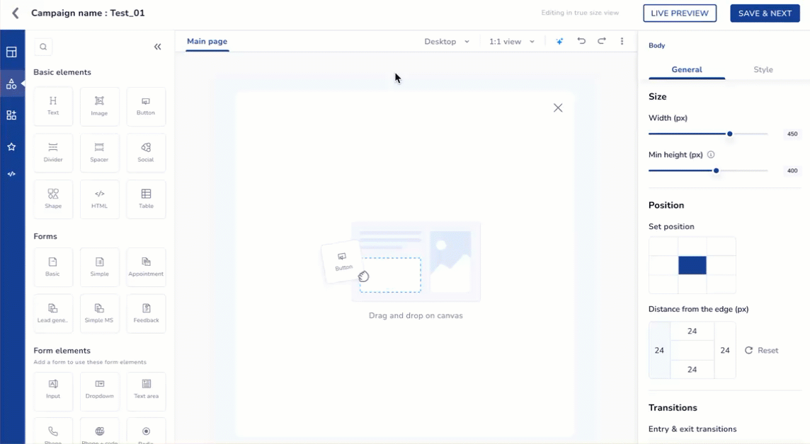
Layout
It helps you arrange basic elements, such as text, images, or buttons, in a visually appealing way. Refer to the table below for the various layouts for your message.
You can drag and drop any layout on the canvas. The right pane has two sections: General and Style, each offering different options.
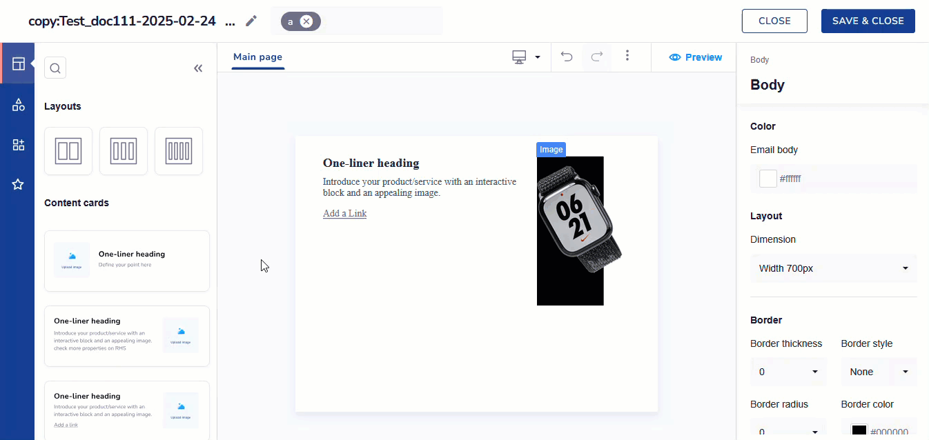
Edit Template with General and Style Options
Refer to the table below to learn more about the General option of the Main page.
Click on the blank space on the canvas to open up this section
| Options | Field Name | Description |
|---|---|---|
| General | Color | It allows you to set the background color of the email body. For Example, HEX code:#eef4e9 |
| Layout | It allows you to set the width of the email layout. Available options are:
| |
| Mobile display setting | It allows users to open a desktop view on mobile devices without any changes. Toggle the button to show the same email content of a desktop in a mobile view. | |
| Style | Border Settings | Allows you to adjust border thickness, style, color, and corner radius with Border Settings.
|
Refer to the table below to learn more about General options.
| General Options | Description | Elements Available |
|---|---|---|
| Padding | Adjust the spacing within the template. | Heading, Paragraph, Image, Divider, Spacer, and Social. |
| Alignment | Align the selected element within the template. | Heading, Paragraph, Image, and Button. |
| Opacity | Control the transparency within the template. | Heading, Paragraph, Image, Divider, Spacer, Button, and Social. |
| Border thickness | Adjust the thickness of the selected element within the template. | Spacer, Image, Divider, and Button |
| Responsive | Select whether you want to hide the element on mobile devices or a computer. | Divider |
Refer to the table below to know more about Style options.
| Style Options | Descriptions | Available for |
|---|---|---|
| Background | Allows you to set background color or image. | Heading, Paragraph, Image, and Social |
| Gradient Picker | Allows you to create gradual changes of color within the template using the Gradient Type and Gradient Direction.Gradient type: It refers to the specific manner in which colors transition within a gradient. Gradient Direction: Select the direction for the gradient effect, including top, right, center, bottom, or left. | Heading, Paragraph, and Image |
| Border | Solid: Creates a continuous, solid line for the border. | Heading, Paragraph, Image, Divider, and Button |
| Shadow | Allows you to adjust shadow blur, opacity, X-axis, Y-axis, and shadow color with Shadow Properties. | Heading, Paragraph, Image, and Divider |
6. Basic Elements
Basic Elements
You can start your template with basic elements like text, image, divider, spacer, etc.
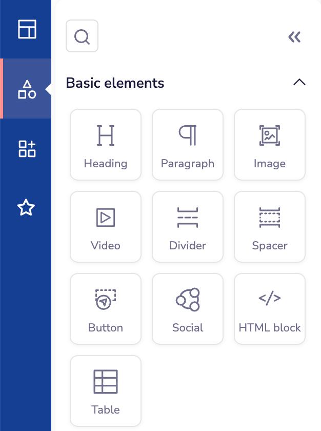
Create your Email Tempate using Basic Elements
Refer to the table below to know the description of basic elements.
| Section | Elements | Descriptions |
|---|---|---|
| Basic Elements | Heading | Select this option to add a heading to your template. |
| Paragraph | Select this option to add a message to your template. | |
| Image | Select this option to insert an image into your template. Customize your template's visuals with these image editing tools | |
| Video | Select this option to insert a video into your template. Videos help make your message more engaging and interactive. Customize your template's visuals with these image editing tools 👍 Note: Playback options depend on the video type. Vimeo videos support all controls, while YouTube and MP4 videos support only the play button. | |
| Divider | Select this option to separate content sections in your template. | |
| Spacer | Select this option to add a spacer to your template. | |
| Button | Select this option to integrate a button into your template.
| |
| Social Links | Select this option to add social media links to your template. You can add up to 16 icons. | |
| HTML block | You can add your own HTML code to templates created in the editor. This lets you customize the template further, adding unique elements unavailable through the editor’s default features. | |
| Table | You can customize the number of rows and columns, set border styles, and add solid or gradient backgrounds. You can also alternate row colors and change the header’s font, color, and alignment for better design. |
7. Widgets
Widgets
Playback options depend on the video type. Vimeo videos support all controls, while YouTube and MP4 videos support only the play button.
The dashboard's Widgets allow you to manage coupon codes and products. You can upload, sort, and track coupon codes with alerts while adding products with their name, price, and CTA for easy display and management.
Widgets allow you to create highly interactive and dynamic content, transforming your email campaigns into engaging experiences. With our Editor, you can easily add widgets to your emails, enabling actions like filling out forms or browsing products directly within the email. This interactivity enhances customer interaction and boosts engagement, making your campaigns more effective and impactful.
Click here for a detailed overview of the various widgets available when creating your email.
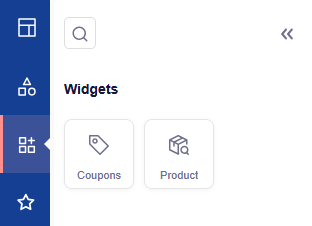
Add Coupons and Product using Widgets
| Section | Elements | Description |
|---|---|---|
| Widgets | Coupons | This helps marketers upload, sort, and share email coupon codes. It alerts users when codes run low or close to expiry and provides real-time tracking and insights for easier management. |
| Product | You can add different products by entering their name, price, and call-to-action. It helps organize and manage product details easily for better display and user interaction. |
Coupons
You can add a coupon to your email template to enhance the personalization and effectiveness of email marketing campaigns. This allows marketers to include dynamic or static coupon codes directly within their email templates, providing targeted incentives to their audience. You can also generate a Shopify coupon code. Refer here to learn more about coupons and how to set them up.
Locate the Coupon block from the context menu in the template editor. Drag and drop the Coupon block into the desired position within your email template. A configuration panel appears on the screen, allowing you to set up the coupon details.
Basic Settings
| Basic settings | Descriptions |
|---|---|
| Source | Select whether your coupon type is Generate a Shopify coupon code or Uploaded coupons in Netcore. |
| Price rules | Select your preferred price rule from the dropdown. This field is displayed when Generate a Shopify coupon code is selected. Refer here to understand the price rules. |
| Type | Select Static or Dynamic as your preferred coupon type. |
Layouts settings
| Layouts settings | Descriptions |
|---|---|
| Padding | Adjust the spacing within the template. |
| Alignment | Align the selected coupon within the template. |
Coupon Text
| Options | Description |
|---|---|
| Font style | Choose the font style for the coupon text from the dropdown list. |
| Font size | Set the font size for the coupon text. |
| Text color | Select the color of the coupon text using the color picker or by entering a hex code. |
| Text format | You can use the formatting options to make the text bold, italic, underlined, strikethrough, or to clear formatting. |
Coupon Styles
| Options | Description |
|---|---|
| Block background | Choose a color for the coupon block using the color picker or by entering a hex code. |
| Border radius | Enter a value (usually in pixels) to set how rounded the corners should be. |
| Border style | Select the desired border style from the dropdown menu to apply it to the coupon block. |
| Border color | Select a color or enter a hex code to specify the border color. |
| Border thickness | Enter a value (usually in pixels) to set the border's thickness. A higher value results in a thicker border. |
Product
Products can be directly added to email templates via the UCE. Locate the Product block from the context menu in the template editor. Drag and drop the Product block into the desired position within your email template. A configuration panel appears on the screen, allowing you to set up the product details.
Video Tutorial
Refer to the video below to understand how to use Product Picker in UCE on the Netcore CE dashboard.
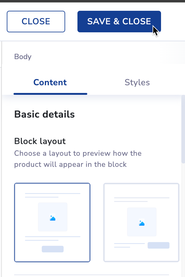
Basic details
| Options | Descriptions |
|---|---|
| Block Layout | This displays a layout preview of how the product will appear in block format. Note: Selection of the second layout disables the list view in the product alignment. |
| Dynamic | This displays products that update automatically based on predefined rules or triggers. |
| Static | This displays the same products to all recipients. |
| Display products by | These rules can be based on:
|
Display Products
| Options | Descriptions |
|---|---|
| Product details to display | This is a mandatory step to select the product details to include. You can choose up to seven details such as name, price, or description. You can also rearrange the order of the attributes as per your requirement. |
| Events | Specifically, analyze user behavior, segment audiences, and create targeted campaigns in your app or website. Events include add-to-cart, product purchases, content views, or other actions. |
| Websites | Source to collect and analyze the data and offer product recommendations to end users. This website link has your product catalog that you want to show your users in recommendations. This field is available only when you select Recommendation in Display products by dropdown. |
| Recommendation type | Choose the type of product recommendations, such as personalized or curated suggestions, to display in the email. This field is available only when you select Recommendation in Display products by dropdown. |
| Button text | Customize the text that appears on the call-to-action button in your email. |
| Button URL | Select the destination URL for the button, directing users to a specific page or action. |
| Product header | Add the top part of an email that shows important details about your Total products, Total discount amount, Total retail price difference in percentage, and other pricing information. |
| Product footer | Add a footer in email that shows important details about your Total Sales price difference, Total discount percent, Total discount amount, and other pricing information. |
| Font style | Choose the font type to define the text appearance in your email template. |
| Font size | Select the size of the text to adjust its readability and visual hierarchy. |
| Alignment | Align the text to the left, center, or right within your email for the desired layout. |
| Text Color | Select the color of the text using a color picker or hex code to match your brand. |
| Text format | Apply text formatting options like bold, italics, or underline to emphasize specific content. |
Product Styles
| Options | Description |
|---|---|
| Block background | Choose a color for the product block using the color picker or by entering a hex code. |
| Border radius | Enter a value (usually in pixels) to set how rounded the corners should be. |
| Border style | Select the desired border style from the dropdown menu to apply it to the product block. |
| Border color | Select a color or enter a hex code to specify the border color. |
| Border thickness | Enter a value (usually in pixels) to set the border's thickness. A higher value results in a thicker border. |
| Card Style | Customize the appearance of product cards with background, borders, and spacing options to enhance visual appeal. |
| Image display options | Choose product images that are displayed, such as in a grid, carousel, or individual format, to fit your email layout. |
Layouts settings
| Layouts settings | Descriptions |
|---|---|
| Padding | Adjust the spacing within the template. |
| Alignment | Align the selected product within the template. |
| No of product | Select the number of products to include in the email from a dropdown menu. You can select upto 10 products to be displayed in a row. |
| Image(s) in a row | Specify the number of product images to display per row in the email from a dropdown menu. |
| Product alignment | You can select how products are displayed in the email: grid (rows and columns) or List (vertically arranged products). |
ImportantMake sure you preview and verify the layout of the template before sending out the Email. This ensures that your message looks right on all devices and screens.
Saved Blocks
Whenever you click on the Favourite icon, a Saved block display appears, allowing you to create and save Saved blocks. These reusable blocks are called Global Widgets (Blocks). Edit one, and the changes reflect everywhere it is used.
When you regularly send email campaigns to customers about new products, sales, or promotions. The Saved blocks in the email editor allow you to create reusable sections (blocks) of your email templates. This can significantly save time and ensure consistency across multiple campaigns.
- Save and reuse blocks across multiple campaigns, changing only the product details.
- Ensures consistent design and structure across all campaigns.
- Speeds up the email creation process, focusing only on content updates.
Save a Block
On the Unified Content Editor (UCE), locate the block you wish to save.
- Hover over the block to display the toolbar options: Add, Copy, Delete, Save
- Click the Star Icon (Save). This opens the Save Block modal with the following fields:
- Select from Header, Body, Footer, or Other.
- Enter a unique name. Allowed characters are: Letters (A–Z, a–z), Numbers (0–9), Underscore (_), Hyphen (-), Spaces. The Save and Cancel buttons appear at the bottom of the modal.
- Click Save. The block will be stored in the Saved blocks section and tagged by type.
Save a Block
Why Use Saved Blocks?
Marketers often reuse elements like headers and footers. Creating them each time is repetitive. Saved Blocks let you:
- Create a block once
- Use it across all campaigns
- Update it in one place and apply changes everywhere
Edit a Saved Block
Drag and drop the saved block on the canvas. There are two options here:
- Edit across all templates
- Unlink and edit
Edit Across All Templates
This option updates the block in every campaign/ template that uses it. You can also view where it is used before confirming the change.
Unlink and Edit
This option updates apply only to the current campaign. You need to re-save it under a new name.
Here, you can edit the block using Genral or Style settings. Refer here to know more about basic elements and settings.
Example: Seasonal Banner
Use Case: A marketer wants to create a seasonal promo banner for Diwali sales.
- Design the promo block with images, offers, and CTA.
- Click Save and name it “Diwali Promo – 2025”.
- Reuse across all emails for that period. Midway, update the CTA text.
- Select Edit Across All Templates > Confirm. All your campaigns are updated instantly.
9.Click SAVE & CLOSE to save the template.
Troubleshooting & FAQs
Q. My email template does not look the same on mobile and desktop. What should I do?
A. Ensure that your template is responsive! In the UCE, you can check how your template looks on both desktop and mobile devices. If something looks odd, try adjusting the layout or checking if there is an option to hide certain elements on mobile. Look for the Responsive setting and ensure everything looks good on both screens.
Q. How can I make my email template look more attractive?
A. You can make your template more eye-catching by using features like background colors, images, and cool fonts. You can also add product images and buttons to make it easier for people to click. Use the Style options to add a background, shadow effects, or borders around sections to make everything stand out!
Q. The button in my template does not work when I click it. What is wrong?
A. It could be because the button's action is not set correctly. When editing the button, make sure you have selected what you want it to do—like opening a webpage or closing the message. Double-check the button settings to make sure everything is linked correctly.
Q. My email template looks different after I save it. Why is that?
A. Sometimes, changes made to the layout or elements can look different depending on where they are viewed. Make sure to preview your email on both desktop and mobile before sending it. Also, check if anything like text size or image alignment got shifted. If needed, make adjustments to fix it.