
Custom HTML Nudges
Learn to create custom HTML nudges on the Netcore PX dashboard.
Overview
An HTML nudge refers to a targeted, interactive message displayed on a user’s screen to guide them through an experience or encourage specific actions. Custom HTML nudges provide greater control over your messaging, enabling you to create highly personalized, branded content. These nudges can take the form of pop-ups, banners, tooltips, or custom layouts, and support rich media like images, videos, and interactive elements.
Why is it Important?
HTML nudges are essential because they engage users at the right moment, offering timely prompts or guidance that improve their experience. By integrating interactive, visually appealing content, HTML nudges can increase conversions, improve onboarding, and ensure users don’t miss key steps in a workflow.
SDK Requirements
- Android: Nudges SDK version 9.0.0 or above.
- iOS: Nudges SDK version 8.6.1 or above.
- Web: Supported on all versions of the Web SDK.
The following features are supported with Custom HTML nudges:
- Use HTML nudges to display messages within your app.
- Upload custom HTML templates as a code file or directly paste your HTML code when creating a nudge.
Best Practices for Custom HTML Nudges
- Ensure your nudges are concise and relevant to the user’s journey.
- Use dynamic elements like buttons with close, link, or invoke actions for seamless interaction.
- Test your custom HTML for responsiveness and compatibility across devices.
- Personalize your nudges with additional events/ goals to create targeted experiences.
Guidelines to Create Custom HTML Nudges
Action Button For Nudge Action
Action buttons trigger specific user interactions, enabling seamless navigation and dynamic engagement within your content. You can trigger subsequent nudges based on user interactions with action buttons like Close, Link, Invoke and more in the DIY nudges.
Create DIY Nudge
- Create a DIY Nudge with an action button. Refer here to know how to Create a Nudge
- Select the action button as the trigger in the Nudge Action dropdown.
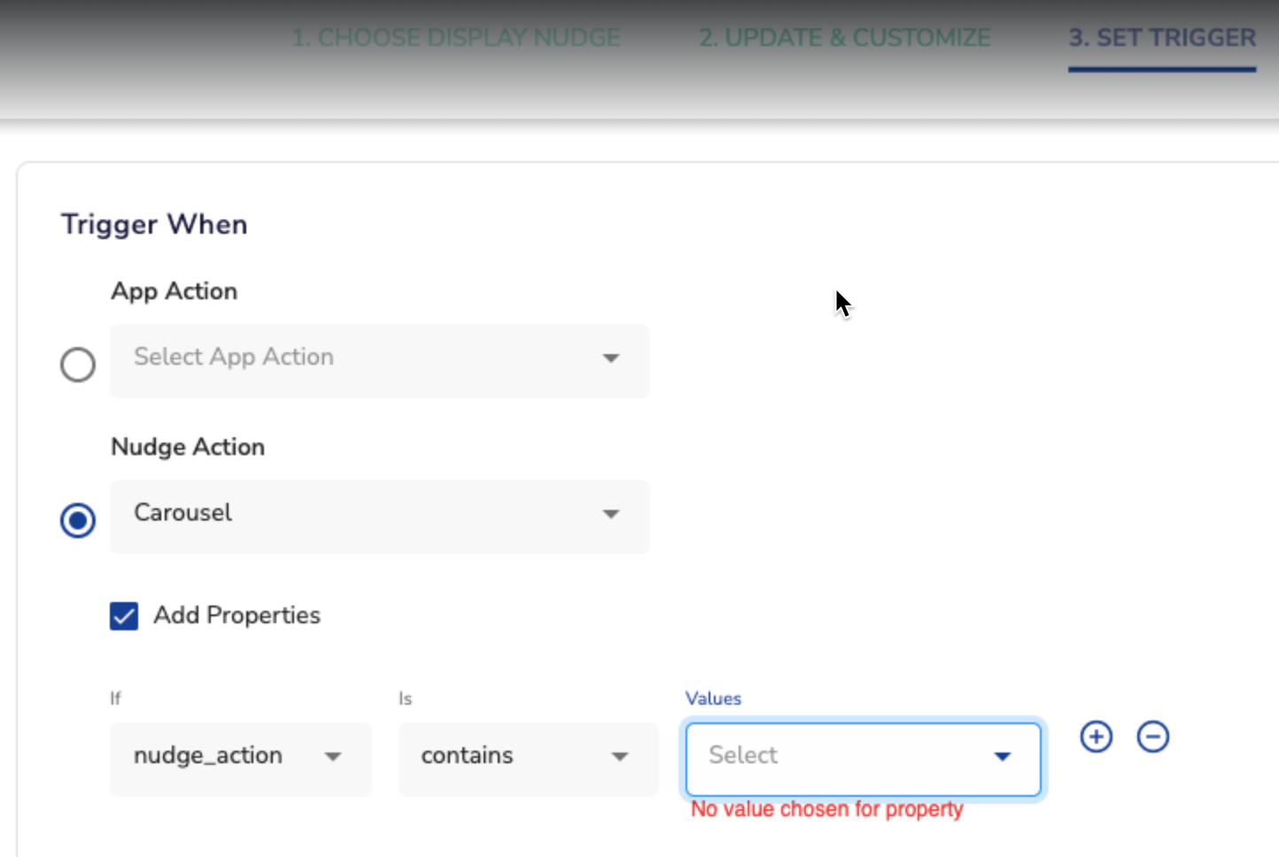
Adding Nudge Action
- Set conditions for when the next nudge should appear, this will be triggered when the user clicks the action button in the previous DIY nudge.
- Preview the walkthrough, where each nudge is triggered as users interact with the action buttons.
This functionality is supported across Android, iOS (SDK Version 9.0.21 onwards)
Adding Custom HTML in Nudges
Your HTML file must include JavaScript to enable custom functionality. Add the following script to your HTML body and not the head:
<script src="https://nudges3.hansel.io/px-diy.js?v=1.3.0" id="px-diy-html"></script>JavaScript Integration
| JavaScript Link | Use |
|---|---|
| <https://nudges3.hansel.io/px-diy.js?v=1.3.0> | Adds and tracks interactions in your HTML nudge using PX SDK. |
Interactions in HTML Nudges
Adding a DIY Action Button (Android & iOS)
When a user creates a DIY nudge which includes action buttons, users can choose which action the nudge will trigger. This ensures that the nudge is aligned with the user's intended interaction and provides a seamless experience.
- HTML Class Method
<button class="smt-nudge-trigger" data-index="1">Submit</button>Use Case for Creating and Triggering DIY Action Button
| Use Case | Goal | Steps to Achieve | Outcome |
|---|---|---|---|
| Creating and triggering a DIY nudge with action buttons | Goal is to engage users and enable them to make decisions through a custom DIY Nudge equipped with actionable buttons. | A new DIY Nudge is created for feedback which has two action buttons.
| This approach allows the team to gather valuable user feedback while giving users control over their interaction, improving both the experience and the insight collected. |
Adding a Close Action
To enable a close action for a button, use one of the following options:
- HTML Class Method:
<button class="smt-nudge-close-action">Close</button>- JavaScript Method:
smtCloseAction();Adding a Link Action
To link a button to a URL, use the following options:
- HTML Class Method:
<button class="smt-nudge-action" data-smt-nudge-link="https://www.google.com">Click Me</button>- JavaScript Method:
smtLinkAction("https://www.google.com");Adding an Invoke Action
Define custom invoke actions for your nudge. Refer to platform-specific documents:
You can use the following method to do so.
- HTML Attribute Method:
<button class="smt-nudge-close-action" data-sig-handler="action">Click Me</button>- action: A non-empty string defining the action.
- payload: A valid JSON payload (optional).
- JavaScript Method:
smtInvokeAction(action);
// OR
smtInvokeAction(action, payload);
Web-Specific Integration
Include the required script for web nudges:
<script src="https://nudges3.hansel.io/px-diy-web.js?v=1.0.0" id="px-diy-html"></script>| JavaScript Link | Use |
|---|---|
| <https://nudges3.hansel.io/px-diy-web.js?v=1.3.0> | Adds and tracks interactions in your HTML nudge using PX SDK. |
Updated 29 days ago