
In-app: Unified Content Editor
Increase user engagement with access to ready-to-use system templates.
Overview
The Unified Content Editor is your all-in-one solution for creating In-app messages. You can select the ready-to-use template or create from scratch with Editor or Custom HTML.
Netcore CE provides various In-app message campaign templates for specific marketing needs.
To create an In-app message campaign, follow these steps:
- Select any position under the Content section when you create your campaign.
| Position | Description |
|---|---|
| Sticky Header | A banner message that sticks to the top of the screen. |
| Sticky Footer | A banner message that sticks to the bottom of the screen. |
| Half Interstitial | A message that covers half of the screen, typically centered. |
| Interstitial | A full-screen message appears over the entire screen temporarily. |
| Cover | A message that fully covers the entire screen, requiring user interaction. |
- Select the required option to create the content for your campaign.
Unified Content Editor
This feature allows you to create and save custom campaigns for later use.
As you proceed, you see three options on the left pane of the DIY window:
- Layout
Layout
It helps you arrange basic elements, such as text, images, or buttons, in a visually appealing way. Refer to the table below for the various layouts for your message.
You can drag and drop any layout on the canvas. The right pane has two sections: General and Style, each offering different options.
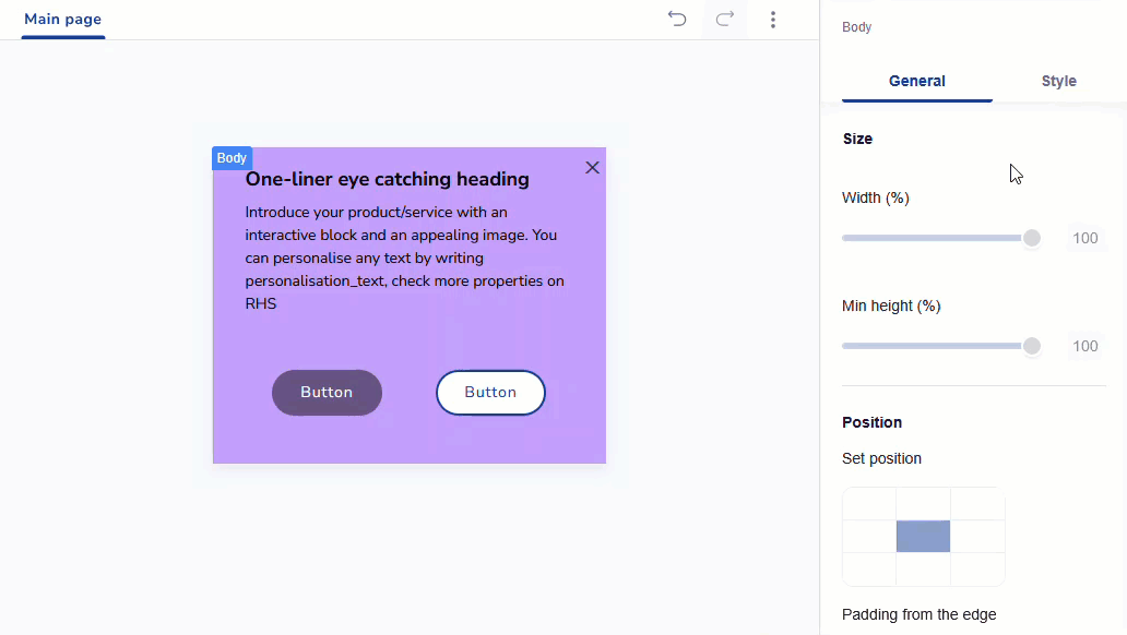
Edit Template with General and Style Options
Refer to the table below to learn more about General options.
| General Options | Description | Elements Available |
|---|---|---|
| Padding | Adjust the spacing within the template. | Heading, Paragraph, Image, Divider, Spacer, and Social. |
| Alignment | Align the selected element within the template. | Heading, Paragraph, Image, and Button. |
| Opacity | Control the transparency within the template. | Heading, Paragraph, Image, Divider, Spacer, Button, and Social. |
| Thickness | Adjust the thickness of the selected element within the template. | Spacer, Image, Divider, and Button |
Refer to the table below to know more about Style options.
| Style Options | Descriptions | Available for |
|---|---|---|
| Background | Allows you to set background colour or image. | Heading, Paragraph, Image, and Social |
| Gradient Picker | Allows you to create gradual changes of colour within the template using the Gradient Type and Gradient Direction.Gradient type: It refers to the specific manner in which colors transition within a gradient. Gradient Direction: Select the direction for the gradient effect, including top, right, center, bottom, or left. | Heading, Paragraph, and Image |
| Border | Allows you adjust border thickness, style, colour, and corner radius with Border Settings. Solid: Creates a continuous, solid line for the border. | Heading, Paragraph, Image, Divider, and Button |
| Shadow | Allows you adjust shadow blur, opacity, X-axis, Y-axis, and shadow colour with Shadow Properties. | Heading, Paragraph, Image, and Divider |
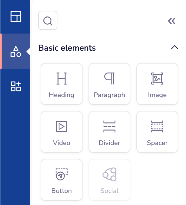
- Basic Elements
Basic Elements
You can start your template with basic elements like text, image, divider, spacer, and so on.
Create your In-app Message using Basic Elements
Refer to the table below to know the description of basic elements.
| Section | Elements | Descriptions |
|---|---|---|
| Basic Elements | Heading | Select this option to add a heading to your template. |
| Paragraph | Select this option to add a message to your template. | |
| Image | Select this option to insert an image into your template. Customize your template's visuals with these image editing tools. | |
| Video | Select this option to insert a video into your template. Videos help make your message more engaging and interactive. Customize your template's visuals with these image editing tools. - Auto Play: Automatically start playing the video when the message loads. | |
| Divider | Select this option to separate content sections in your template. | |
| Spacer | Select this option to add a spacer to your template. | |
| Button | Select this option to integrate a button into your template. |
- Widgets
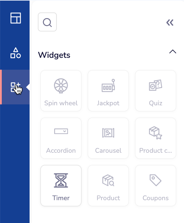
Widgets
Widgets allow you to create highly interactive and dynamic content, transforming your In-app campaigns into engaging experiences. With our Editor, you can easily add widgets to deliver personalized messages, guide user actions, or showcase relevant content. This interactivity enhances customer interaction and boosts engagement, making your campaigns more effective and impactful.
Upcoming ReleaseThe below widgets in In-app are coming soon
- Spin the wheel
- Jackpot
- Quiz
- Accordion
- Carousel
- Product catalog
- Product
- Coupons
Add Widgets
Timer
You can add a countdown timer to messages to create urgency with date-based or duration-based timers that tick down in real time. You can set it to end at a specific date and time. For example, the Independence Day sale that ends on August 15, 11:59 PM, or it runs for a set length of time, for example, offer valid for the next 72 hours.
Locate the Timer block from the context menu in the template editor. Drag and drop the Timer block from the Widget section into the desired position within your template. A configuration panel appears on the screen, allowing you to set up the timer details.
Refer to the table below to learn more about General options.
| General Options | Description | Elements Available |
|---|---|---|
| Configure Timer | Count down to a set date/time or for a set time starting when the timer appears. | |
| Style | Select the orientation for the Timer. | |
| Show labels | Specify the label position relative to the element. You can edit the labels | |
| Layout | Arrangement and positioning of elements | |
| Opacity | Control the transparency within the template. |
Refer to the table below to know more about Style options.
| Style Options | Description | Elements Available |
|---|---|---|
| Digit styling | Configure the appearance of digits including dimensions, font, and colors. | |
| Label styling | Customize the label text appearance including font and size. |
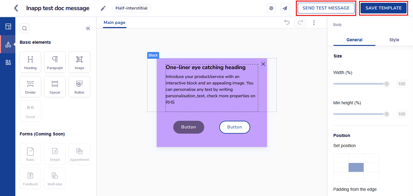
- Personalize your content according to requirements. Refer here to personalize.
- When your message is ready using your desired elements and settings, click the Live Preview button to see how it will appear on the app.
- Click the Next button to send your message.
Preview your In-app Message
Button closeNow you can edit the X or Close icon in-app by adjusting the colour, style and button type in the body section of Basic elements.
Refer here to Schedule and Save your message campaign.
Updated 26 days ago