
Custom HTML
Learn to create templates using our custom HTML editor.
For enhanced control over your campaigns, customize web messages with HTML, CSS, and JavaScript to achieve unique branding. You can use custom HTML to create messages perfectly for your brand and engage your website users when they are on the website.
The following functions are supported with HTML web messages.
- Use HTML templates for showing messages on your website.
- Support for Landscape and Portrait mode with web message campaigns.
- You can upload custom HTML templates as a code file or simply paste your HTML code while creating web message campaigns.
Important Points to Remember
- The HTML/CSS should be specified as per W3C standards.
- We recommend you to use system default fonts.
Create Campaign with Custom HTML
To create a Web message campaign using HTML, follow these steps:
- Choose any layout under Content section, when you create your campaign.
- Select Custom HTML option to create the content for your campaign using our Code Editor.
Refer to the table below to know more about all the Layouts.
| Layout | Description |
|---|---|
| Banner | Banner is a bar at the top or bottom of the screen, ideal for alerts. |
| Sticky Bar | A sticky bar is a fixed bar at the top or bottom, remains during scrolling. |
| Modal | A modal is a pop-up window on the screen for important messages or input. |
| Full Screen | Full screen layout covers the entire screen, ideal for important announcements or offers. |
As you proceed, you see a Configure web message screen. When configuring a web message in the HTML editor, you'll find these options:
| Option | Description |
|---|---|
| Message Position | Specifies where the message appears on the screen. It contains the following options: classic-bottom-right classic-bottom-left classic-top-right classic-top-left classic-center drawer-left |
| Overlay | Sets the colour and colour codes to determine the overlay appearance with the background. |
| Width | Sets the width of the template |
| Height | Sets the height of the template |
- On the left pane, go to the Code Editor section and add your HTML code in the box.
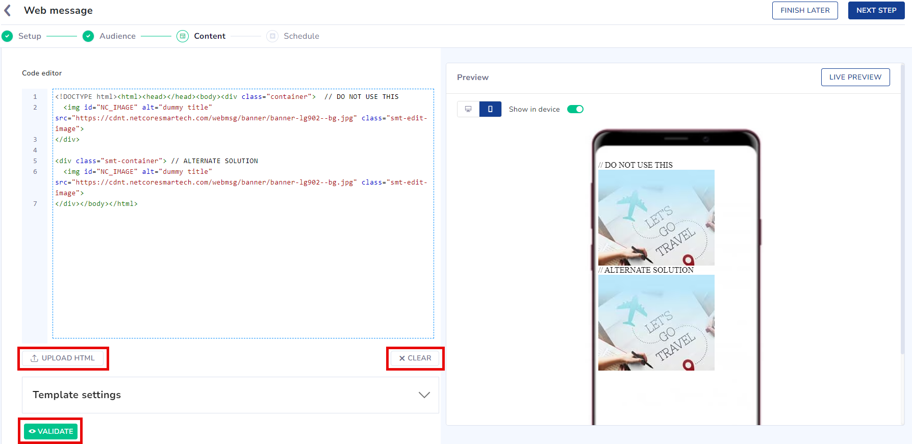
Code Editor
- Under Template settings, adjust message position, overlay, height, and width to your preference. If needed, press the CLEAR button to delete any existing code. Our Code Editor also gives a Validate option, which verifies the correctness of the code you've entered.
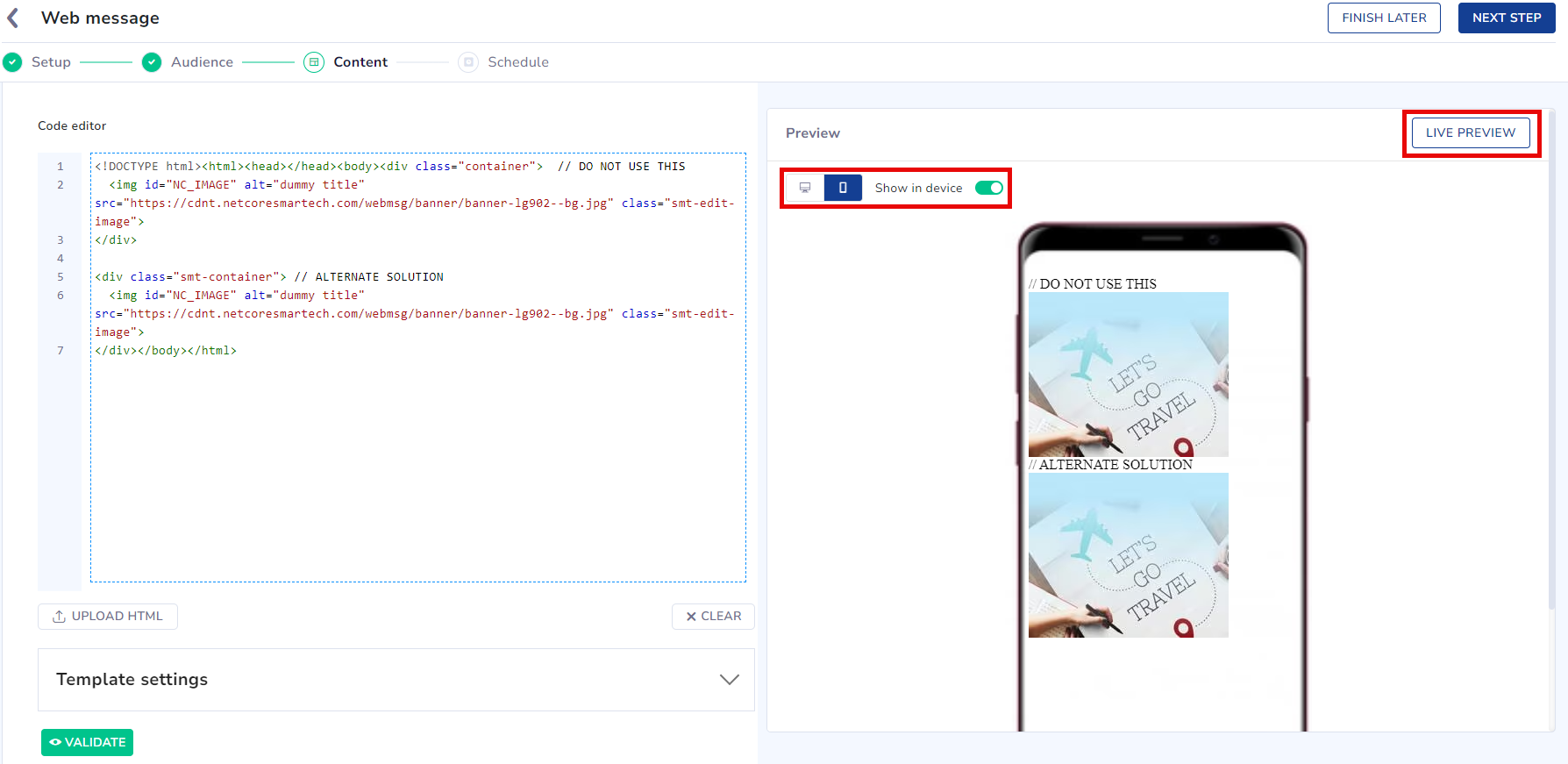
- On the right pane, Live Preview your template based on the code you've entered. .Toggle the Show on device button to preview the web message with or without being displayed on the website.
Preview Template
- Click the Next button to send your web message.
Refer here to Schedule and Save your web message campaign.
Rules to Create Custom HTML
When creating a web message template in the HTML editor, follow these rules:
- Use a complete DIV-based layout.
- Apply CSS classes inline.
- Ensure images have copyright permission.
- Only one <img> tag is allowed per template.
- Start the HTML with .
- Include a title element in the head section:
<title>My Form</title>- The
tag must include these attributes:
- alt (mandatory): Alternate text displayed if the image doesn’t render.
- title (optional): A tooltip that appears when the user hovers over the image.
<img src=”some-link” alt=”some-image” />- An id is mandatory in all templates.
- Commented code is not allowed.
<!-- container for Image tag starts here -->
<div class="smt-img-div">
  <img id="NC_IMAGE" src="https://cdnt.netcoresmartech.com/webmsg/banner/banner-lg902--bg.jpg" class="smt-edit-image">
</div>
<!-- container for Image tag ends here -->
<!--div class="smt-img-div">
</div-->
NoteWe only support type="text" inputs and type="email" or "mobile" inputs are not supported.
Personalization Syntax for Custom HTML Web Messages
When implementing personalization in custom HTML web messages to pull payload values from the last recorded Web SDK event (e.g., for fields like Origin, Destination, or Departure Date), use the following double-underscore activity token syntax:
[%__fieldName$activity_type$default__%]
Syntax Breakdown:
fieldName: The name of the value on the activity (must match the shape of the tracked activity, e.g., city).activity_type: The event/activity name used when that behavior is tracked (must match how the activity is stored for the user).default__: The value that displays if the field or activity is missing.
This syntax provides the correct personalization logic for activity-based triggers in custom templates.
Templates
Explore a variety of templates for different elements, including input fields, background images in CSS, image tags, titles, div structures and sequences, links (buttons), paragraphs, and more. Below are essential elements to create a attractive web message template.
Codes for Template Elements
1.Background Image
Enhance your message template by incorporating a captivating background image.
To Addinsert id="NC_background_color"
<div id="NC_background_color" class="smt-modal smt-edit-background-color"></div>2.Use of 'Container' Class for Parent Containers
Ensure proper layout by avoiding use of container class for wrapping elements.
<div class="container">  // DO NOT USE THIS
  <img id="NC_IMAGE" alt="dummy title" src="https://cdnt.netcoresmartech.com/webmsg/banner/banner-lg902--bg.jpg" class="smt-edit-image">
</div>

<div class="smt-container"> // ALTERNATE SOLUTION
  <img id="NC_IMAGE" alt="dummy title" src="https://cdnt.netcoresmartech.com/webmsg/banner/banner-lg902--bg.jpg" class="smt-edit-image">
</div>
3. Call-to-Action (CTA) Button
Guide users effectively with an engaging call-to-action button. If the href attribute is empty, use javascript:void(0); for functionality.
<a id="NC_CLOSE_BUTTON" href="javascript:void(0);" class="smt-close smt-close-bt smt-edit-close-button">Close</a>
<a id="NC_CLOSE_ICON" href="javascript:void(0);" class="smt-close smt-close-icon smt-edit-close-icon">X</a>
4.Content Element with Dynamic IDs
Keep your message dynamic by inserting content elements with unique IDs like NC_TEXT_ONE, which can be incremented for subsequent elements.
To addInsert id = NC_TEXT_ONE
The “id” will keep on changing followed by number of
elements
(e.g. id=”NC_TEXT_ONE”, id=”NC_TEXT_TWO” and so on)
<p id="NC_TEXT_ONE" class="smt-p smt-edit-content">GET FREE PERSONALIZED RECOMMENDATIONS FROM OUR TRAVEL EXPERTS !</p>5.Form Element
Maintain consistency and clarity by following the specified syntax for form elements.
<form id="NC_FORM1" class="smt-form">6.Input Element
Ensure seamless integration of input elements using the provided syntax.
Important Note
- On the use of multiple input elements and error tags, the id will keep on changing i.e. id=NC_INPUT_TEXT1, id=NC_INPUT_TEXT2, and so on.
- Similarly for error id=NC_ERROR1, id=NC_ERROR2, and so on.
- Dropdowns are supported in Custom HTML.
<div class="smt-form-group">
  <input id="NC_INPUT_TEXT1" type="text" name="Email" class="smt-input" placeholder="Email" data-attribute="EMAIL">
  <span class="smt-error" id="NC_ERROR1">Please enter your email address</span>
</div>
7.IMG Tag
Enrich your message with visually appealing images using the suggested syntax for IMG tags.
<div class="smt-img-div">
  <img id="NC_IMAGE" alt="dummy title" src="https://cdnt.netcoresmartech.com/webmsg/banner/banner-lg902--bg.jpg" class="smt-edit-image">
</div>
8.Action Button
Enhance user engagement by implementing action buttons according to the provided syntax.
<div class="smt-button-div smt-cta-group callToAction">
  <button type="button" id="NC_CTA_ONE" class="smt-button smt-edit-button">Learn More</button>
<button type="button" id="NC_CTA_TWO" class="smt-button2 smt-edit-button">Buy Now!</button>
 </div>
9.Form Action Button
Initiate user interaction with form action buttons using the prescribed syntax.
#Close the message
<button type="button" id="NC_CTA_ONE" class="smt-button smt-edit-button NC_ACTIVE smt-close">Close</button>
#Save and close
<button type="button" id="NC_CTA_ONE" class="smt-button smt-edit-button NC_ACTIVE smt-save-close">Save and Close</button>
#Save and Open ThankYou Page
<button type="button" id="NC_CTA_ONE" class="smt-button smt-edit-button NC_ACTIVE">Save form data & open Thankyou page</button>
NOTEDropdowns are not supported in custom HTML.
10.Redirection URL
Direct user navigation efficiently by adhering to the specified syntax for redirection URLs.
#(button) redirection URL which opens in same tab
<button type="button" id="NC_CTA_ONE" class="smt-button smt-edit-button NC_ACTIVE" data-action-id="NC_CTA_ONE" data-action-link="https://www.google.com/"> BUY</button>

#(button) redirection URL which opens in new tab
<button type="button" id="NC_CTA_ONE" class="smt-button smt-edit-button NC_ACTIVE" data-action-id="NC_CTA_ONE" data-action-link="https://www.google.com/" data-action-target="_blank"> BUY</button>

#(image only template) redirection URL which opens in same tab
<div id="NC_image_only" data-action-id="NC_image_only" data-action-is-prime="true" data-action-link="https://www.google.com/">
  <span id="NC_background_image" class="smt-modal smt-edit-background-color" style="
    background-image: url('https://www.insidehighered.com/sites/default/server_files/media/Inside%20Digital%20Learning/iStock-872232248.jpg');
    background-repeat: no-repeat;
    background-size: contain;
    background-position: center center;
    display: block;
  ">
</span>
</div>

#(image only template) redirection URL which opens in new tab
  <span id="NC_background_image" class="smt-modal smt-edit-background-color" style="
    background-image: url('https://www.insidehighered.com/sites/default/server_files/media/Inside%20Digital%20Learning/iStock-872232248.jpg');
    background-repeat: no-repeat;
    background-size: contain;
    background-position: center center;
    display: block;
  ">
</span>
</div>
Codes for Template Types
NoteThe height and width dimensions provided in the sample code below are our recommended sizes for creating templates.
Below, you'll find a variety of code snippets for different template types, including:
1.Sticky Bar Template
Sticky Bar Template
Enhance user experience with a Sticky Bar Template, ensuring important information remains visible during scrolling. Refer to the code below for seamless implementation.
<!DOCTYPE html>
<html lang="en" class="smt-html">
  <head>
    <title> Sticky Bar </title>
    <meta charset="utf-8" />
    <meta name="viewport" content="width=device-width, initial-scale=1, shrink-to-fit=no" />
    <style>
      /* General styling and box-sizing reset */
      * {
        -moz-box-sizing: border-box;
        -webkit-box-sizing: border-box;
        box-sizing: border-box;
      }

      /* Sticky bar container styling */
      .smt-body {
        height: 60px;
        margin: 0 auto;
      }

      .w100 {
        width: 100%;
      }

      /* Link styling */
      a,
      a:visited,
      a:active,
      a:hover {
        text-decoration: none;
      }

      /* Floating left and right helper classes */
      .smt-float-left {
        float: left;
      }

      .smt-float-right {
        float: right;
      }

      /* Sticky bar styling */
      .smt-sticky-bar {
        padding: 0 3% 0 0;
        min-height: 60px;
        max-height: 60px;
        height: auto;
        box-sizing: border-box;
        position: relative;
        width: 100%;
        display: flex;
        flex-wrap: nowrap;
        background: #fff url(https://cdnt.netcoresmartech.com/webmsg/sticky-banner/bitmap.jpg);
        background-repeat: no-repeat;
        background-size: 100%;
        background-position: center center;
        overflow: hidden;
      }

      /* Dropdown option styling */
      .smt-dropdown > option {
        color: #333;
      }

      /* Close button styling */
      .smt-close-bt {
        font-family: Verdana, Geneva, Tahoma, sans-serif;
        font-weight: 700;
        position: absolute;
        right: 3px;
        top: 3px;
        color: #000;
      }

      /* Input field styling */
      .smt-input {
        height: 32px;
        border: 1px solid #5c5c5c;
        padding: 0 3%;
        width: 80%;
        font-size: 14px;
        background: transparent;
        margin-right: 15px;
        color: #000;
        outline: 0;
        max-width: 350px;
      }

      /* Placeholder text styling for input field */
      .smt-input::-webkit-input-placeholder {
        font-size: 14px;
        color: #000;
      }

      .smt-input::-moz-placeholder {
        font-size: 14px;
        color: #000;
      }

      .smt-input:-ms-input-placeholder {
        font-size: 14px;
        color: #000;
      }

      .smt-input:-moz-placeholder {
        font-size: 14px;
        color: #000;
      }

      /* Heading styling */
      .smt-h1 {
        font-family: Helvetica, Arial, sans-serif;
        font-size: 25px;
        font-weight: bold;
        color: #5c5c5c;
        margin: 0;
        text-align: left;
      }

      /* Button styling */
      .smt-button {
        height: 38px;
        border-radius: 5px;
        background-color: #4a4a4a;
        font-family: Helvetica, Arial, sans-serif;
        font-size: 20px;
        font-weight: bold;
        color: #ffffff;
        display: block;
        text-align: center;
        padding: 0 5%;
        line-height: 38px;
        width: 90%;
        border: 0;
        max-width: 236px;
        cursor: pointer;
      }

      /* Layout styling for rows and content */
      .smt-row {
        width: 100%;
        height: 100%;
        float: left;
        background-color: #fff;
      }

      .smt-content-div {
        width: 50%;
        padding: 0 2%;
        margin-right: 5%;
        vertical-align: middle;
        float: left;
        position: relative;
        display: flex;
        align-items: center;
        height: 60px;
      }

      .smt-input-div {
        width: 55%;
        flex: 40%;
        padding: 0;
        margin: 5px 0;
        vertical-align: middle;
        float: left;
        position: relative;
      }

      .smt-button-div {
        float: right;
        display: flex;
        flex: 45%;
        align-items: center;
        height: auto;
        width: 30%;
        padding: 0;
      }

      /* Vertically center elements */
      .smt-vertically-center {
        position: relative;
        top: 50%;
        -ms-transform: translateY(-50%);
        transform: translateY(-50%);
      }

      /* Error message styling */
      .smt-error {
        display: block;
        width: 100%;
        font-size: 12px;
        color: red;
        font-family: Helvetica, Arial, sans-serif;
        margin: 2px 0 0 0;
        text-align: left;
      }

      /* Form styling */
      form {
        width: 45%;
        display: flex;
        flex: 100%;
        padding: 0;
        margin: 0;
      }

      /* Responsive styling for tablets */
      @media screen and (min-width: 768px) and (max-width: 1024px) {
        .smt-button-div {
          width: 45%;
          margin-right: 20px;
        }
        .smt-button {
          width: 100%;
        }
      }

      /* Responsive styling for mobile devices */
      @media screen and (max-width: 768px) {
        .w100 {
          position: relative;
        }
        .smt-row {
          display: flex;
          align-items: center;
        }
        form {
          width: 100%;
          padding: 0;
        }
        .smt-sticky-bar {
          max-height: 55px;
          padding: 0 2% 0 5%;
          background-size: cover;
        }
        .smt-h1 {
          font-size: 11px;
          line-height: normal;
          margin-bottom: 5px;
          padding: 0 10px;
        }
        .smt-input-div {
          margin: 0;
          padding: 0;
          width: 55%;
        }
        .smt-content-div {
          margin: 0;
          padding: 0;
          width: 100%;
          height: auto;
        }
        .smt-input {
          height: 19px;
          line-height: 19px;
          font-size: 7px;
          width: 100%;
        }
        .smt-input::-webkit-input-placeholder {
          font-size: 7px;
        }
        .smt-input::-moz-placeholder {
          font-size: 7px;
        }
        .smt-input:-ms-input-placeholder {
          font-size: 7px;
        }
        .smt-input:-moz-placeholder {
          font-size: 7px;
        }
        .smt-button-div {
          width: 43%;
          position: relative;
          display: inline-block;
          top: 0;
          height: auto;
          margin-right: 15px;
        }
        .smt-button {
          height: 25px;
          line-height: 25px;
          font-size: 9px;
          width: 90%;
          padding: 0 2px;
        }
        .smt-error {
          font-size: 9px;
        }
        .smt-row {
          padding: 5px 0;
        }
        .smt-close-bt {
          font-size: 12px;
          left: 5px;
          right: auto;
          top: 0%;
          color: #000;
          right: 0;
          left: auto;
          z-index: 1;
        }
        .smt-hidden4-mobile {
          background: none;
        }
      }

      /* Responsive styling for very small screens */
      @media screen and (max-width: 380px) {
        .smt-content-div {
          width: 90%;
        }
      }

      @media screen and (max-width: 320px) {
        .smt-button {
          height: 19px;
          line-height: 19px;
          font-size: 9px;
        }
      }
    </style>
  </head>
  <body class="smt-body">
    <!-- Container for sticky bar with background image -->
    <div id="NC_background_image">
      <!-- Close button (text) -->
      <a id="NC_CLOSE_BUTTON" href="javascript:void(0);" class="smt-close smt-close-bt smt-edit-close-button">Close</a>
      <!-- Close button (icon) -->
      <a id="NC_CLOSE_ICON" href="javascript:void(0);" class="smt-close smt-close-bt smt-edit-close-button">X</a>
      <!-- Main sticky bar content -->
      <div class="smt-row">
        <div class="smt-content-div smt-sticky-bar">
          <!-- Form container with input field and submit button -->
          <form id="NC_subscribe_form" method="post" action="">
            <div class="smt-input-div smt-float-left">
              <!-- Input field for user input -->
              <input id="NC_subscribe_input" type="text" name="EMAIL" class="smt-input" placeholder="Enter your email address" />
              <!-- Error message container -->
              <div id="NC_error_message" class="smt-error"></div>
            </div>
            <div class="smt-button-div smt-float-right">
              <!-- Submit button -->
              <button id="NC_subscribe_button" type="submit" class="smt-button">Subscribe</button>
            </div>
          </form>
        </div>
      </div>
    </div>
  </body>
</html>
2.Modal Template
Modal Template
Enhance user interaction with a Modal Template, ideal for presenting important content or actions. Refer to the code below for seamless integration.
<!DOCTYPE html>
<html lang="en" class="smt-html">
  <head>
    <title> Modal </title>
    <meta charset="utf-8" />
    <meta name="viewport" content="width=device-width, initial-scale=1, shrink-to-fit=no" />
    <style>
      /* Reset box-sizing to border-box for all elements */
      * {
        -moz-box-sizing: border-box;
        -webkit-box-sizing: border-box;
        box-sizing: border-box;
      }

      /* Basic styling for the HTML and body */
      .smt-html {
        height: 100%;
      }
      .smt-body {
        margin: 0 auto;
        height: 100%;
      }

      /* Styling for all links */
      a,
      a:visited,
      a:active,
      a:hover {
        text-decoration: none;
      }

      /* Modal container styling */
      .smt-modal {
        padding: 0;
        width: 90%;
        max-width: 880px;
        padding: 50px 0 30px 0;
        top: 50%;
        left: 50%;
        transform: translate(-50%, -50%);
        text-align: center;
        font-family: Helvetica, Arial, sans-serif;
        position: relative;
        border-radius: 20px;
        background-color: #fcd94a;
        background-repeat: no-repeat;
        background-position: center center;
      }

      /* Inner container of the modal for layout alignment */
      .smt-modal-inner {
        display: flex;
        align-items: center;
        justify-content: space-between;
        margin: 0 auto;
        width: 85%;
        height: auto;
        position: relative;
      }

      /* Close button styling */
      .smt-close-bt,
      .smt-close-icon {
        z-index: 2;
        font-family: Verdana, Geneva, Tahoma, sans-serif;
        font-weight: 700;
        position: absolute;
        right: 20px;
        top: 20px;
        font-size: 22px;
        color: #fff;
      }

      /* Image container styling */
      .smt-img-div {
        width: auto;
        height: 100%;
        display: flex;
        align-items: center;
        justify-content: center;
      }
      .smt-img-div .smt-image {
        min-width: auto;
        max-width: 100%;
        max-height: 375px;
        border-radius: 25px;
      }

      /* Heading 1 styling */
      .smt-h1 {
        font-family: Helvetica, Arial, sans-serif;
        font-size: 40px;
        font-weight: bold;
        color: #262626;
        margin: 0;
      }

      /* Heading 2 styling */
      .smt-h2 {
        font-size: 30px;
        font-weight: 200;
        color: #1b1b1b;
        display: inline-block;
        margin: 10px 0 48px;
      }
      .smt-h2 .smt-span {
        font-size: 30px;
        font-weight: 600;
      }

      /* Paragraph styling */
      .smt-p {
        font-size: 20px;
        font-weight: 600;
        text-align: center;
        color: #98832b;
        display: inline-block;
        border-bottom: 1px solid;
      }
      .smt-p button {
        background: none;
        border: 0;
        color: #98832b;
        font-size: 20px;
        cursor: pointer;
        font-weight: bold;
      }

      /* Button styling */
      .smt-button {
        border: 0;
        min-height: 40px;
        border-radius: 5px;
        background-color: #ed4646;
        font-size: 20px;
        font-weight: 600;
        text-align: center;
        color: #ffffff;
        width: 100%;
        margin-bottom: 10px;
        padding: 10px;
        cursor: pointer;
        overflow: hidden;
        white-space: nowrap;
        text-overflow: ellipsis;
      }

      /* Column layout styling */
      .smt-col1 {
        float: left;
        width: 45%;
        height: 100%;
      }
      .smt-col2 {
        float: right;
        width: 51%;
        text-align: left;
        height: 100%;
      }
      .smt-div {
        text-align: center;
      }

      /* Responsive design for screens between 768px and 922px */
      @media only screen and (min-width: 768px) and (max-width: 922px) {
        .smt-modal {
          height: auto;
          padding: 20px 0;
        }
        .smt-close-bt,
        .smt-close-icon {
          font-size: 17px;
        }
        .smt-h1 {
          font-size: 30px;
        }
        .smt-h2 {
          font-size: 25px;
          margin: 20px 0;
          line-height: 35px;
        }
        .smt-h2 .smt-span {
          font-size: 28px;
        }
        .smt-button {
          min-height: 35px;
          line-height: 22px;
          font-size: 18px;
          padding: 5px;
        }
        .smt-p {
          margin: 10px 0;
        }
      }

      /* Responsive design for screens between 641px and 767px */
      @media only screen and (min-width: 641px) and (max-width: 767px) {
        .smt-modal {
          height: auto;
          padding: 20px 0;
        }
        .smt-h1 {
          font-size: 25px;
        }
        .smt-h2 {
          font-size: 20px;
          line-height: 30px;
          margin: 20px 0;
        }
        .smt-close-bt,
        .smt-close-icon {
          font-size: 18px;
        }
        .smt-button {
          min-height: 35px;
          line-height: 22px;
          font-size: 18px;
          padding: 5px;
        }
      }

      /* Responsive design for screens between 480px and 640px */
      @media only screen and (min-width: 480px) and (max-width: 640px) {
        .smt-h1 {
          font-size: 18px;
          margin-top: 10px;
        }
        .smt-modal {
          max-width: 329px;
          height: auto;
          padding: 15px 0;
        }
        .smt-modal-inner {
          width: 80%;
          flex-direction: column;
        }
        .smt-img-div .smt-image {
          width: 56%;
        }
        .smt-close-bt,
        .smt-close-icon {
          font-size: 17px;
        }
        .smt-h2 {
          font-size: 15px;
          margin: 10px 0;
          line-height: normal;
        }
        .smt-h2 .smt-span {
          font-size: 15px;
        }
        .smt-p {
          font-size: 15px;
        }
        .smt-button {
          min-height: 29px;
          line-height: 18px;
          font-size: 15px;
          max-width: 200px;
          padding: 5px;
        }
        .smt-col1,
        .smt-col2 {
          float: none;
          width: 100%;
          text-align: center;
        }
        .smt-p {
          margin: 8px 0;
        }
        .smt-p button {
          font-size: 16px;
        }
      }

      /* Responsive design for screens smaller than 480px */
      @media only screen and (max-width: 480px) {
        .smt-modal {
          max-width: 229px;
          height: auto;
          padding: 10px 0;
        }
        .smt-modal-inner {
          width: 80%;
          flex-direction: column;
        }
        .smt-img-div {
          height: auto;
        }
        .smt-close-bt,
        .smt-close-icon {
          font-size: 16px;
        }
        .smt-img-div .smt-image {
          width: 50%;
        }
        .smt-h1 {
          font-size: 16px;
          margin-top: 10px;
        }
        .smt-h2 {
          font-size: 14px;
          margin: 5px 0 10px 0;
          line-height: 20px;
        }
        .smt-h2 .smt-span {
          font-size: 15px;
        }
        .smt-p {
          font-size: 15px;
        }
        .smt-button {
          min-height: 29px;
          line-height: 18px;
          font-size: 15px;
          max-width: 150px;
          padding: 5px;
        }
        .smt-col1,
        .smt-col2 {
          float: none;
          width: 100%;
          text-align: center;
        }
        .smt-p {
          margin: 8px 0;
        }
        .smt-p button {
          font-size: 15px;
        }
      }
    </style>
  </head>
  <body class="smt-body">
    <!-- Modal container -->
    <div class="smt-modal">
      <!-- Close button -->
      <div class="smt-close-bt" onclick="closeModal()">X</div>
      <!-- Inner content of the modal -->
      <div class="smt-modal-inner">
        <!-- Left column with image -->
        <div class="smt-col1">
          <div class="smt-img-div">
            <img src="path/to/your/image.jpg" class="smt-image" alt="Modal Image">
          </div>
        </div>
        <!-- Right column with text -->
        <div class="smt-col2">
          <h1 class="smt-h1">Your Heading Here</h1>
          <h2 class="smt-h2">Subtitle or Description <span class="smt-span">Additional Info</span></h2>
          <p class="smt-p">
            Your paragraph text goes here. <button onclick="someAction()">Click Here</button>
          </p>
          <!-- Button -->
          <button class="smt-button" onclick="someAction()">Action Button</button>
        </div>
      </div>
    </div>
    <script>
      function closeModal() {
        // Add your modal close logic here
      }

      function someAction() {
        // Add your button click action logic here
      }
    </script>
  </body>
</html>
3.Banner template
Banner Template
Improve user engagement with a Banner Template, ideal for presenting key messages or promotions. Refer to the code below.
<!DOCTYPE html>
<html lang="en" class="smt-html">
  <head>
    <title> Banner </title>
    <meta charset="utf-8" />
    <meta name="viewport" content="width=device-width, initial-scale=1, shrink-to-fit=no" />
    <style>
      /* General box-sizing rule for all elements */
      * {
        -moz-box-sizing: border-box;
        -webkit-box-sizing: border-box;
        box-sizing: border-box;
      }

      /* Style for the HTML element */
      .smt-html {
        height: 100%;
      }

      /* Style for the body element */
      .smt-body {
        margin: 0 auto;
        height: 100%;
      }

      /* Style for links and link states */
      a,
      a:visited,
      a:active,
      a:hover {
        text-decoration: none;
      }

      /* Container for modal popup */
      .smt-modal {
        display: flex;
        padding: 30px;
        width: 100%;
        max-width: 300px;
        min-height: 300px;
        margin: 0 auto;
        text-align: center;
        font-family: Helvetica, Arial, sans-serif;
        position: relative;
        background-color: #f8f7f8;
        background-repeat: no-repeat;
        background-position: center center;
      }

      /* Inner container of the modal */
      .smt-modal-inner {
        margin: 0 auto;
        width: 90%;
        position: relative;
        display: flex;
        align-items: center;
        justify-content: center;
      }

      /* Style for close button and icon */
      .smt-close-bt,
      .smt-close-icon {
        z-index: 2;
        font-family: Verdana, Geneva, Tahoma, sans-serif;
        font-weight: 700;
        position: absolute;
        right: 5px;
        top: 5px;
        font-size: 15px;
        color: #0d1e2e;
      }

      /* Heading 1 styling */
      .smt-h1 {
        font-family: Helvetica, Arial, sans-serif;
        font-size: 50px;
        font-weight: bold;
        text-align: center;
        color: #0f1f2f;
        margin: 0;
      }

      /* Heading 2 styling */
      .smt-h2 {
        font-family: Helvetica, Arial, sans-serif;
        font-size: 14px;
        text-align: center;
        color: #0f1f2f;
        margin: 0;
      }

      /* Paragraph styling */
      .smt-p {
        font-family: Helvetica, Arial, sans-serif;
        font-size: 10px;
        text-align: center;
        color: #6c706e;
      }

      /* Button styling */
      .smt-button {
        width: 150px;
        min-height: 30px;
        font-family: Helvetica, Arial, sans-serif;
        font-size: 12px;
        color: #b4becb;
        background-color: #0f1f30;
        border: 1px solid #0f1f30;
        cursor: pointer;
        padding: 5px;
      }

      /* Form group styling */
      .smt-form-group {
        width: 150px;
        margin: 0 auto 15px;
      }

      /* Dropdown option styling */
      .smt-dropdown > option {
        color: #333;
      }

      /* Input field styling */
      .smt-input {
        width: 100%;
        max-width: 150px;
        border: 1px solid#0f1f30;
        background: transparent;
        height: 30px;
        font-family: Helvetica, Arial, sans-serif;
        font-size: 11px;
        color: #b4b4b4;
        outline: 0;
      }

      /* Placeholder styling for input fields */
      .smt-input::-webkit-input-placeholder {
        color: #b4b4b4;
        font-size: 10px;
      }
      .smt-input::-moz-placeholder {
        color: #b4b4b4;
        font-size: 10px;
      }
      .smt-input:-ms-input-placeholder {
        color: #b4b4b4;
        font-size: 10px;
      }
      .smt-input:-moz-placeholder {
        color: #b4b4b4;
        font-size: 10px;
      }

      /* Form styling */
      .smt-form {
        margin: 20px 0 28px;
      }

      /* Centering utility class */
      .smt-vertical-center:before {
        content: ' ';
        display: inline-block;
        vertical-align: middle;
        height: 100%;
      }
      .smt-vertical-center > .smt-container {
        width: 100%;
        display: inline-block;
        vertical-align: middle;
      }

      /* Error message styling */
      .smt-error {
        display: block;
        width: 100%;
        font-size: 10px;
        color: red;
        font-family: Helvetica, Arial, sans-serif;
        margin: 5px auto 0;
        text-align: left;
      }

      /* Responsive styling for small screens */
      @media only screen and (max-width: 320px) {
        .smt-h1 {
          font-size: 36px;
        }
        .smt-p {
          font-size: 9px;
        }
      }
    </style>
  </head>
  <body class="smt-body">
    <!-- Modal container -->
    <div id="NC_background_color" class="smt-modal smt-edit-background-color">

      <!-- Close button (text) -->
      <a id="NC_CLOSE_BUTTON" href="javascript:void(0);" class="smt-close smt-close-bt smt-edit-close-button">Close</a>

      <!-- Close button (icon) -->
      <a id="NC_CLOSE_ICON" href="javascript:void(0);" class="smt-close smt-close-icon smt-edit-close-icon">X</a>

      <!-- Inner content of the modal -->
      <div class="smt-modal-inner smt-vertical-center">
        <div class="smt-container">
          <!-- Main heading -->
          <h1 id="NC_TEXT_ONE" class="smt-h1 smt-edit-title1">30% OFF</h1>

          <!-- Subheading -->
          <h2 id="NC_TEXT_TWO" class="smt-h2 smt-edit-title2">on your first purchase</h2>

          <!-- Form with email input and button -->
          <form id="NC_FORM1" class="smt-form">
            <div class="smt-form-group">
              <input id="NC_INPUT_TEXT1" type="text" name="email" class="smt-input" placeholder="ENTER YOUR EMAIL" />
              <span class="smt-error" id="NC_ERROR1">Please enter valid email id</span>
            </div>
            <div class="smt-cta-group callToAction">
              <button type="button" id="NC_CTA_ONE" class="smt-button edit-button">DONE</button>
            </div>
          </form>

          <!-- Additional text below the form -->
          <p id="NC_TEXT_THREE" class="smt-p smt-smt-edit-content">USE THE SAME EMAIL ID FOR YOUR<br />ACCOUNT</p>
        </div>
      </div>

      <!-- Clear floats -->
      <div style="clear: both"></div>
    </div>
  </body>
</html>
4.Full Screen Template
Full Screen Template
Create an immersive experience with a Full-Screen Template, maximizing your content's visibility and impact. Refer to the code below.
NoteAdd the height and width in body tag as 100% as mentioned in the code below.
<!DOCTYPE html>
<html lang="en" class="smt-html">
  <head>
    <title> Full Screen </title>
    <meta charset="UTF-8" />
    <meta name="viewport" content="width=device-width, initial-scale=1.0" />
    <meta http-equiv="X-UA-Compatible" content="ie=edge" />
    <style>
      /* Global box-sizing for all elements */
      * {
        -moz-box-sizing: border-box;
        -webkit-box-sizing: border-box;
        box-sizing: border-box;
      }
      /* Full height and width for the HTML element */
      .smt-html {
        height: 100%;
        width: 100%;
      }
      /* Center the body content with full width and height */
      .smt-body {
        margin: 0 auto;
        width: 100%;
        height: 100%;
      }

      /* Reset link styles */
      a,
      a:visited,
      a:active,
      a:hover {
        text-decoration: none;
      }
      /* Full screen modal setup */
      .smt-modal {
        width: 100%;
        height: 100%;
        box-sizing: border-box;
        position: relative;
        padding: 0;
        background-repeat: no-repeat;
        background-position: center center;
      }
      /* Center content inside the modal */
      .smt-modal-inner {
        max-width: 964px;
        width: 100%;
        margin: 0 auto;
        padding: 0;
        text-align: center;
        font-family: Helvetica, Arial, sans-serif;
        position: relative;
        min-height: 100%;
        min-height: 100vh;
        display: flex;
        align-items: center;
        justify-content: center;
      }

      /* Close button and icon styling */
      .smt-close-bt,
      .smt-close-icon {
        z-index: 2;
        font-family: Verdana, Geneva, Tahoma, sans-serif;
        font-weight: 700;
        position: absolute;
        right: 1%;
        top: 1%;
        font-size: 22px;
        color: #000;
      }
      /* Column width settings */
      .smt-col-1,
      .smt-col-2 {
        display: inline-block;
        width: 39%;
        vertical-align: middle;
      }
      .smt-col-2 {
        width: 59%;
      }

      /* Vertical centering helper class */
      .smt-vertical-center:before {
        content: ' ';
        display: inline-block;
        vertical-align: middle;
        height: 100%;
      }
      .smt-vertical-center > .smt-container {
        width: 100%;
        display: inline-block;
        vertical-align: middle;
        margin: 2% 0;
      }

      /* Image container styling */
      .smt-img-div .smt-img {
        position: relative;
        margin: 20% 0;
        max-width: 200px;
      }
      /* Text content styling */
      .smt-content-text {
        text-align: left;
      }
      .smt-content-text .smt-p {
        font-family: Helvetica, Arial, sans-serif;
        font-size: 25px;
        color: #030303;
        margin: 25px 0;
      }

      /* Main heading styling */
      .smt-h1 {
        font-family: Helvetica, sans-serif;
        font-size: 60px;
        font-weight: 900;
        color: #030303;
        margin: 0;
      }

      /* Input field styling */
      .smt-input {
        width: 94%;
        border: 1px solid #979797;
        background: transparent;
        height: 46px;
        padding: 0 3%;
        margin-bottom: 30px;
        color: #9b9b9b;
        font-size: 20px;
        outline: 0;
      }
      .smt-input::-webkit-input-placeholder,
      .smt-input::-moz-placeholder,
      .smt-input:-ms-input-placeholder,
      .smt-input:-moz-placeholder {
        color: #9b9b9b;
        opacity: 0.69;
        font-size: 20px;
      }

      /* Button styling */
      .smt-button,
      .smt-button2 {
        min-height: 52px;
        font-size: 25px;
        font-weight: 600;
        text-align: center;
        color: #edf6fd;
        width: 40%;
        border: 0;
        background: #d0021b;
        border-radius: 5px;
        margin-top: 12px;
        display: inline-block;
        padding: 10px;
        word-break: normal;
        overflow-wrap: anywhere;
      }
      .smt-button2 {
        background: #4a4a4a;
        width: 56%;
      }
      /* Label styling */
      .smt-form .smt-label {
        margin-bottom: 10px;
        display: inline-block;
        color: #f8e71c;
        font-size: 18px;
        font-weight: 600;
      }

      /* Clearfix for floating elements */
      .smt-clearfix {
        clear: both;
      }
      /* Background image for the modal */
      .smt-popup-one-side-img {
        background: url(https://cdnt.netcoresmartech.com/webmsg/full-screen/fullscrn-bg2.jpg) no-repeat;
        background-size: cover;
        background-position: center center;
      }

      /* Responsive adjustments */
      @media screen and (max-width: 922px) {
        .smt-h1 {
          font-size: 50px;
        }
      }

      @media screen and (max-width: 768px) {
        .smt-modal {
          padding: 0;
        }
        .smt-h1 {
          font-size: 30px;
        }
        .smt-img {
          width: 60%;
        }
        .smt-button,
        .smt-button2 {
          font-size: 18px;
        }
        .smt-hidden-mobile {
          display: none;
        }
        .smt-col-2 {
          width: 90%;
        }
      }

      @media screen and (max-width: 320px) {
        .smt-h1 {
          font-size: 24px;
        }
        .smt-content-text .smt-p {
          font-size: 18px;
        }
        .smt-button,
        .smt-button2 {
          width: 100%;
          min-height: 40px;
          line-height: 16px;
        }
      }

      @media screen and (min-width: 769px) and (max-width: 850px) and (orientation: landscape) {
        .smt-model {
          height: auto;
        }
      }
    </style>
  </head>
  <body class="smt-body" style="height:100%;width:100%">
    <!-- Fullscreen modal container -->
    <div id="NC_background_image" class="smt-modal smt-popup-one-side-img smt-edit-background-image">
      <!-- Close button -->
      <a id="NC_CLOSE_BUTTON" href="javascript:void(0);" class="smt-close smt-close-bt smt-edit-close-button">Close</a>
      <!-- Close icon -->
      <a id="NC_CLOSE_ICON" href="javascript:void(0);" class="smt-close smt-close-icon smt-edit-close-icon">X</a>
      <!-- Modal inner content -->
      <div class="smt-modal-inner smt-vertical-center">
        <div class="smt-container">
          <div class="smt-row">
            <!-- Image column (hidden on mobile) -->
            <div class="smt-col-1 smt-hidden-mobile smt-img-div">
              <img
                id="NC_IMAGE" alt="Add text you want to displaye when the image does not get rendered"
                src="https://cdnt.netcoresmartech.com/webmsg/full-screen/fullscreen-money.png"
                class="smt-img smt-edit-image"
              />
            </div>
            <!-- Text and button column -->
            <div class="smt-col-2 smt-text-left">
              <div class="smt-content-text">
                <!-- Main heading -->
                <h1 id="NC_TEXT_ONE" class="smt-h1 smt-edit-title1">ENJOY A CASHBACK OF 25%</h1>
                <!-- Subtext -->
                <p id="NC_TEXT_TWO" class="smt-p smt-edit-text">
                  Get cashback up to Rs.1000 by<br />
                  paying your bill via Amazon Pay
                </p>
                <!-- Call to action buttons -->
                <div class="smt-cta-group callToAction">
                  <button type="button" id="NC_CTA_ONE" class="smt-button smt-edit-button">Checkout</button>
                  <a id="NC_CTA_TWO" href="" class="smt-button2 smt-edit-button">Continue shopping</a>
                </div>
              </div>
            </div>
            <div class="smt-clearfix"> </div>
          </div>
        </div>
      </div>
    </div>
  </body>
</html>
5.Timer Template
Timer Template
Add a dynamic countdown to your template by adding Timer Template to your website. Refer to the code below.
Points to rememberParent div should always have id = 'NC_GAMIFICATION_TIMER'.
Enter the value of days, hours, minutes & seconds on respective span tags.
Style changes can be made to below code, but class names should remain same. Code should be HTML5 compliant
<div id="NC_GAMIFICATION_TIMER">
      <div id="clockdiv">
        <div>
          <span class="days">00</span>
          <div class="smalltext">Days</div>
        </div>
        <div>
          <span class="hours">00</span>
          <div class="smalltext">Hrs</div>
        </div>
        <div>
          <span class="minutes">05</span>
          <div class="smalltext">Min</div>
        </div>
        <div>
          <span class="seconds">12</span>
          <div class="smalltext">Sec</div>
        </div>
      </div>
</div>- Add this code to the end of the body tag. Ensure the numbers for days, hours, minutes, and seconds match what you entered in in the above code, under the respective keys.
<input id="gamification_timer_config" type="hidden" value='{"day":"00","hour":"00","minute":"05","second":"12","isscheduledate":false,"isshowtext":false,"textfontcolor":"#ffffff","outerbackgroundcolor":"#51a6de","bgcolor":"#774494"}'>- Insert the following snippet within the body tag at the end.
<script src="//cdnt.netcoresmartech.com/smartech_gamify.js"></script>6.Form Templates
Form Template
Our editor intuitively identifies your form and offers the following options for customization:
- Store Response
- Thank You Page
- Field Requirements
- Attribute Mapping
- Personalization
Refer to the table below for details on actions and how to use these options effectively.
| Option | Description | Action to do |
|---|---|---|
| Store Response | Manage where your form data is stored. | Select the list to save form data. |
| Thank You Page | Customize the page users see after submitting the form. | Upload a separate HTML for your Thank You page. |
| Field Requirements | Specify if fields are necessary or optional. | Specify mandatory or optional fields (for forms with multiple fields). |
| Attribute Mapping | Connect form fields to corresponding attributes for easy tracking. | Map fields with attributes. |
| Personalization | Tailor content to individual form fields for a personalized experience. | Customize content for each form field. |
Refer to the code below for form templates featuring two form fields.
<!DOCTYPE html>
<html lang="en" class="smt-html">
  <head>
    <title>Custom HTML</title>
    <meta charset="utf-8" />
    <meta name="viewport" content="width=device-width, initial-scale=1, shrink-to-fit=no" />
    <style>
      /* General box-sizing to include padding and border in element's total width and height */
      * {
        -moz-box-sizing: border-box;
        -webkit-box-sizing: border-box;
        box-sizing: border-box;
      }

      /* Ensure the HTML element takes full height */
      .smt-html {
        height: 100%;
      }

      /* Center and ensure the body takes full height */
      .smt-body {
        margin: 0 auto;
        height: 100%;
      }

      /* Remove underline from all anchor tags */
      a,
      a:visited,
      a:active,
      a:hover {
        text-decoration: none;
      }

      /* Styles for the modal container */
      .smt-modal {
        padding: 0;
        width: 100%;
        max-width: 200px;
        min-height: 200px;
        margin: 0 auto;
        text-align: center;
        font-family: Helvetica, Arial, sans-serif;
        position: relative;
        border-radius: 5px;
        background-color: #30ae7b; /* Background color of the modal */
        background-repeat: no-repeat;
        background-position: center center;
      }

      /* Inner content container within the modal */
      .smt-modal-inner {
        margin: 0 auto;
        width: 100%;
        position: relative;
        padding: 10px 15px;
      }

      /* Style for input fields */
      .smt-input {
        width: 100%;
        margin-bottom: 10px;
      }

      /* Close button styles */
      .smt-close-bt,
      .smt-close-icon {
        z-index: 2;
        font-family: Verdana, Geneva, Tahoma, sans-serif;
        font-weight: 700;
        position: absolute;
        right: 5px;
        top: 5px;
        font-size: 12px;
        color: #fff; /* White color for close button text */
      }

      /* Container for the image */
      .smt-img-div {
        width: 100%;
      }

      /* Style for images within the image container */
      .smt-img-div img {
        width: 70%;
        max-width: 100px;
      }

      /* Style for headings */
      .smt-h2 {
        font-size: 12px;
        font-weight: bold;
        font-style: normal;
        font-stretch: normal;
        line-height: normal;
        letter-spacing: normal;
        text-align: center;
        color: #ffffff; /* White color for heading text */
        display: inline-block;
        margin: 10px 0;
      }

      /* Style for buttons */
      .smt-button {
        border-radius: 5px;
        background-color: #f8f8f8; /* Light gray background for buttons */
        border: 0;
        width: auto;
        min-width: 75px;
        max-width: 150px;
        height: auto;
        font-size: 12px;
        font-weight: bold;
        font-style: normal;
        font-stretch: normal;
        line-height: 14px;
        letter-spacing: normal;
        text-align: center;
        color: #30ae7b; /* Green text color for buttons */
        display: inline-block;
        padding: 5px;
        cursor: pointer;
        overflow: hidden;
      }
    </style>
  </head>
  <body class="smt-body">
    <!-- Modal container -->
    <div id="NC_background_color" class="smt-modal smt-edit-background-color">
      <!-- Close button (text) -->
      <a id="NC_CLOSE_BUTTON" href="javascript:void(0);" class="smt-close smt-close-bt smt-edit-close-button NC_REMOVE">Close</a>
      <!-- Close button (icon) -->
      <a id="NC_CLOSE_ICON" href="javascript:void(0);" class="smt-close smt-close-icon smt-edit-close-icon">X</a>
      <!-- Inner content of the modal -->
      <div class="smt-modal-inner">
        <!-- Container for the image -->
        <div class="smt-img-div">
          <img
            id="NC_IMAGE"
            src="https://cdnt.netcoresmartech.com/webmsg/banner/banner-add-to--cart2.png"
            class="smt-edit-image"
          />
        </div>
        <!-- Form within the modal -->
        <form id="NC_FORM1">
          <!-- Heading in the modal -->
          <h2 id="NC_TEXT_ONE" class="smt-h2 smt-edit-title">THERE IS SOMETHING LEFT<br />IN THE CART</h2>
          <!-- Input field for email -->
          <input
            id="NC_INPUT_TEXT1"
            type="text"
            name="Email"
            class="smt-input NC_NOT_ACTIVE NC_ACTIVE"
            placeholder="Email"
            data-attribute="EMAIL"
          />
          <!-- Call-to-action buttons -->
          <div class="smt-cta-group callToAction">
            <button type="button" id="NC_CTA_ONE" class="smt-button smt-edit-button smt-close">BUY</button>
            <button type="button" id="NC_CTA_TWO" class="smt-button smt-edit-button smt-close">BUY2</button>
          </div>
        </form>
      </div>
      <div style="clear: both"></div>
    </div>
  </body>
</html>
Updated 26 days ago