
Unified Content Editor (DIY)
Create stunning, mobile-responsive web message templates with our unified content editor.
The DIY Editor is your all-in-one solution for creating web messages. This feature allows you to create and save custom campaigns for later use.
Create a Campaign with DIY
To create a Web message campaign using DIY, follow these steps:
- Select your layout and then select any existing template or create new template under Content section, when you create your campaign. Refer here to create a web message.
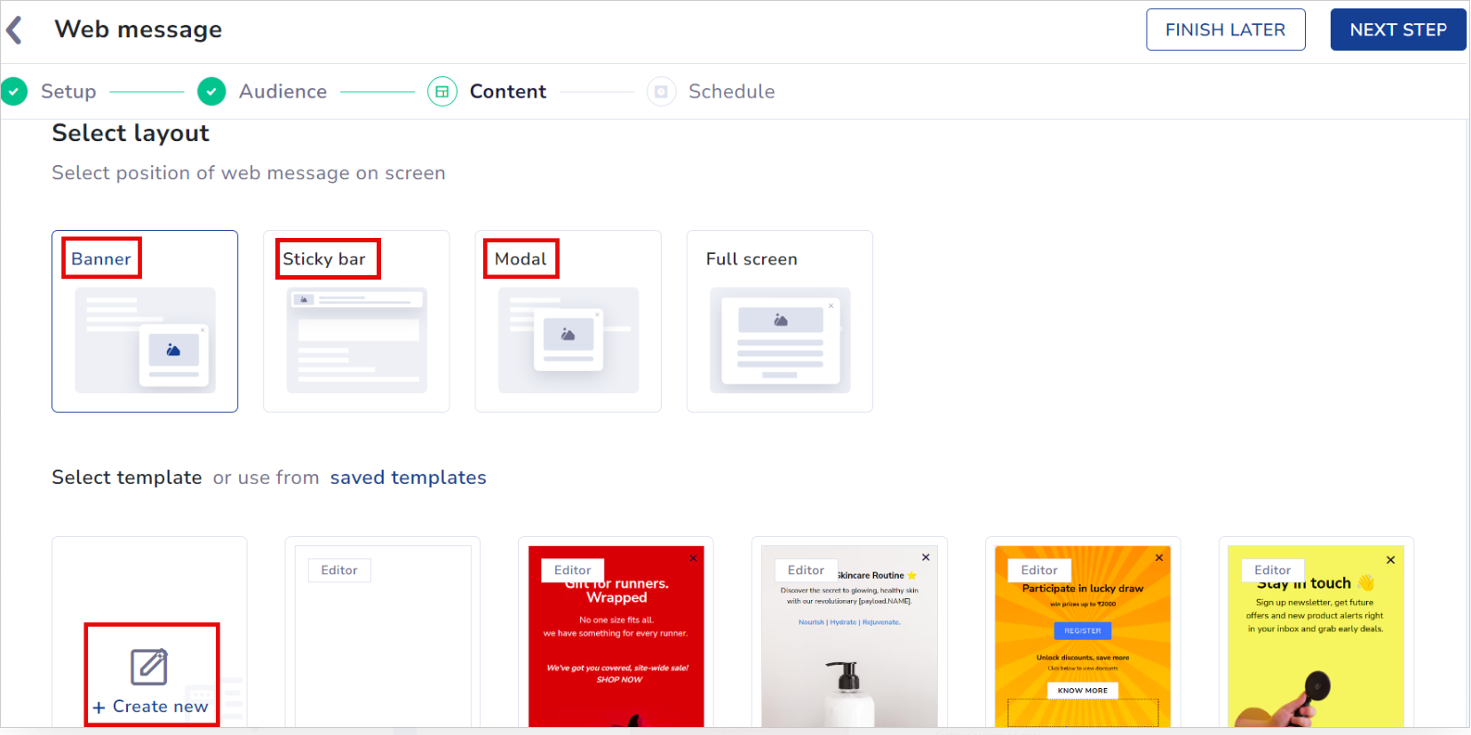
Create Web Message
Access UCE
- You can use Banner, Sticky bar & Modal layout to create your content using DIY editor.
- You can use any template that is categorized as Editor to create your content using DIY editor.
- Select DIY editor option to create the content for your campaign using our drag and drop options.
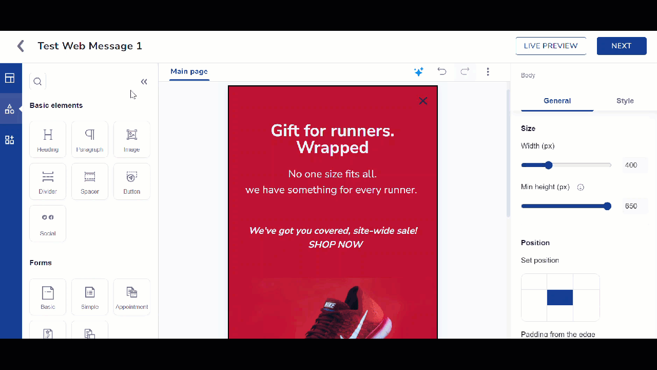
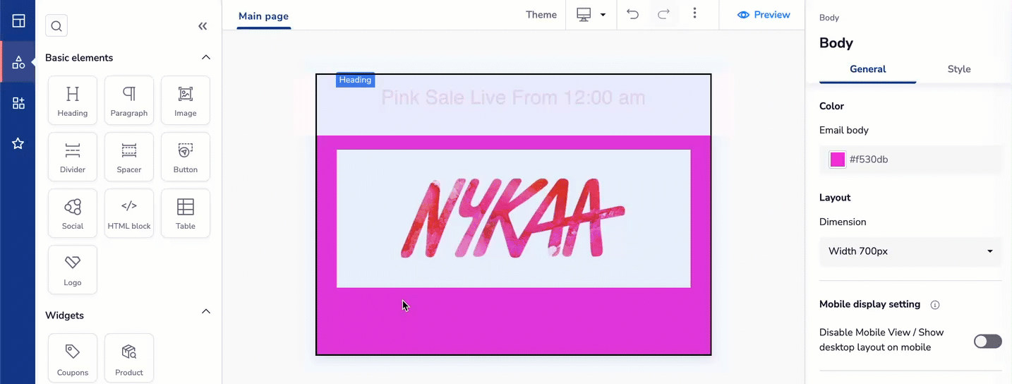
Create your Web Message using the DIY Editor
As you proceed, you see three options on the left pane of the DIY window:
1. Layout
Layout
It helps you arrange basic elements, such as text, images, or buttons, in a visually appealing way. Refer to the table below for the various layouts for your web message.
| Layout | Description | Use Case |
|---|---|---|
| Banner | A slim message at the top or bottom of the webpage. | Announcing flash sales, free shipping offers, or maintenance updates. |
| Sticky Bar | A fixed bar that stays visible as users scroll through the page. It ensures important messages remain in view. Note: Sticky bars may affect message visibility. Width is set to 100% by default and is uneditable. | Limited time discount, new product launch, cookie consent notifications |
| Modal | A pop-up message appears in the center of the screen, dimming the background. | Promoting newsletter sign-ups, gathering feedback, or announcing exclusive deals. |
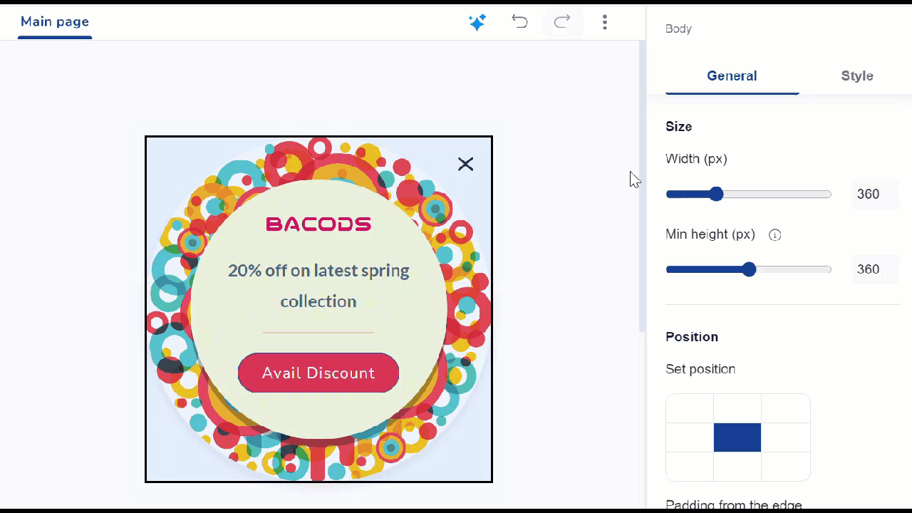
You can drag and drop any layout on the canvas. The right pane has two sections: General and Style, each offering different options.
Edit Template with General and Style Options
Refer to the table below to learn more about General options.
| General Options | Description | Elements Available |
|---|---|---|
| Padding | Adjust the spacing within the template. | Heading, Paragraph, Image, Divider, Spacer, and Social |
| Alignment | Align the selected element within the template. | Heading, Paragraph, Image, and Button |
| Opacity | Control the transparency within the template. | Heading, Paragraph, Image, Divider, Spacer, Button, and Social |
| Thickness | Adjust the thickness of the selected element within the template. | Spacer, Image, Divider, and Button |
| Responsive | Select whether you want to hide the element on mobile devices or a computer. | Divider |
| Website overlay | Blur background content when displaying a web message partially. | Main Page |
Refer to the table below to know more about Style options.
| Style Options | Descriptions | Available for |
|---|---|---|
| Background | Allows you to set background colour or image. | Heading, Paragraph, Image, and Social |
| Gradient Picker | Allows you to create gradual changes of colour within the template using the Gradient Type and Gradient Direction. Gradient type: It refers to the specific manner in which colors transition within a gradient. Gradient Direction: Select the direction for the gradient effect, including top, right, center, bottom, or left. | Heading, Paragraph, and Image |
| Border | Allows you adjust border thickness, style, colour, and corner radius with Border Settings. Solid: Creates a continuous, solid line for the border. | Heading, Paragraph, Image, Divider, and Button |
| Shadow | Allows you adjust shadow blur, opacity, X-axis, Y-axis, and shadow colour with Shadow Properties. | Heading, Paragraph, Image, and Divider |
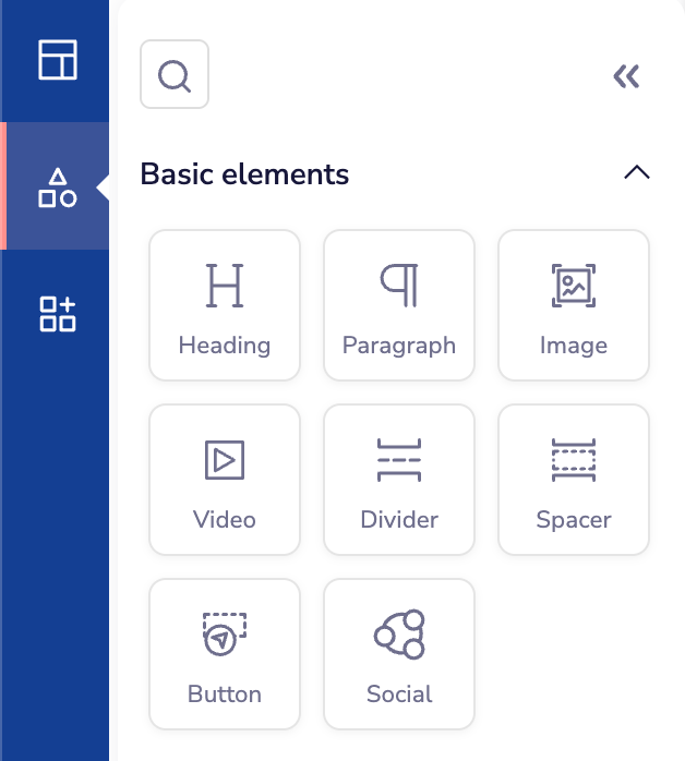
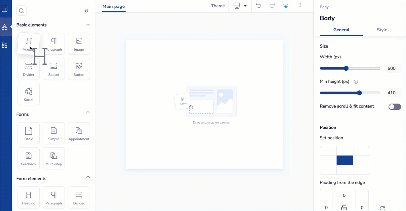
2. Basic Elements
Basic Elements
You can start your template with basic elements like text, image, divider, spacer, and so on.
Create Web Message using Basic Elements
Refer to the table below to know the description of basic elements.
| Section | Elements | Descriptions |
|---|---|---|
| Basic Elements | Heading | Select this option to add a heading to your template. |
| Paragraph | Select this option to add a message to your template. | |
| Image | Select this option to insert an image into your template. Customize your template's visuals with these image editing tools. | |
| Video | Select this option to insert a video into your template. Videos help make your message more engaging and interactive. Customize your template's visuals with these image editing tools. - Auto Play: Automatically start playing the video when the message loads. | |
| Divider | Select this option to separate content sections in your template. | |
| Spacer | Select this option to add a spacer to your template. | |
| Button | Select this option to integrate a button into your template. | |
| Social Links | Select this option to add social media links to your template. You can add up to 16 icons. | |
| Logos | Add and manage your brand logos across all your campaigns without manually uploading them every time. Refer here to create logos. |
Customize Close Button
Follow the steps given below to customise the Close button.
- Click the CLOSE button for your web message.
- Go to Style settings in the right pane.
- Find the Configure close button section. The options available here are:
- Font: Select from the dropdown (Grouppo is default)
- Icon Color: Choose your preferred color
- Icon Background: Set the background color
- Size (px): Adjust button dimensions
- Border Size: Modify border thickness
All settings update your close button's appearance in real-time.
3. Forms
Forms
Web message forms let you collect data and engage users directly within your web messages. You can customize forms to suit different needs, whether for collecting simple data, scheduling appointments, gathering feedback, or meeting other requirements.
Drag and drop the Form into the template. A configuration panel appears on the screen, allowing you to set up the form details.
Create Web Message using Forms
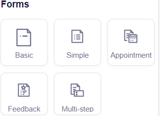
The Unified Content Editor (DIY) provides five types of forms:
- Basic
This form has one field for quick data collection, such as email addresses or phone numbers. It is used to collect basic information from users.
| Use Case | Description |
|---|---|
| Newsletter Sign-ups | Collect email addresses from users interested in subscribing to your newsletter. |
| Contact Requests | Gather basic contact information for user inquiries or support requests. |
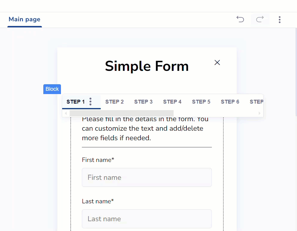
- Simple
With multiple fields, this form gathers more detailed information, such as names and addresses, while staying easy to fill out.
| Use Case | Description |
|---|---|
| Customer Surveys | Collect detailed feedback on customer experiences, including names, emails, and opinions. |
| Product Inquiries | Capture specific product questions or requests, along with contact details for follow-up. |
- Appointment Form
An Appointment Form allows users to schedule meetings or appointments by selecting dates and times from a calendar. It may include fields for personal details and appointment preferences.
| Use Case | Description |
|---|---|
| Customer Support Scheduling | Enable users to book time slots for customer support or consultations. |
| Event Registrations | Allow users to book slots for events or webinars. |
- Multi-Step Form
You can break down a longer form into multiple steps or pages. It guides users through the data entry process in a structured manner, often including progress indicators.
| Use Case | Description |
|---|---|
| Application Forms | Manage extensive data collection for applications like job applications, membership sign-ups, or grant requests. |
| Onboarding Process | Facilitate user onboarding by collecting data in a segmented, manageable format. |
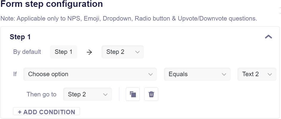
Form Step Configuration
The Form Step Configuration feature lets you control how users move through multi-step forms. You can change the default step order. For example, skip directly from Step 1 to Step 3 if needed. Define conditions to direct users based on their answers. You can create up to two conditions for each step. This feature helps you guide users through a more personalized form experience based on their responses.
NoteForm Step Configuration applies to NPS, Emoji, Dropdown, Radio button, and Upvote/Downvote questions.
Configure form steps as per your preference
ExamplesExample 1: Custom Step Progression
If you want users to skip Step 2 if they select a specific answer. Configure the form so that users who choose this answer move directly from Step 1 to Step 3.
Example 2: Adding conditions based on answers
Question: What is your preferred mode of transport?
Options: Car, Bike, BusStep Configuration:
If the answer is Car, direct users to Step 4.
If the answer is Bike, direct users to Step 5.
If the answer is Bus, direct users to Step 6.
- Feedback Form
You can gather users' opinions, ratings, and comments. It typically includes fields for rating scales, comment boxes, and specific questions related to user experience.
| Use Case | Description |
|---|---|
| Product Feedback | Collect user opinions on product features, usability, and satisfaction to guide future improvements. |
| Service Reviews | Gather feedback on services provided, helping to enhance customer experience and service quality. |
| Event Feedback | Obtain participant feedback on events, webinars, or training sessions to study effectiveness and identify areas for improvement. |
Click the  icon to add more steps to your form. You can add up to 10 steps, with the 11th step being the success message (confirming that your response has been recorded).
Add up to 10 steps in your form
Refer to the table below for other functionalities available when editing form elements.
| Function | Description |
|---|---|
Duplicate Element  | Creates a copy of the selected element. |
Move Up  | Shifts the selected element one position higher in the order. |
Move Down  | Shifts the selected element one position lower in the order. |
Delete Element  | Removes the selected element from the layout. |
Select Date  | Allows the user to choose a date from a calendar. |
Select Time  | Allows the user to choose a time from a time picker. |
Response Collection
When users submit a form, sync this data to the Netcore CE dashboard. This updates your Contact Master with new information.
Follow the steps given below to set up the Form Response Collection.
- On the right pane of the Editor, under the General section, click Form Setup next to Response Collection.
- A window titled Select an App to Integrate With will open. Click Configure.
- Map the form submissions to the user attributes as needed. Click Save to apply the mappings. Netcore’s Contact Master has now been successfully attached.
- Click Save Configurations to finalize the setup. You can edit the configuration later if necessary.
Important Points to Remember
- Response Collection is a mandatory step.
- Responses on email will directly update user attributes. This might impact existing segments, campaigns and journeys.
- You don’t need to map the primary key (like email or mobile) to attributes.
- Anonymous users (those who don’t provide identifiable info) can’t be stored in attributes.
- Ensure your form includes a primary key (like an email) because it’s required for Lists.
- You can add form responses to existing lists by selecting the preferred segment from a dropdown menu.
4. Form Elements
Form Elements
You can start customizing your form with form elements like a radio button, star rating, heading, input, dropdown, and so on.
Refer to the table below to learn about the form elements available in the editor.
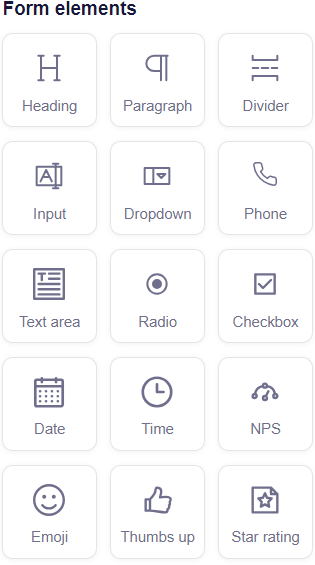
Create your Form using Form Elements
| Form Element | Description |
|---|---|
| Heading | Select this option to add a heading to your form. |
| Paragraph | Select this option to add a text paragraph to your form. |
| Divider | Separating different sections of the form helps improve its visual organization. |
| Input | Provides a field for users to enter text or data, usually a single line. |
| Dropdown | Allows users to select an option from a pre-defined list of choices. |
| Phone | Allows users to input their phone number. |
| Text Area | Allows users to input multiple lines of text suitable for detailed responses. |
| Radio | Allows users to choose a single option from multiple options. |
| Checkbox | Allows users to select one or more options from a list of choices. |
| Date | Allows users to input or select a specific date. |
| Time | Allows users to input or select a specific time. |
| NPS | The NPS (Net Promoter Score) element collects feedback by asking users to rate their likelihood of recommending a product or service on a scale. Toggle Helping text below the NPS button to enable or disable the text. |
| Emoji | Users can select or input an emoji to provide feedback or express emotions. You can use up to five emojis and customize their appearance, including size options (small, medium, or large). |
| Thumbs Up | Allows users to provide positive feedback with a single thumbs-up icon. The icon style and size can be customized. |
| Star Rating | Allows users to rate an item or service by selecting a range of stars. You can customize the number of stars (up to 10) and choose the size (small, medium, or large) to fit your design needs. |
The right pane has two sections, General and Style, each offering different options for customizing your form elements.
Refer to the table below to learn more about General options.
| General Options | Description | Elements Available for |
|---|---|---|
| Padding | It allows you to adjust the spacing within the template. | Heading, Paragraph, Image, Divider, Spacer, and Social |
| Alignment | It allows you to align the selected element within the template. | Heading, Paragraph, Image, and Button |
| Opacity | It allows you to control the transparency within the template. | Heading, Paragraph, Image, Divider, Spacer, Button, and Social |
| Thickness | It allows you to adjust the thickness of the selected element within the template. | Spacer, Image, Divider, and Button |
| Responsive | It allows you to select whether you want to hide the element on mobile devices or a computer. | Divider |
| Website Overlay | It allows you to blur background content when displaying a web message partially. | Main Page |
| Configure NPS | Set up your Net Promoter Score (NPS) by defining the minimum and maximum rating values. The minimum number is one, and the maximum number is 10. You can also customize the style of the rating box. | NPS |
| Field's states | Field States refer to the different appearances of a field. There are three types of fields:
| Date, Dropdown, and Phone |
| Field type | Choose the type of input field:
| NPS, Emoji, Star rating, Thumbs up, Dropdown, Phone, Radio, Checkbox, and Date |
| Placeholder content | Add a hint or example text in the input field to guide users through the expected information (For example, Enter your email address). | NPS, Emoji, Star rating, Thumbs up, Dropdown, Phone, Radio, Checkbox, and Date, |
| Error message | Define a message that appears if the user enters incorrect or invalid information, such as an invalid email format or incorrect phone number length. | Date |
| Mandatory | Mark the field as required, ensuring users must respond before they can submit the form. Required fields are indicated with an asterisk (*). | NPS, Emoji, Star rating, Thumbs up, Dropdown, Phone, Radio, Checkbox, and Date |
| Space between question and box | Adjust the spacing between the form question or label and the input box to enhance readability and layout. | NPS, Emoji, Star rating, Thumbs up, Dropdown, Phone, Radio, Checkbox, and Date |
| Space between options | Adjust the spacing/ distance between options. | NPS, Emoji, Star rating, Thumbs up, Dropdown, Phone, Radio, Checkbox, and Date |
| Opacity | Set the opacity level of the input field to control its visibility within the form. | NPS, Emoji, Star rating, Thumbs up, Dropdown, Phone, Radio, Checkbox, and Date, |
Refer to the table below to learn about Style options.
| Styles | Description | Available for |
|---|---|---|
| Background | Allows you to set background color or image. | Heading, Paragraph, Image, and Social |
| Gradient Picker | Allows you to create gradual changes of color within the template using the Gradient Type and Gradient Direction.
Gradient Direction: Select the direction for the gradient effect, including top, right, center, bottom, or left. | Heading, Paragraph, and Image |
| Border | Allows you to adjust border thickness, style, color, and corner radius with Border Settings.
Solid: Creates a continuous, solid line for the border.
| Heading, Paragraph, Image, Divider, and Button |
| Shadow | Allows you to adjust shadow blur, opacity, X-axis, Y-axis, and shadow color with Shadow Properties. | Heading, Paragraph, Image, and Divider |
| Configure background image | Set up the background image for your element and choose how it should fit. Options include | NPS, Emoji, Star rating, Thumbs up, Dropdown, Phone, Radio, Checkbox, and Date |
| Input Styling | You can customize the appearance of input fields by adjusting options like Font Name, Font Size, Font Color, Alignment, and Style (Bold (B), Underlined (U), or Italic (I)). | NPS, Emoji, Star rating, Thumbs up, Dropdown, Phone, Radio, Checkbox, and Date |
5.Widgets
Widgets
Widgets allow you to create highly interactive and dynamic content, transforming your campaigns into engaging experiences. With our Editor, you can easily add widgets to deliver personalized messages, guide user actions, or showcase relevant content. This interactivity enhances customer interaction and boosts engagement, making your campaigns more effective and impactful.
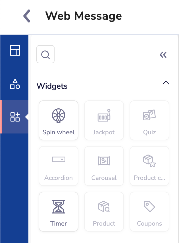
Widgets in Web Message
Spin the Wheel
Engage your customers with a fun and interactive game. This widget allows customers to spin a wheel by clicking a button within the email. As the wheel spins and stops on a prize, customers eagerly anticipate what reward they will earn. It's an easy and exciting way to offer rewards, making the experience feel more valuable than just giving them out directly. Use this widget for any audience to boost interaction and excitement.
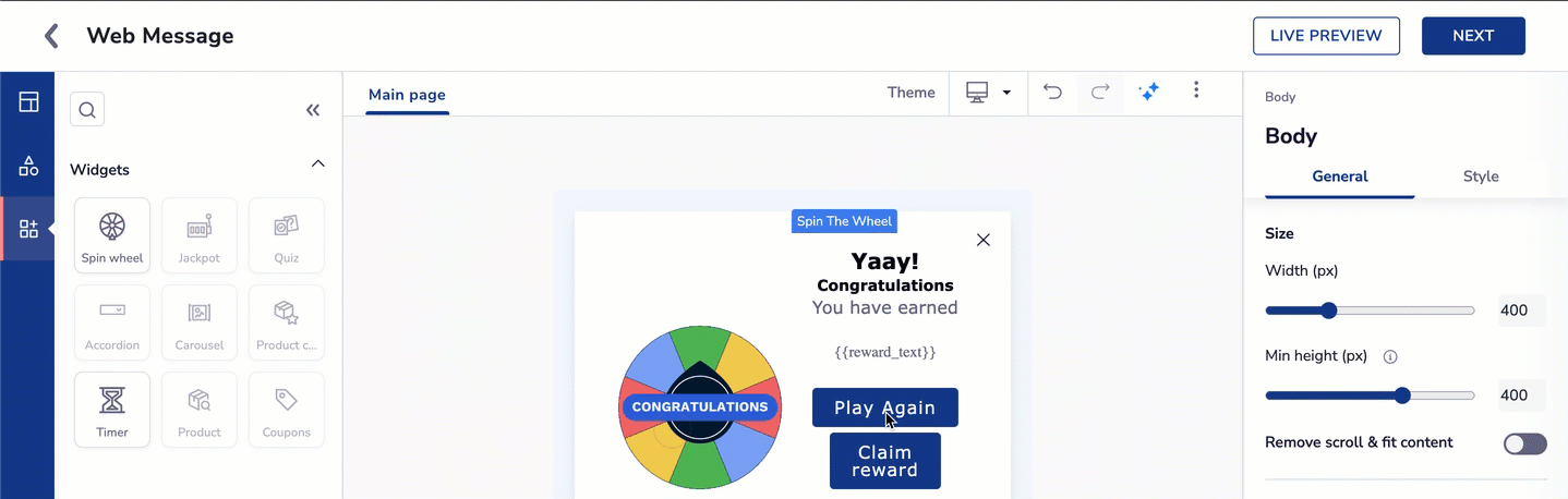
Spin Wheel Widget
Create Spin the Wheel Template
Follow the given steps to create a Spin Wheel Element
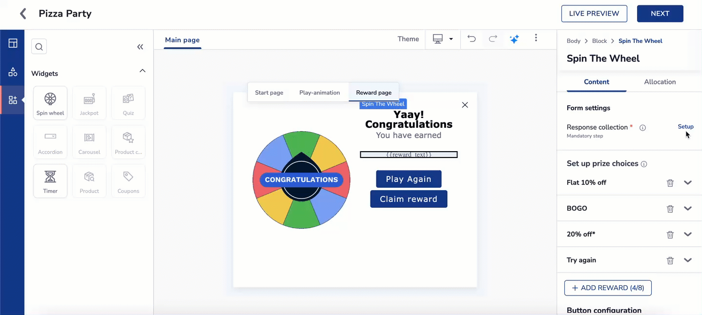
- Add the Spin the Wheel widget to your canvas. Each element of the widget consists of three key sections: Start page , Play-animation, and Reward page.
- Customize the Spin the Wheel widget to your requirement as below
1. Start page
- On the start page of the widget, click on the image to edit the content from the right side of the editor. Refer to the table below to understand the elements available to edit it:
| Heading | Description |
|---|---|
| Form settings | Response collection: Responses will directly update user attributes and get stored in the panel. This might impact existing segments, campaigns, and journeys. This is a mandatory step |
| Start Image | <ui> You can choose from the below option to do so: 1. Upload new 2. Image from URL 3. My uploads |
| Button configuration | Use the check box from Add a 'start' button option to enable/disable the button. you can also customize the color of the block and button using the gradient picker. |
2. Play-animation
This is the next step once you click the start page image, the GIF will be visible only after clicking start. Refer to the table below to understand the elements available to edit it:
| Heading | Description |
|---|---|
| Animation (GIF) | This GIF will be visible only after clicking start. You can choose a different image than the start page Play-animation element. |
| Button configuration | Use the check box from Add a 'start' button option to enable/disable the button. you can also customize the color of the block and button using the gradient picker. |
3. Reward page
Finally for the third step, you need to set up the Rewards for the users if they choose to play Spin the wheel. It is divided into two sections,
- Content: Refer to the table below to understand the elements available to edit it:
| Heading | Description |
|---|---|
| Form settings | Response collection: Responses will directly update user attributes and get stored in the panel. This might impact existing segments, campaigns, and journeys. This is a mandatory step. Click here to set up the Response collection. |
| Set up prize choices | You can select up to eight rewards. Each reward section has the following categorization.
|
| Button configuration | Use the check box from Add a 'start' button option to enable/disable the button. you can also customize the color of the block and button using the gradient picker. |
- Allocation: Win ratio shows how often users can see a reward compared to others. If set to zero, the reward won't show. If set to one, the reward will be displayed based on allocated probability.
Form settings for Response collection
RecommendedIt is recommended to set up the Response collection after the Rewards page, as this ensures user reward details are captured correctly.
Set up Response collection
Steps to create a Response collection.
- Once the Rewards have been decided, click on the Response collection under Form settings on the Content tab on the right side of the screen.
- Map the form submissions to user attributes to the questions from the widget. For example, Enter your mail ID to avail exciting rewards can be , mapped to Email attribute.
- Click save configuration to attach the form to the Widget.
Use Case: Increase Engagement During a Festive Campaign
| Section | Details |
|---|---|
| Objective | Boost user engagement and collect leads during Diwali Sale Campaign using the Spin the Wheel widget. |
| Scenario | You are running a festive promotion and want to give users a fun, interactive way to win discounts, coupons, or freebies, while also capturing data like email or phone number. |
| How it Works |
|
| Benefits |
|
You can also use Brand kit to maintain and establish your company's visual identity across all communication channels. Click on the Theme on the main canvas to set it up. Click here for more information.
Theme
The Theme feature in the Unified Content Editor (UCE) allows you to quickly apply your brand’s colors and fonts to any pre-designed template. If you want to apply the settings of another brand kit that is published but not active, then Themes is used. Instead of manually changing each block’s style, you can choose a brand kit (a set of colors and fonts) and instantly see the entire template update.
On the right side of the theme panel, all the published Brandkit will be available, and the active Brandkit will be used for the default styling. Themes can also be applied to ready-to-use templates, allowing you to quickly customize them with your brand kit.
This keeps your design consistent with your brand and saves time when creating campaigns.
Steps to implement the Theme on your template:
- Click the Theme button at the top of the editor. The Theme Panel will slide open on the right-hand side of the screen.
ImportantThe active Brand Kit becomes the default styling for everything you create until you switch to a different kit.
- In the Theme Panel, cards represent all available brand kits. Each card shows:
- Color palette preview (small color swatches)
- Font style preview (sample text)
- Brand kit name
- Click on the card for the brand kit you want to apply. Your template will instantly update with the selected brand colors and fonts. You can choose to shuffle the color palette within that particular brand kit's template.
Brand Kit Theme on UCE
Shuffle Color Palette
- With just a click, you can see different color combinations from your brand palette applied instantly to your template. Text and button colors adjust automatically for readability, so every combination looks great.
Refer here to create a Brand Kit from scratch.
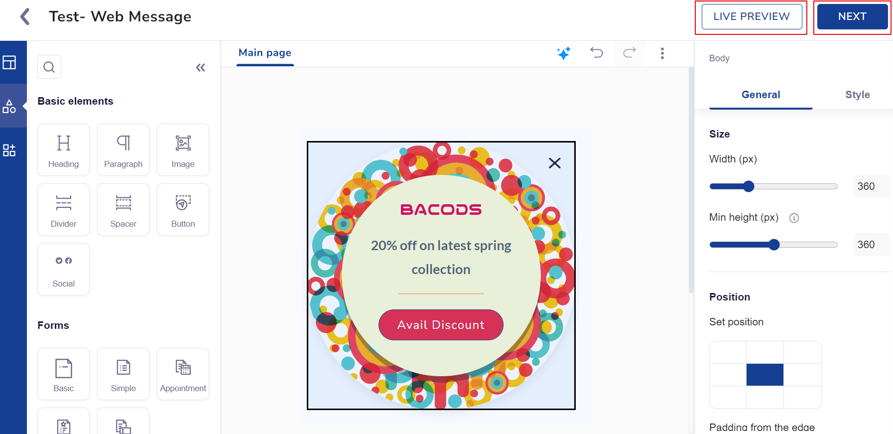
- When your web message is ready using your desired elements and settings, click the Live Preview button to see how it will appear on the website.
- Click the Next button to send your web message.
Preview your Web Message
Refer here to Schedule and Save your web message campaign.