UCE: Image Editor & Mobile Responsiveness
Explore the latest features in the Unified Content Editor (UCE).
Image Editor
The Unified Content Editor (UCE) now offers advanced image editing options, allowing users to enhance visuals directly within the editor.
Important Point to Remember
Image editing features are available exclusively in the desktop view and are not accessible in the mobile view.
Follow the given steps on how to use the image editor.
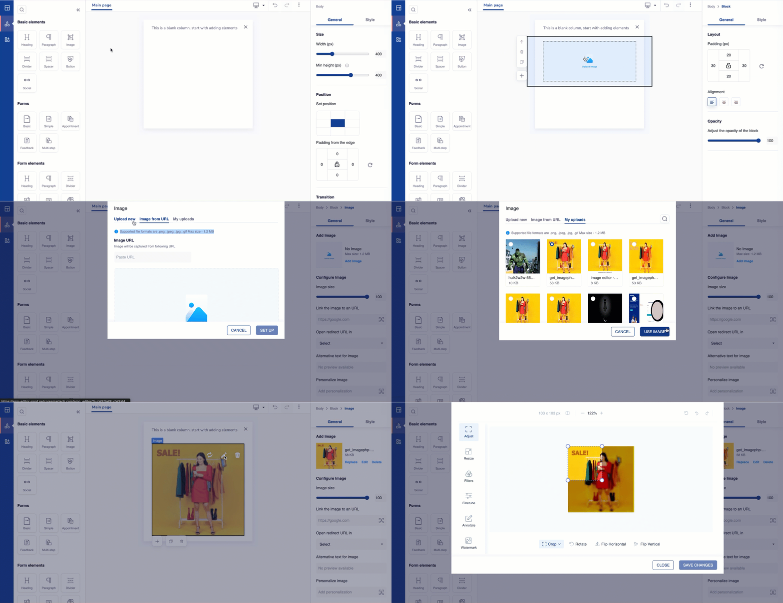
- Drag and drop an image element on the canvas.
- Click Upload image. There are three options available to add your image:
-
Upload New: Upload an image directly from your device.
-
Image URL: Add an image by entering its URL.
-
My Uploads: Use previously uploaded images saved in your library.
Supported File Formats and Size
- Supported formats: .png, .jpeg, .jpg, .gif
- Maximum file size: 1.2 MB
- The image is added to the canvas. Click
 to open the image editor.

Edit Image using Advanced Editing Options
The image editor opens. Refer to the table given to know the editing options available here.
| Option | Sub-options | Description |
|---|---|---|
| Adjust | Adjust the image to predefined sizes for ease of use. | |
| Social Media | Adjust the image to popular social media dimensions. | |
| Custom | Manual resize the image using your preferred dimensions. | |
| Original | Keep the original dimensions of the image. | |
| Landscape (16:9) | Set the image to a widescreen format. | |
| Portrait (9:16) | Set the image to a vertical format. | |
| Ellipse | Crop the image into an elliptical shape. | |
| Classic TV (4:3) | Set the image to the 4:3 aspect ratio. | |
| Cinemascope (21:9) | Set the image into an ultra-widescreen format. | |
| Rotate | Rotate the image in 90-degree increments. | |
| Flip Horizontal | Mirror the image from left to right. | |
| Flip Vertical | Mirror the image from top to bottom. | |
| Resize | Change the dimensions of the image. Lock the aspect ratio to maintain proportions while resizing. | |
| Width | Adjust the horizontal dimension of the image. | |
| Height | Adjust the vertical dimension of the image. | |
| Filters | Apply preset filters to enhance the visual appeal of the image. | |
| Finetune | Edit the image for brightness, color balance, clarity, warmth and so on. | |
| Brightness | Adjust the overall lightness of the image. | |
| Contrast | Adjust the difference between light and dark areas. | |
| HSV | Adjust colour tones and intensity. | |
| Blur | Soften the details to create a smooth effect. | |
| Warmth | Adjust the color temperature of the image. | |
| Annotate | Overlay text with options to customize font and style. | |
| Text | Add custom text to the image. | |
| Image | Insert another image on top of the current image. | |
| Rectangle | Add a rectangular shape to the image. | |
| Ellipse | Add an elliptical shape to the image. | |
| Polygon | Add a polygon with adjustable sides. | |
| Pen | Draw freehand with a brush tool. | |
| Line | Add straight lines to the image. | |
| Arrow | Add arrows to the image. | |
| Watermark | Click Add Watermark to upload an image as a watermark on your existing image. |
Refer to the table to know the functionalities while editing the image.
| Functionality | Description |
|---|---|
Zoom in  | Use this icon to zoom in and get a closer view of the image. |
Zoom out  | Use this icon to zoom out and see a broader view of the image. |
| Refresh | Discard all changes and reset the editor for a fresh start. |
| Undo | Reverse a change or mistake. |
| Redo | Restore a change that was undone. |
Mobile Responsiveness
The Mobile Responsiveness feature in UCE allows you to view/ edit templates for mobile devices. This ensures compatibility and improves user experience on smaller screens.
The UCE provides two views for template creation:
| View | Description |
|---|---|
| Desktop View (Default) | This view has all the options for template creation. It is best for designing templates for larger screens. |
| Mobile View | This view displays the template within a mobile frame. Mobile styling options are unavailable. Components will match desktop styling for a consistent experience. |
Follow the given steps to try out the Mobile Responsiveness feature.
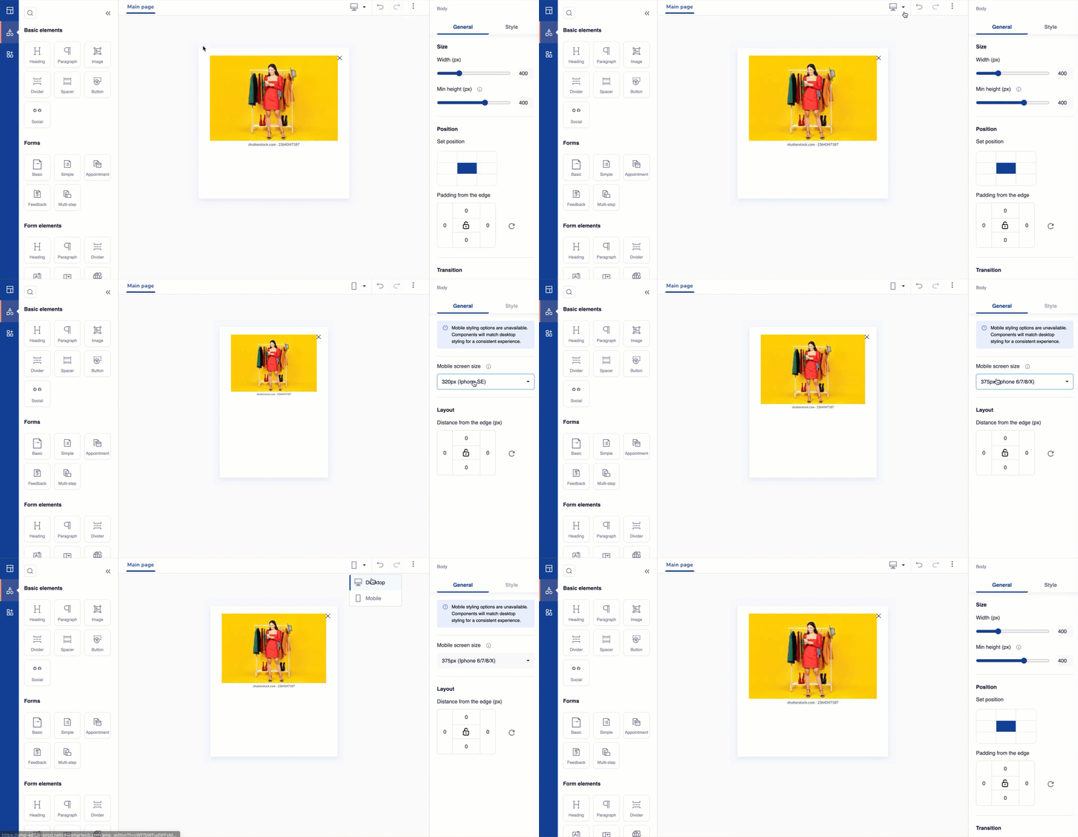
- You can toggle between the Desktop and Mobile views using the dropdown at the top of the screen.
- In Mobile view, users can customize the template using specific options available in the General Tab on the right-hand side. The Style Tab is disabled in this view.
- Select a breakpoint from the dropdown where we have listed dimensions according to standard mobile sizes. After selection, messages will adapt to mobile configuration. Above this width, messages will be displayed in the desktop format, ensuring a responsive experience across all devices.
- Define the distance of the image from the edge. Lock to keep values the same from all sides. Unlock to change values independently.

Toggle between Desktop & Mobile Views
Element-Level Visibility
- The Hide on Device option is now available at the element level, such as images, buttons, text).
- This allows users to hide specific elements within a block for mobile devices without affecting the entire block.
Updated about 1 year ago
