App users (Old View)
Track and analyze user engagement and conversions of App Users.
App users
The App Users section shows detailed information about your app’s users. It tracks active and converted users who have completed important actions like purchasing or signing up. This section helps you view your users' engagement and which groups contribute to your app’s success. The data displayed here is categorized into two types of users:
Active users
Active Users on the Mobile App refers to the number of users interacting with your app during a specific period. This metric helps track user engagement and app activity over time.
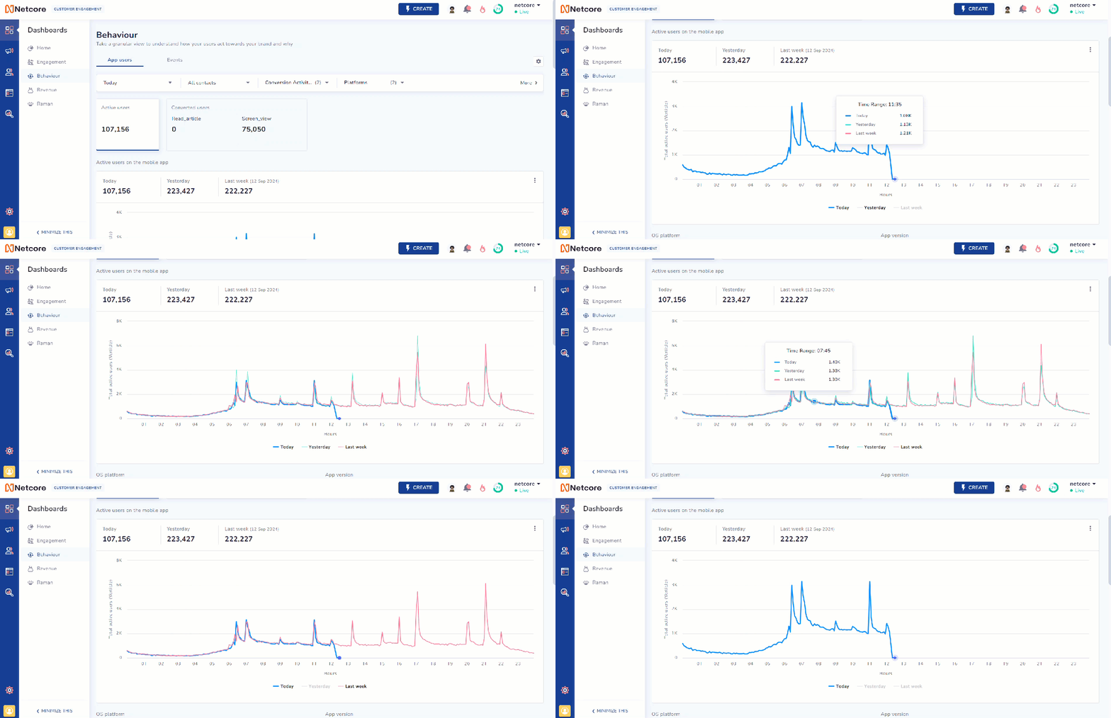
The data is displayed in a graph format, representing active users for the following periods, including Today, Yesterday, Last Week, and Average.
The graph displays user activity over time:
- X-axis: Time in hours (0-24)
- Y-axis: Active users
It has three color-coded lines:
- Blue: Today
- Green: Yesterday
- Red: Last week
Hover over the lines to view user numbers at specific times. Click the Today, Yesterday, or Last Week buttons below the graph to view or hide data for that day. This makes it easy for you to compare activity between days.

Graph Showing Active Users on the Mobile App
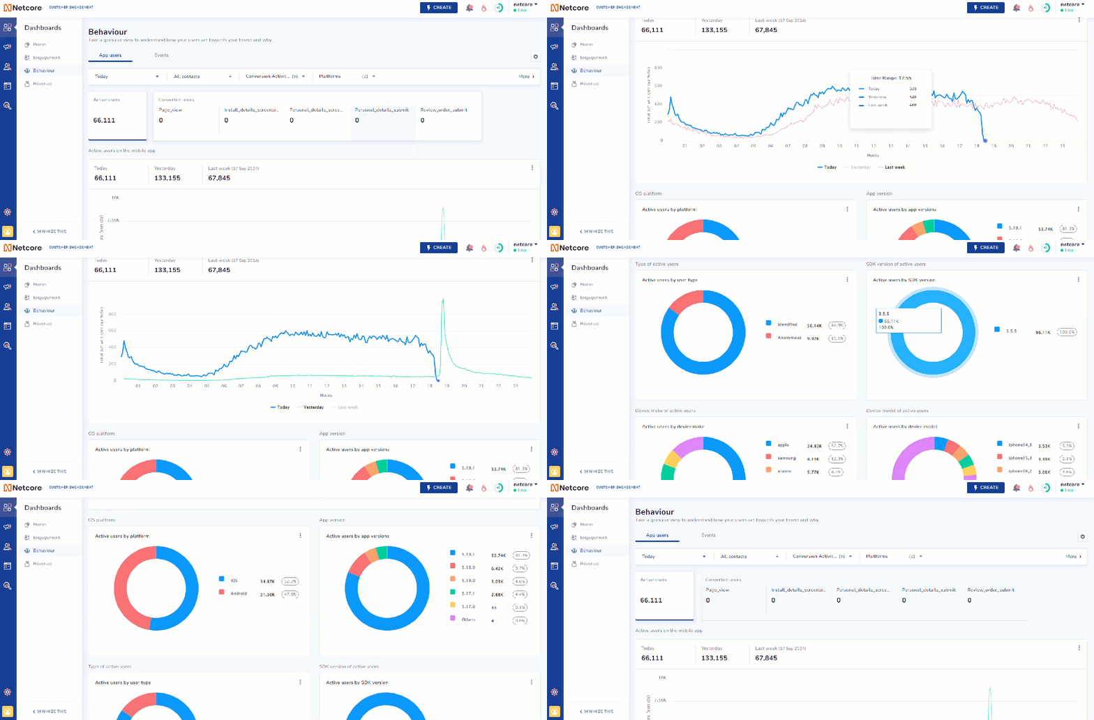
In addition to the graph format, as you scroll down, you will find detailed pie charts that show active users by various categories. Click  to export data in PDF, PNG, or JPEG format. Refer to the table to learn about the available pie charts.
| Pie chart | Description |
|---|---|
| Active Users by Platform | Displays a pie chart of active users split by platforms like iOS and Android. |
| Active Users by App Version | Displays a pie chart showing the distribution of active users of different app versions. |
| Active Users by User Type | Displays a split of converted users by user type (identified vs. anonymous). |
| Active Users by SDK Version | Displays a pie chart showing active users by SDK version. |
| Active Users by Device Make | Shows active user data split by device brand. |
| Active Users by Device Model | Displays a breakdown of active users by device model. |

View Active Users Data in Pie Chart Format
Converted users
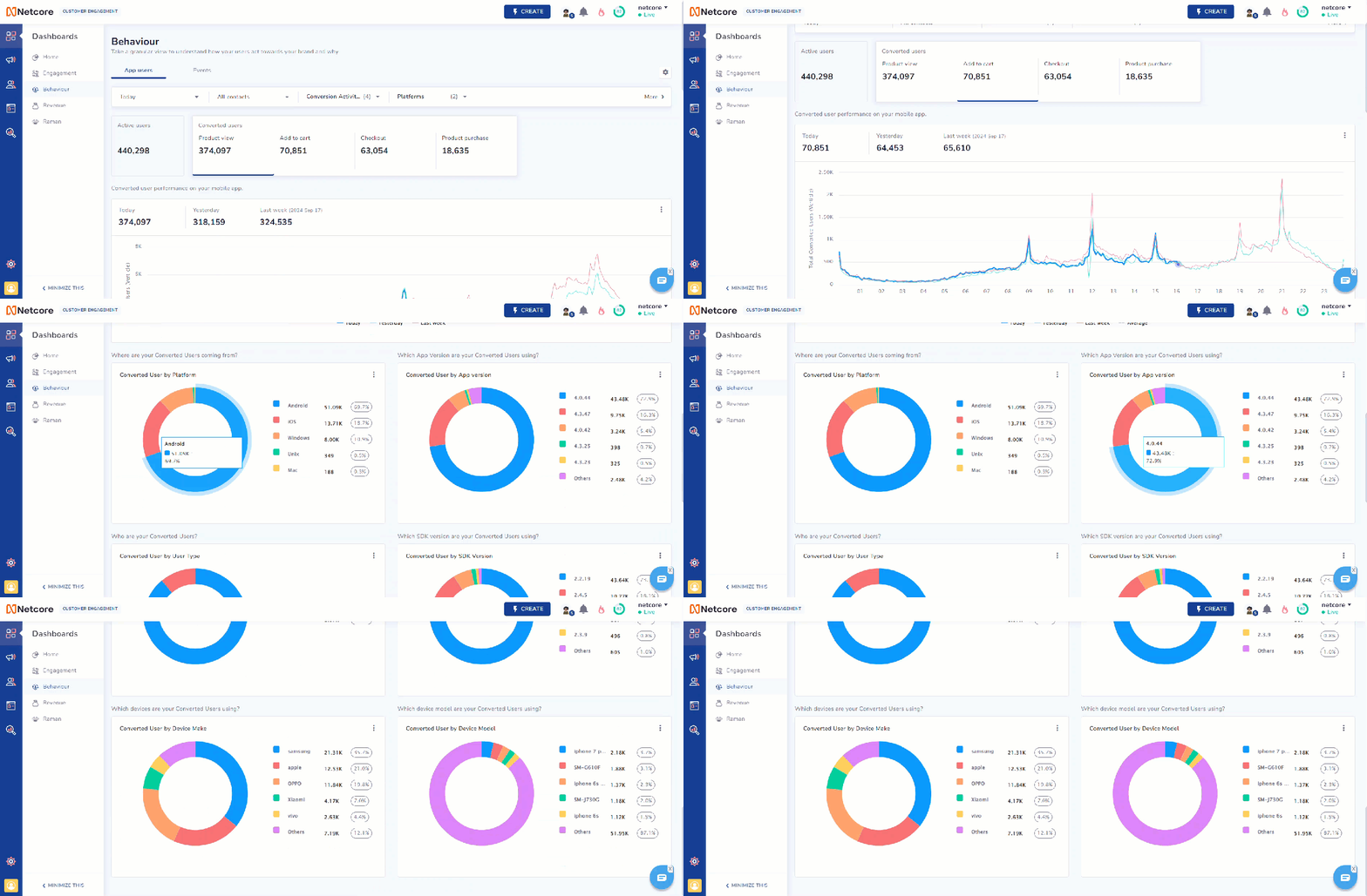
The Converted users section represents key user actions on your mobile app. Data is displayed in a graph format and can be viewed for various time periods, including Today, Yesterday, Last Week, and Average performance over time.
The events you select from the Conversion Activity dropdown will appear in the Converted Users section. Click on your chosen event to view detailed performance data for converted users on your mobile app.
In addition to the graph format, as you scroll down, you will find detailed pie charts that show active users by various categories. Click  to export data in PDF, PNG, or JPEG format. Refer to the table to learn about the available pie charts.
| Pie chart | Description |
|---|---|
| Converted User by Platform | Displays a pie chart of converted users split by platforms like iOS and Android. |
| Converted User by App Version | Displays a pie chart showing the distribution of converted users of different app versions. |
| Converted User by User Type | Displays a split of converted users by user type (identified vs. anonymous). |
| Converted User by SDK Version | Displays the conversion data split by SDK version |
| Converted User by Device Make | Displays a pie chart of converted users by device brands like Apple, Samsung, and so on. |
| Converted User by Device Model | Displays conversion data by device model. |

View Data of Converted Users in Pie Chart Format
Updated 5 months ago
