
Interactive Push Notifications templates
Push notifications are a powerful tool for marketers, but with so many notifications competing for attention, it's essential to make yours stand out. By using different types of push notifications, you can capture the user's attention and drive action. Whether it's a personalized message or an interactive notification, experimentation with different types can lead to increased engagement and a better user experience. So, get creative and start experimenting with push notifications to take your marketing strategy to the next level.
Types of Advance layouts:
These layouts are available for Android and iOS SDK v3.3.0 and above:-
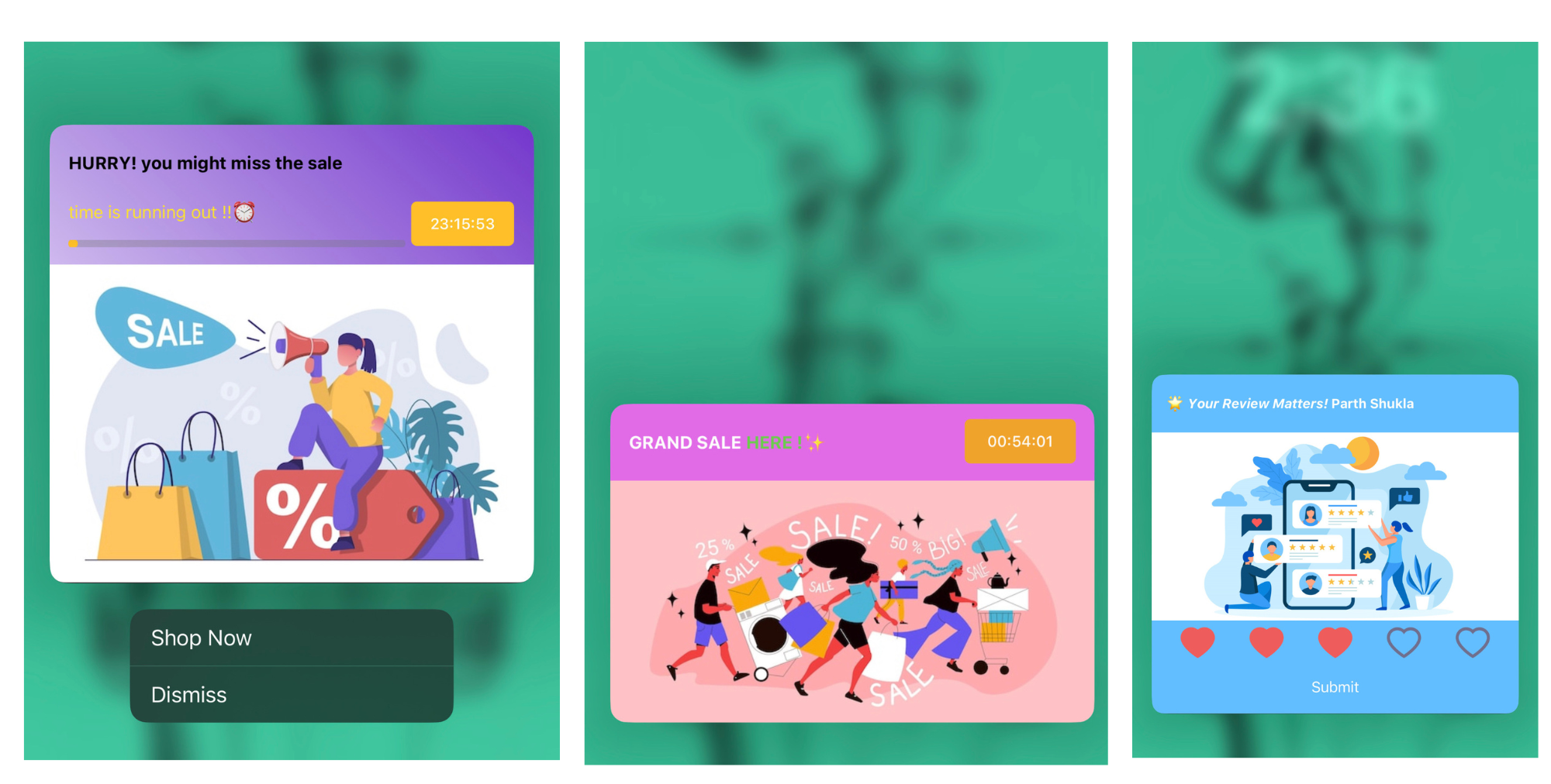
- Timer - This template enables the user to include a timer in the notification.
- Progress Bar - This is a variant of the timer template where you can added a progress bar for the timer as well.
- Rating - This template allows the marketer to allows the users to submit ratings over a notification.
These layouts are available for Android v3.4.1 and iOS SDK v3.4.0 and above:-
- Small Image - This specially to highlight any particular product through notifications.
- Overlay on Image - This template enables you to add a full-width image to a design, providing the opportunity to overlay additional content on top of it.
- Edge-to-edge Carousel - This enables the user to set a carousel with multiple images from edge-to-edge.
- Edge-to-edge Image - This template allows the user to add image in the entire notification from edge-to-edge.
Content section
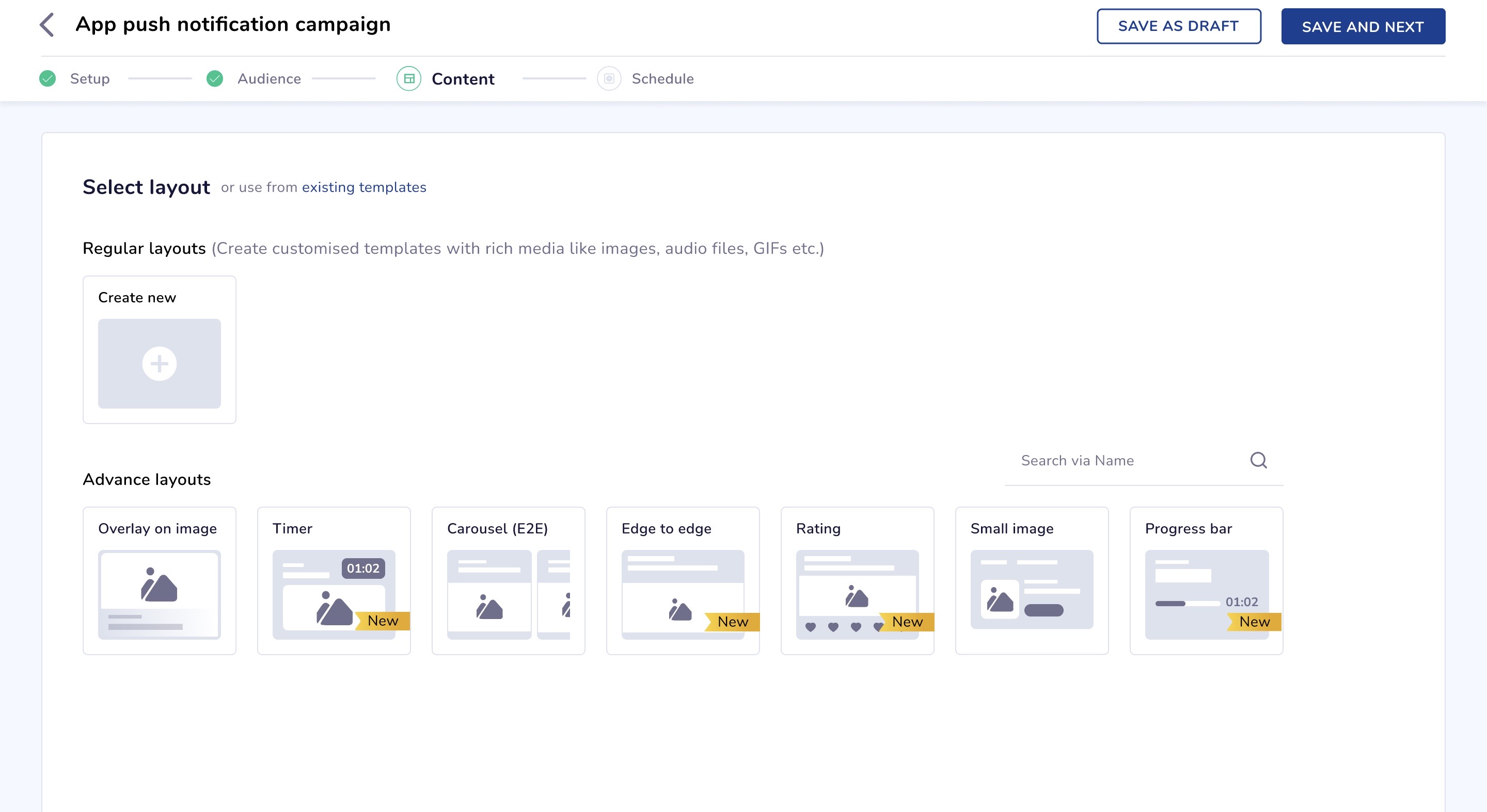
Select Layout for App Push Campaign
Timer
This template will allow the user to add a timer to the notification.
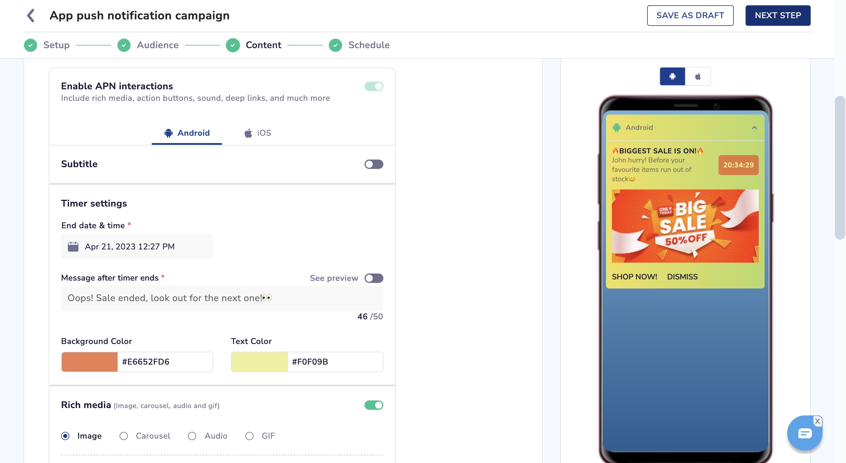
Enable APN Interactions
- End date & time - The user can select an end-time for the timer.
- Maximum time allowed for timer is 24 hours (1 day) and minimum is 1 hour
- Time would be shown as per the user’s local time.
- Message after timer ends - This message will replace the title and body of the notification after the timer has ended.
- Background color & text color - You can customize the color of the timer.
- See preview - It shows how the notification will look when the timer ends and the message is shown.
NoteFor all advance layouts:
- Fallback template will be shown in case users have not upgraded the SDK to be able to view timer template.
- All types of campaigns (A/B, Split and multi-message) will work with the timer template.
For Timer and Progress Bar layouts:
- Campaign scheduled time cannot be more than the Timer end-time.
Progress Bar
This is a variant of the Timer template where you can added a Progress Bar for the timer as well.
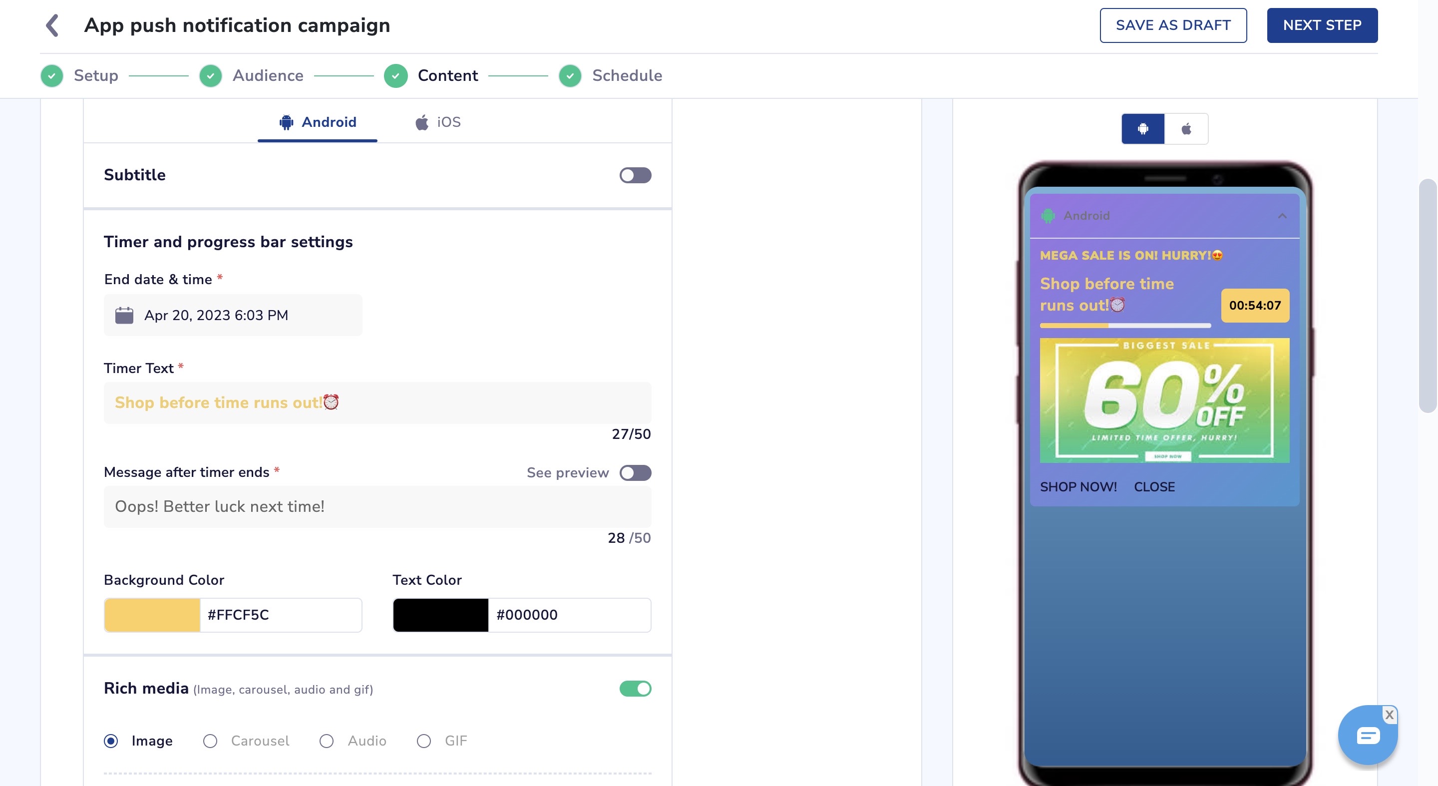
Timer and Progress Setups for App Push Campaign
- End date & time - The user can select an end-time for the timer.
- Maximum time allowed for timer is 24 hours (1 day) and minimum is 1 hour.
- Time would be shown as per the user’s local time.
- Timer text - This text will be shown along with the Progress bar.
- Message after timer ends - This message will replace the timer text of the notification after the timer has ended.
- Background color & text color - You can customize the color of the timer.
- See preview - It shows how the notification will look when the timer ends and the message is shown.
Using Timer and Progress Bar in Journeys
Using the Timer or Progress bar template can be a little tricky, please make sure to keep the following points in mind while implementing it.
- Journey end-time should not be greater then the timer or progress bar end-time - Timer can be set for a maximum of 24 hours, if it is used in a journey which runs for more than the timer end-time, then the users will receive expired timer notifications.
- TTL (Time To Leave) should not be greater than the timer or progress bar end-time - If the TTL set for a timer or progress bar notification is set for a later time than the timer end-time, the notifications can be delivered after the timer has already expired which will show the timer end message to the user.
Rating
This template allows the marketer to allows the users to submit ratings over a notification.
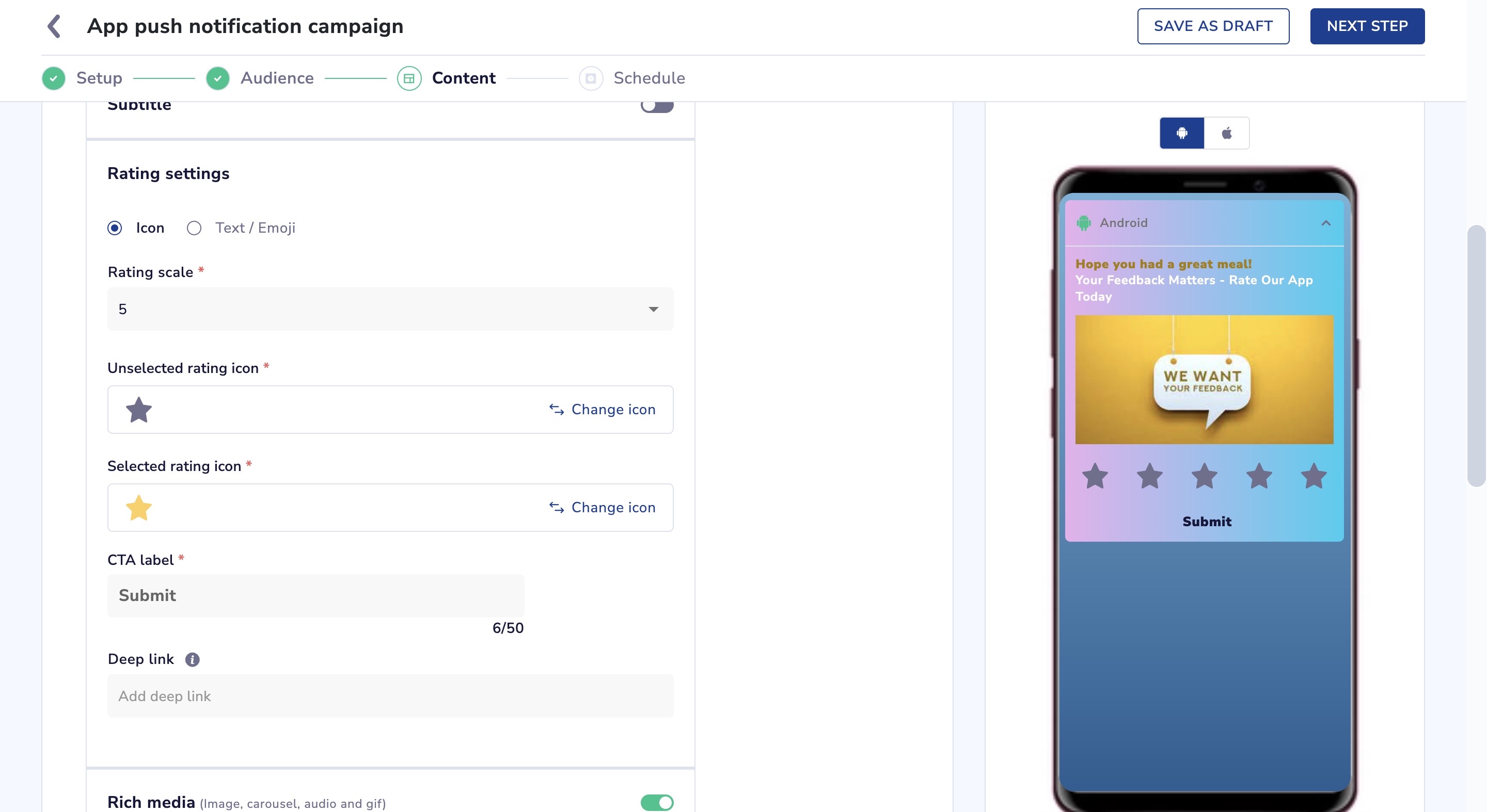
Setup Ratings for App Push Campaign
- Icon - You can select from a preset icon list or upload your own icons.
- Text/ Emoji - Choosing this will enable you to add words or emojis as ratings.
- Rating scale - You can select the number of selections to be provided for rating between 2, 3 and 5.
- Deep link - if you provide a deeplink then after submitting the rating, the notification will open either to the deeplink if it is provided else to the landing url provided above.
How will the ratings be stored and how to use it?
- When user clicks on submit button, rating event will be also capture. Event name is smt_pn_rating
- This event can be used for segmentation, as a trigger event in journeys as well as in the behaviour dashboard.
- Payloads captured in this events would be the mid, trid and the rating. If the user does not give any rating and submits the notifications, then we will capture 'Not Given' as a default value in the rating payload.
- Whatever rating values have been set by you be it text, emojis or icons, they will be captured and shown in the rating payload.
- If icons are used, then the corresponding position of the icon will be the value captured. Example : if there are 5 hearts and the user clicks on the 3rd heart then the value stored would be 3.
Notifications to End User
Example: Notification to End-User Using iOS Device
Small Image
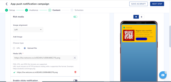
Add Image for App Push Campaign
- Image alignment:- The user can select alignment of image using to either left( default ) or right.
- Image URL or file is mandatory. The aspect ratio must be 1:1, and a maximum file size of 40KB.
- A maximum of one action button can be added to this template.
Overlay
- Add Image:- The user can add overlay image.
- Image URL or file is mandatory. The aspect ratio must be 2:1 and maximum file size of 40KB.
- Make sure that the crucial part of the image, which needs to be visible on the device screen, is positioned in the upper half of the image.
Edge-to-edge Carousel
- Carousal Type:- Users can choose either Manual or Automatic for the carousel transition.
- If Automatic, set a timer between 2 to 10 seconds for image transitions.
- Add Image;- It's mandatory for users to insert an Image URL or upload a file.
- Ensure that the important part of the image, which needs to be visible, is not in the lower portion.
- Users can add a maximum of 5 images to the carousel.
Images must have an aspect ratio of 2:1 and a maximum file size of 40KB.
- Title:- Users should enter text for the title that will appear on top of the image.
- Description:- Users should add text for a description displayed below the title on the image.
- Call to action:- Users can enter either a deep link or a URL for the action button represented on the image.
- Overlay Color:- Users can choose a background color for the overlay on the image.
Edge to Edge
- It's mandatory for users to insert an Image URL or upload a file.
- Images must have an aspect ratio of 2:1 and a maximum file size of 40KB.
Updated 20 days ago