DIY Drag and Drop Editor
Now you have more options to create your web message campaigns, choose as per your use from below mentioned options:
- Pseudo Editor
- Custom HTML
- DIY Drag and Drop Editor
Explore the DIY editor
Build visually stunning, mobile-responsive web message templates with our intuitive DIY editor.
Head over to the content section of building your web message campaign, a new thumbnail for DIY editor will be visible as shown below.
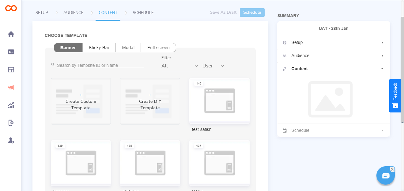
Note
If the DIY editor is not visible, please contact your Account Manager to enable the same.
Click on DIY thumbnail to open a pop-up and set criteria for your web message's modification of position and dimension
Position
| Position | Layout |
|---|---|
| bar top | Sticky |
| bar bottom | Sticky |
| classic-center | Banner & Modal |
| classic-top-right | Banner |
| classic-top-left | Banner |
| classic-bottom-right | Banner |
| classic-bottom-left | Banner |
| drawer-left | Banner |
| drawer-right | Banner |
Dimension
| Dimension | Settings |
|---|---|
| Width | Adjustable up to 1200 pixels |
| Height | Adjustable according to the added components |
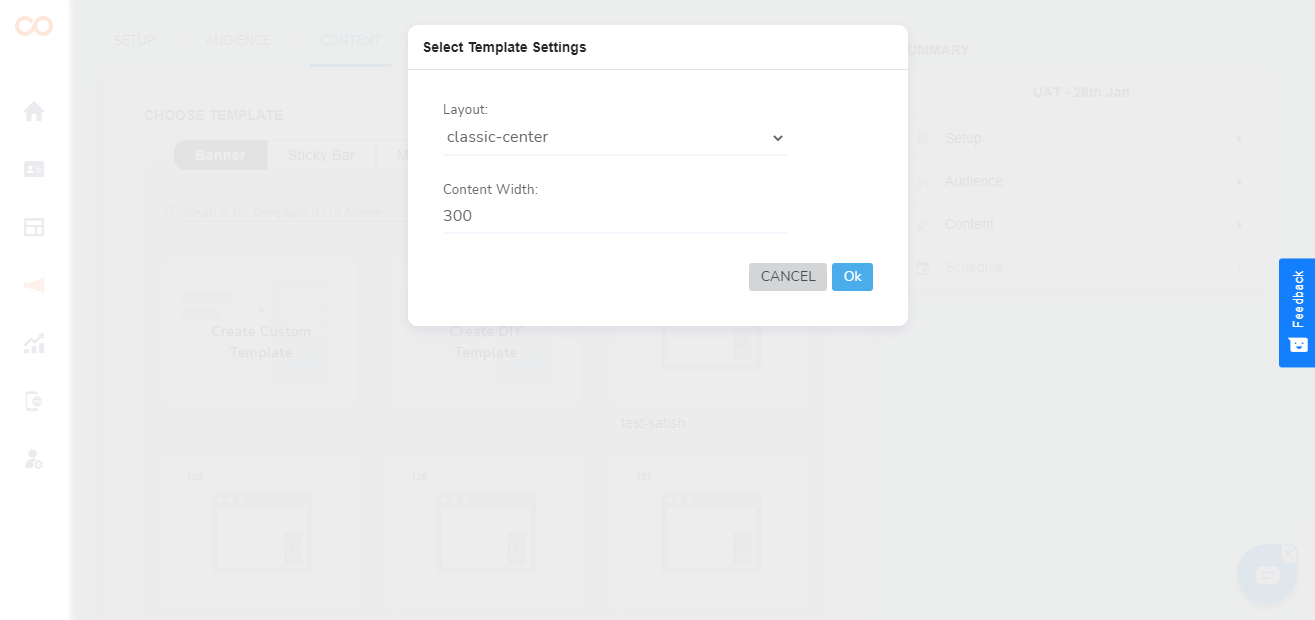
In case you want to change the width of the web message, you will have to discard the template and start with fresh settings
Editing Window
Once the editor opens, you will see below features that you can use to build your web message campaign
| Feature | Descriptions |
|---|---|
| Template Name | Make sure you are saving a template with a new name in case you want to make a new template and not overwrite. |
| Save | In case you want the template you made to be available for other campaigns, save the template here. In case while reusing you make some changes in this template and do not change the template name, it will be rewritten |
| Schedule | Click here to go to scheduling web message, if not saved, the template will not get added in your gallery |
| Undo, Redo & History | Undo, redo & History buttons are provided at the bottom left side at the DIY panel |
| Live Preview | Have a look at how your web message appears in a real-time setting. |
| Rows | You can change the alignments of components and add two or more components together in a row with the help of Row option. |
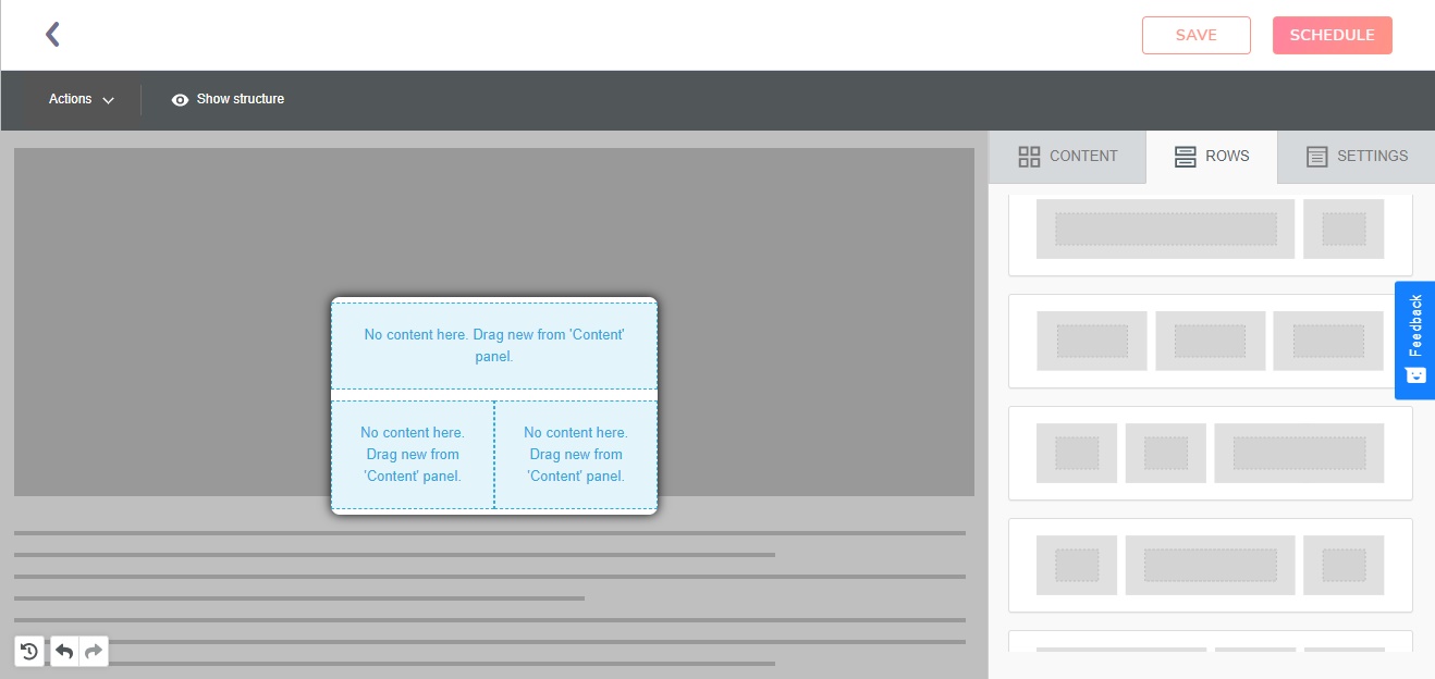
Components
You will get an option to choose the content from the option provided in the sidebar, you can drag and drop the components.
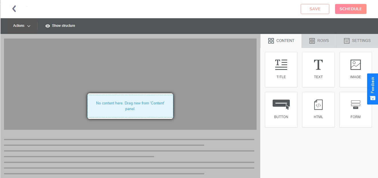
Title
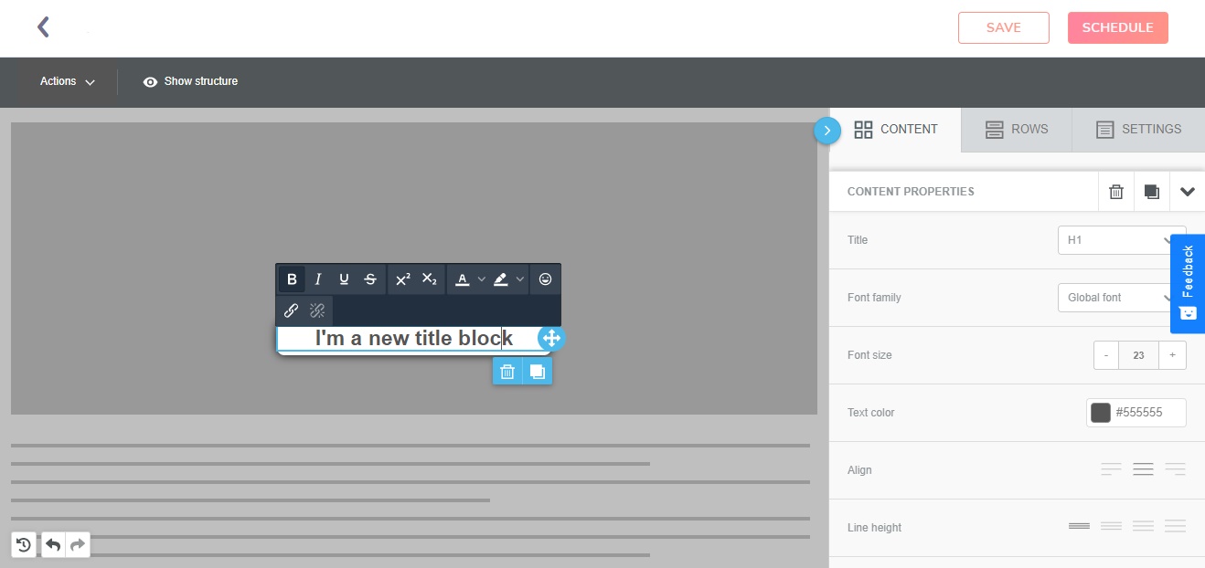
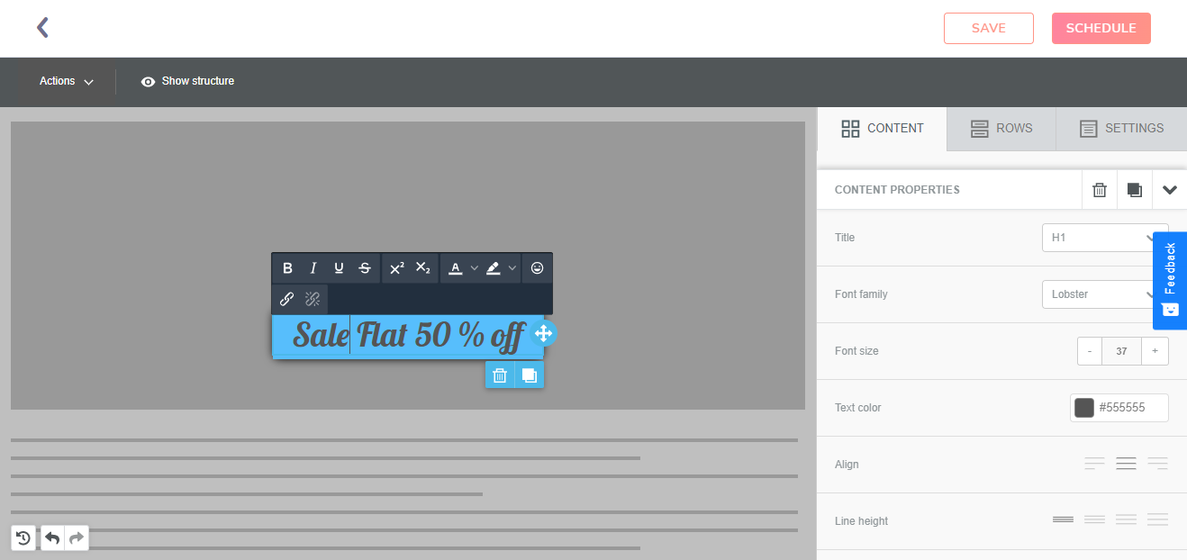
Enter one line title using this component.
| Components | Features |
|---|---|
| Title | Gives you three customizable header settings for the title |
| Font Family | Choose the font among various options provided |
| Align | Customize the alignment of the title |
| Text Direction | Type in different directions, increased comfort for typing in multiple languages |
Text
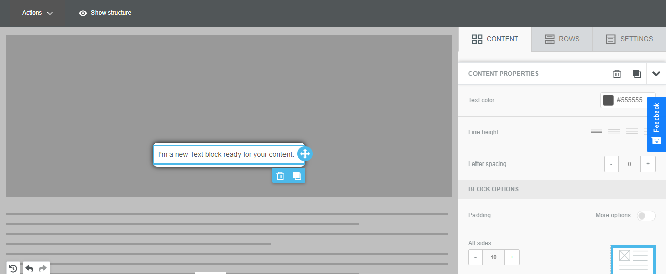
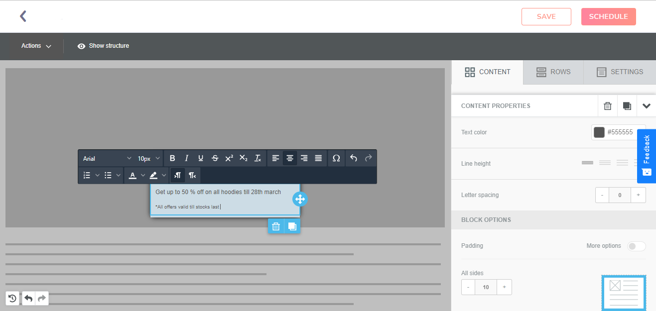
The text block allows you to enter the message body to your web message.
| Components | Features |
|---|---|
| Text Color | Choose the the color of the texts from different hues. |
| Line Height | Decide on four presetting of spacing between two lines |
| Letter Spacing | Customize the spacing between two letters of a text |
Image
The image option allows you to insert the image in your content.
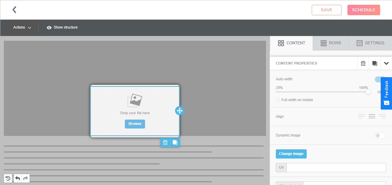
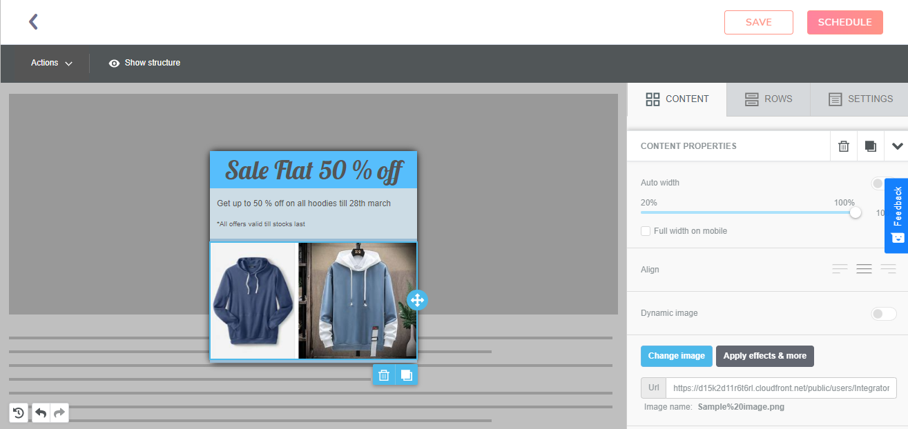
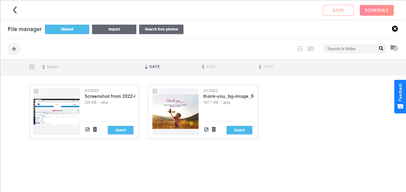
| Components | Features |
|---|---|
| Browse Button | When a user clicks on the browse button of the image content box, he gets the option of upload an image, import an image and image free search. |
| Upload Image | Allows you to upload an image from the system |
| Import Image | Allows you to import the image from various cloud storages and social media |
| Search Free Image | You can search for high quality images from a collection of over 500,000 images |
| Dynamic Image | The “Dynamic Image” option which when enabled, makes the URL location of a sample image shown in the editor. Dynamic URL is used in the HTML code. The size of the dynamic image will be set on the sample one, so use an image of the same size. |
Buttons
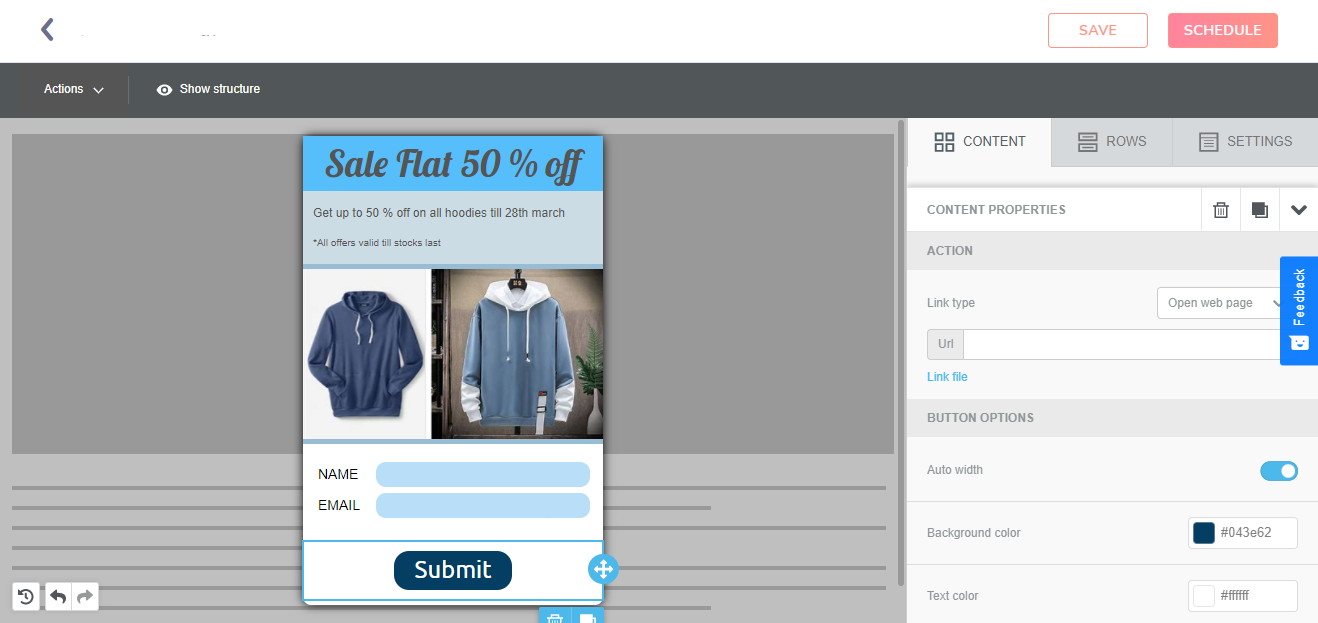
Users can add call-to-action buttons that can be adjusted according to the event.
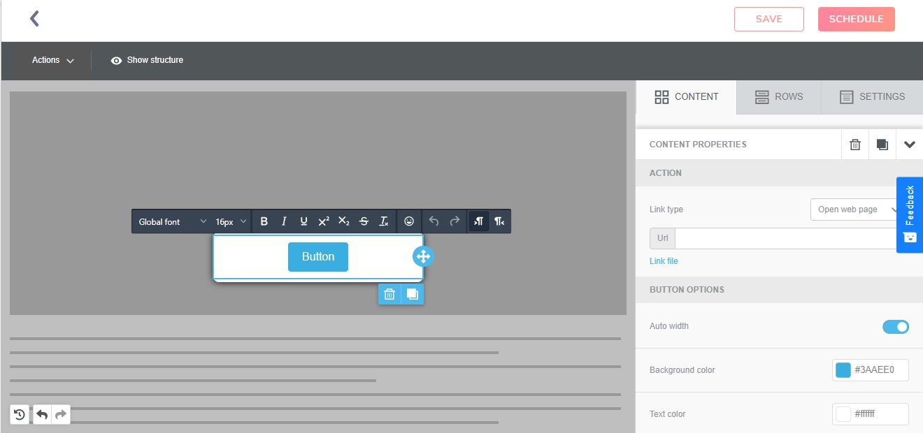
| Components | Features |
|---|---|
| Url | Enter the Url depending on where you want the button to redirect the user |
| Auto Width | It determines the button's optimal fit width automatically. |
| Background Color | Customize the background of the button |
| Align | Align the button to left, right or center. |
Forms
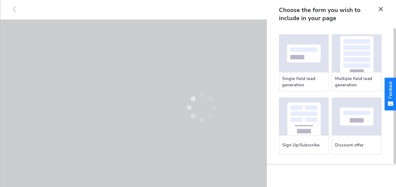
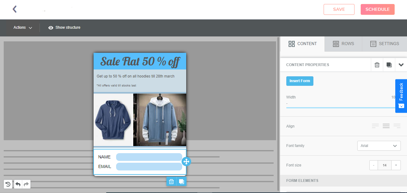
Add multiple fields to capture data, flexibilities provided for form building allows you to explore multiple form building capabilities.
| Component | Feature |
|---|---|
| Select Form | Choose from single field and multiple field lead generation, sign-up/subscribe and discount offer. You can also modify and make your own form. |
| Width | Adjust the width of the form |
| Align | Customize the alignment of the form contents |
| Manage Fields | Add or remove the fields in the form. |
| Customization of Text and Background | The option of customization of text and the text background is also provided. |
HTML
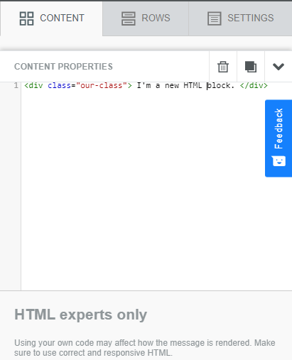
To render your message, write your own code.
| Content | Feature |
|---|---|
| HTML box | It allows you to write your own HTML message. It is always advisable to use correct and responsive HTML |
Common functionalities
Here are some explanation of few common functionalities which can be applied throughout the web message built.
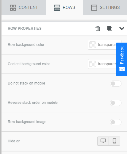
| Feature | Description |
|---|---|
| Row Background | Set background color of the entire row. |
| Content background | Set background color of the content boxes. |
| Do not stack on mobile | Choose to override the default behavior and prevent columns from stacking vertically on mobile devices. |
| Reverse Stack on mobile | In some cases, the columns stacked on mobile can work better in a reversed order. |
| Row background image | Insert image as row background |
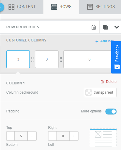
| Feature | Description |
|---|---|
| Customize columns | Add new columns and drag the size of the existing columns. |
| Column Background | Change the background color of each column. |
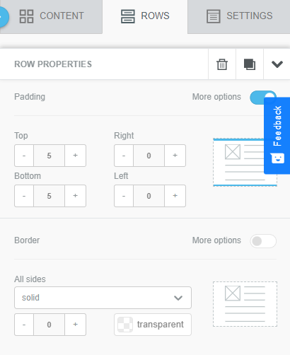
| Feature | Description |
|---|---|
| Padding | Padding can be adjusted for the columns in the row from four sides - top, bottom, left and right. |
| Border | Border can be added to each column in a row separately for each side - top, bottom, left and right. The borders can be either solid, dotted or dashed. |
Updated almost 2 years ago
