RFM Transitions
Analyze the flow of customers between various segments with RFM Transitions.
Transitions
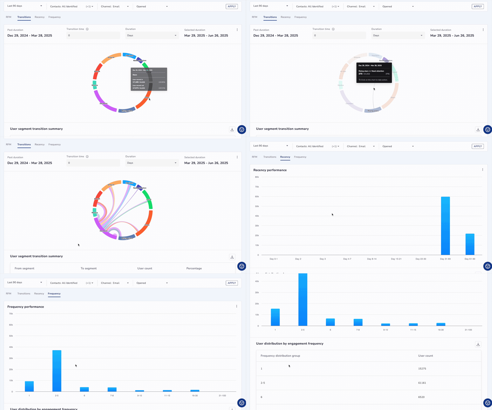
RFM transitions highlight how users move between different RFM segments over a selected time frame; such as from Rising star to At risk. These insights help marketers track which users are improving, declining, or newly engaged, offering a clear view of evolving customer behavior. Marketers can instantly act on these insights by saving segments, launching campaigns, downloading lists, or checking user reachability. This view enables smarter targeting by showing where each user stands across varying levels of engagement.
For example, you might see how many New users transitioned to Loyal users or how many "At-Risk" customers became Dormant.
Visualise these transitions on the Netcore CE dashboard, which clearly shows the flow of customers between various segments.
| Headers | Description |
|---|---|
| Past Duration | Previous time range such as Jan 1–31 representing earlier user behavior. |
| Selected Duration | Recent time range such as Feb 1–29 for comparing user behavior. |
| Transition Time | The in-between window where user behavior changes are observed. |

View Flow of Customers Between Various Segments
Hover over a segment to view its details. Clicking on the segment will open the Take action box, where you can perform the following actions:
-
Save as Segment: Save the segment for future use.
-
Create Campaign: Create a campaign based on this segment. The supported channels for campaign creation are:
- SMS
- RCS
- App Push
- In App Message
- Web Message
Next select desired delivery type based on channel selected.
You can also download the report by entering your desired email ID to receive the data.
Tabular view of transition
Scroll down to see a tabular view of the segment transitions. The table includes the following headers:
- Last Duration: The previous time period used in the transition.
- Selected Duration: The current time period selected for analysis.
- User Count: The total number of users in the selected segment.
- Percentage: The percentage change in user activity between the two durations.
Recency
The Recency Distribution shows how recently users interacted with your platform, such as the last time they opened the app, made a purchase, or completed any other meaningful action. The assumption is that the more recent the interaction, the higher the likelihood of the user engaging with future campaigns or making a conversion.
The Y-axis shows number of users and X-axis shows number of days. You can download this graph as PNG, JPEG or PDF.
The histogram categorizes users into time-based buckets based on the number of days since their last activity. This distribution is essential for re-engagement strategies, identifying dormant users, and triggering recovery campaigns.
Recency distribution group
| Group | Users |
|---|---|
| Day 0-1 | Hyper-recent users |
| Day 2 | |
| Day 3 | |
| Day 4–7 | Week 1 drop-off risks |
| Day 8–14 | Week 2 typical engagement |
| Day 15–21 | Week 3 moderate engagement |
| Day 22–30 | Monthly return pattern |
| Day 31–60 | Mildly dormant |
| Day 61–90 | Low activity phase |
| Day 91–180 | At risk / long dormant |
Example Table:
| Recency Distribution Group | User Count |
|---|---|
| Day 0-1 | 12,430 |
| Day 4–7 | 9,120 |
| Day 91–180 | 3,280 |
Use Cases:
- E-commerce: Re-engage "Day 4–7" users before they drop off to increase retention rates.
- BFSI: Send reminders or alerts to "Day 31–60" investment clients to renew or top-up their investments.
- Travel: Trigger win-back campaigns for "Day 91–180" travelers to rebook their next trips.
Frequency
The Frequency Distribution shows how often a user has engaged within a specified time period. This could involve app sessions, product views, purchases, or other actions. It allows you to segment users based on their engagement intensity, identifying loyal power users versus occasional or one-time visitors.
The Y-axis shows number of users and X-axis shows frequency engagement. You can download this graph as PNG, JPEG or PDF.
Frequency distribution group
| Bucket | Engagement Level |
|---|---|
| 1 | New users, onboarding |
| 2–5 | Early engagement |
| 6 | Transition zone |
| 7–8 | |
| 9–10 | |
| 11–15 | Mid-level engagement |
| 16–30 | High engagement |
| 31–100 | Super users / Power users |
| 100+ |
Example Table:
| Frequency Distribution Group | User Count |
|---|---|
| 1 | 8,950 |
| 2–5 | 15,320 |
| 16–30 | 1,420 |
Use Cases:
- E-commerce: Offer loyalty rewards to high-frequency buyers (16–30).
- BFSI: Educate first-time visitors with engaging journeys or demos to convert them into long-term clients.
- Travel: Target 6–10 trip bookers for referral incentives to expand your user base.
Monetary
The Monetary Distribution shows the total revenue contributed by each user in a given time period. This can be from purchases, bookings, premium upgrades, or other monetizable events. This distribution helps identify high, mid, and low-value users, enabling you to create targeted campaigns for upselling or rewarding top spenders.
Histogram Buckets (Example Numbers):
| Bucket (Spending) | Notes |
|---|---|
| 0–100 | Low value, price-sensitive |
| 101–300 | Casual spenders |
| 301–500 | Value shoppers |
| 501–1,000 | Mid-tier buyers |
| 1,001–2,000 | Consistent high spenders |
| 2,001–5,000 | Premium buyers |
| 5,001+ | Top-tier spenders |
Example Table:
| Monetary Distribution Group | User Count |
|---|---|
| 0–100 | 14,200 |
| 501–1,000 | 7,650 |
| 5,001+ | 820 |
Use Cases:
- E-commerce: Target top-tier shoppers (5,001+) with exclusive early-access campaigns for new product launches.
- BFSI: Offer premium investment plans to clients who spend between 1,000–5,000, focusing on tailored investment opportunities.
- Travel: Promote entry-level packages or EMI options to price-sensitive users (0–300).
Updated 9 months ago
