
App Users (New View)
Track and analyze user engagement across your app with the new activity dashboard.
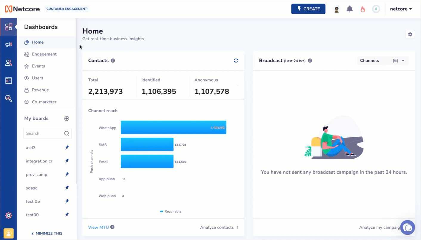
The Users section shows detailed information about your app’s users. It tracks active and converted users who have completed key actions, such as purchasing or signing up. This section helps you view your users' engagement and which groups contribute to your app’s success.
Track, Analyze & Customize User's App Activity
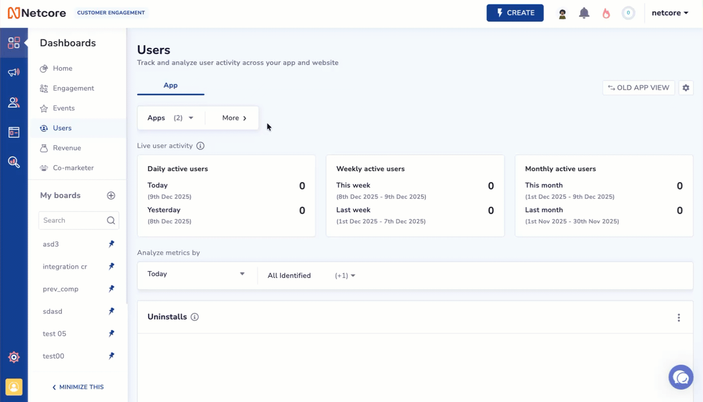
Live User Activity
View real-time active user counts for your app or website. These numbers are not affected by the chart filters below. The metrics available in the block are:
- Daily active users (DAU)
DAU is the count of active users for today and yesterday. DAU is calculated based on users triggering App Launch / First App Launch.
- Weekly active users (WAU)
WAU tracks the number of users who were active during the current week, defined as Monday to Sunday. The metric displays active-user counts for both this week and last week, helping you compare week-over-week engagement.
- Monthly active users (MAU)
MAU captures the number of users who were active during the current month, measured from the 1st of the month to the last calendar day. It shows active-user counts for this month and the previous month, enabling month-over-month trend analysis.
Functionality
Refer to the sections below to know the functionalities available on the Users dashboard.
Filters
Click More to Apply more filters to your dashboard view.
Apply More Filters to Your Dashboard View
Apps
Select the specific app(s) from the dropdown that you want to include in your analysis. By default, all apps are selected. Use this filter when your account tracks multiple apps and you want to focus on a particular one.
App versions
Select the app version(s) from the dropdown to filter your data. This helps you compare performance or behaviors across different releases. For example, when verifying the impact of a new update.
SDK versions
Select the SDK version from the dropdown that is running on the user’s device. This is useful for diagnosing SDK-related issues, validating rollouts, or comparing event tracking consistency across SDK upgrades.
Customize
Click Customize to select or deselect the metrics you want to display on your dashboard. This lets you control which insights are visible based on your analysis needs.
Old App View
Click this button to switch to the old app users' dashboard. Refer to the given document to know the old dashboard view.
Analyze Metrics
Refer to the given table to determine the options for curating your metrics.
| Option | Description |
|---|---|
| Duration | Select the number of days for which you want to view the data.
|
| Audience | Select from the dropdown any of the following options.
|
Active users
The Active Users section helps you track how many users engage with your app across different time periods. It provides a quick summary of overall activity and lets you analyze trends through a visual timeline chart.
At the top of the widget, you will see two key metrics for the selected date range:
- Total Active Users
Displays the total number of users who were active during the selected period.
Example: 1,891 active users from Sep 2025 to Dec 2025.
- Average Session Count
Shows the average number of sessions per user during the same period.
Example: 209 average sessions.
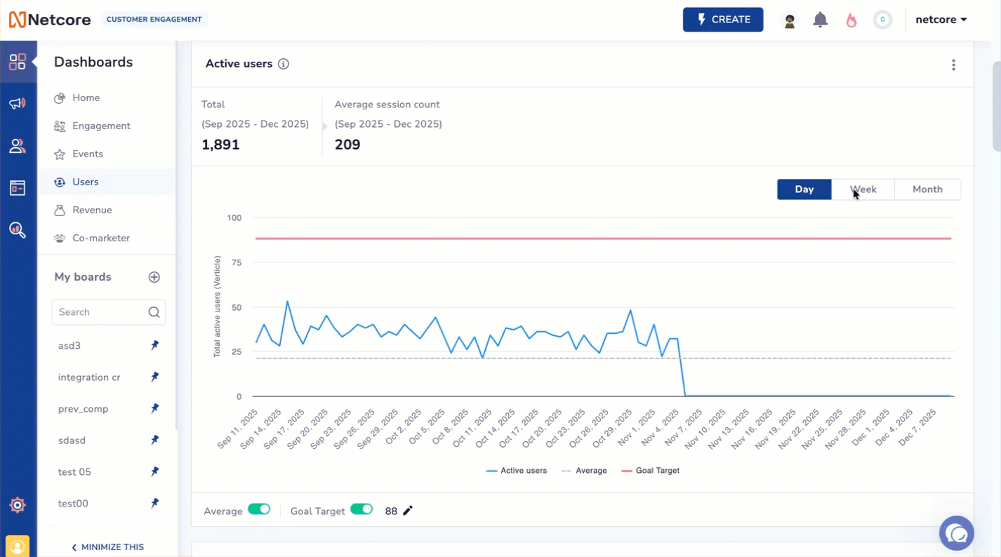
View Active App Users
Trend Graph
The line graph visualises how daily, weekly, or monthly active users fluctuate over time. Refer to the given table to know the graph components.
| Component | Description |
|---|---|
| X-axis | Timeline corresponding to the selected granularity: - Day: Shows day-wise active users. |
| Y-axis | Total number of active users |
| Blue Line- Active users | Shows the number of active users for each selected time unit (Day, Week, or Month). |
| Gray Dashed Line- Average | Displays the average active users for the selected date range, helping you compare individual data points against the overall trend. |
| Red Line- Goal Target | Indicates the target number of active users you aim to achieve, allowing you to track progress toward engagement goals. |
You can view the metrics in a graph displayed daily, weekly, or monthly. Hover over the graph to see accurate values for each metric. Select a view to analyze trends at different levels of detail.
At the bottom of the chart, you can toggle the following:
- Average: Turns the average line (gray dashed line) on or off. Use this to focus on the raw trend or compare against your baseline.
- Goal Target: Turns the goal line (red line) on or off. You can also edit the goal target value from here to reflect your desired engagement benchmark.
In addition to the graph format, as you scroll down, you will find detailed pie charts that show active users by various categories. Click  to export data in PDF, PNG, or JPEG format. Refer to the given table to learn about the available pie charts.
| Pie chart | Description |
|---|---|
| Active Users by Platform | Displays a pie chart of active users split by platforms like iOS and Android. |
| Active Users by App Version | Displays a pie chart showing the distribution of active users of different app versions. |
| Active Users by User Type | Displays a split of converted users by user type (identified vs. anonymous). |
| Active Users by SDK Version | Displays a pie chart showing active users by SDK version. |
| Active Users by Device Make | Shows active user data split by device brand. |
| Active Users by Device Model | Displays a breakdown of active users by device model. |
View Active Users Data in Pie Chart Format
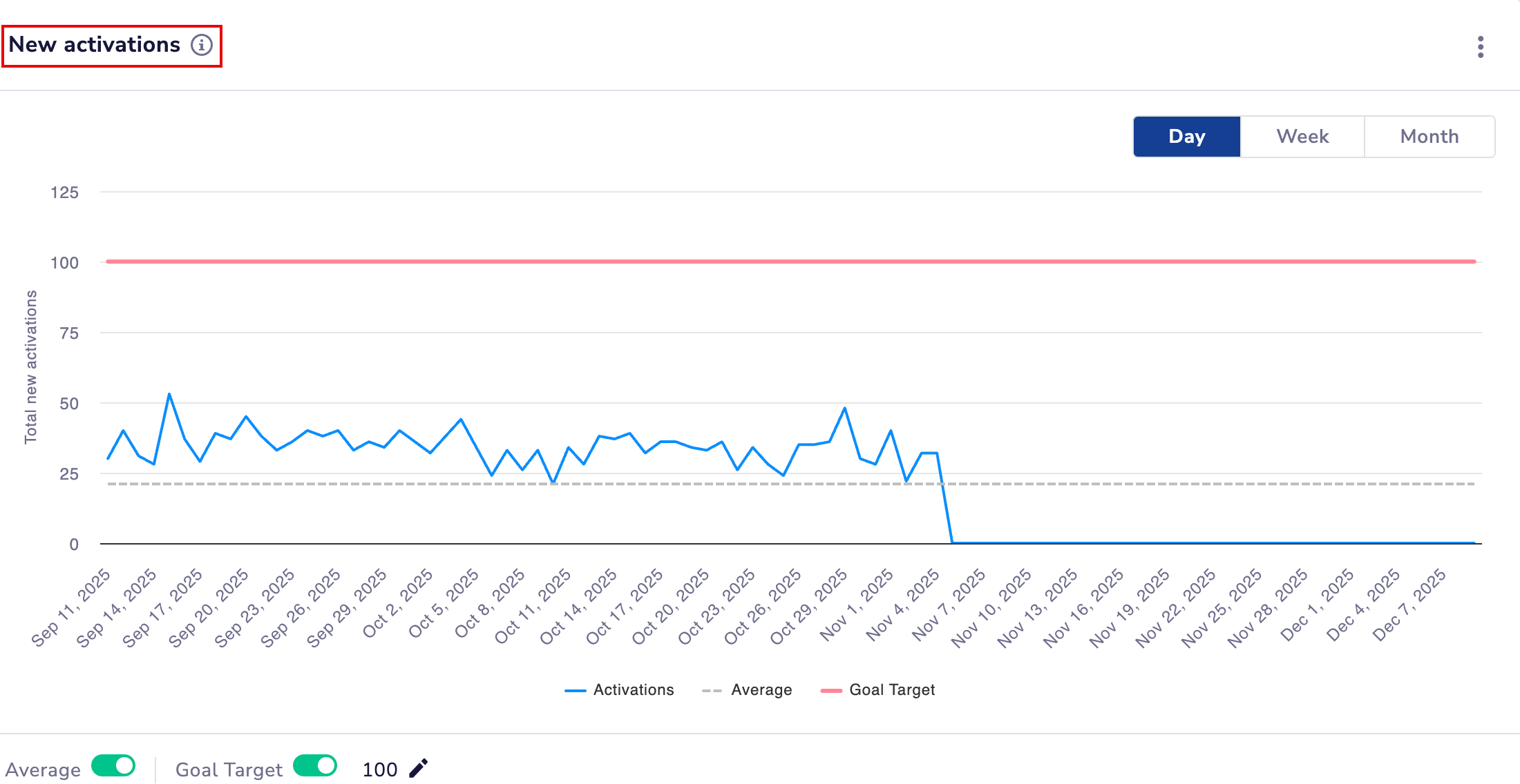
New activations
Users who launched your app for the first time within the selected period.
View App Launch
Understanding the Graph
- A blue line plots daily, weekly, or monthly activation counts.
- A gray dashed line shows the average activations for the selected range.
- Use the Day/Week/Month toggle to switch the timeline view.
At the bottom of the chart, you can toggle the following:
- Average: Show or hide the average line.
- Goal Target: Enable to compare activations against a defined target.
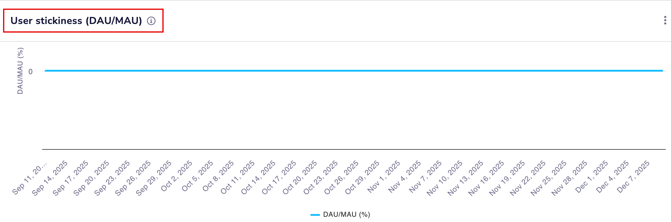
User Stickiness (DAU/MAU)
Measures how frequently users return to your app by calculating the percentage of monthly active users who visit daily.
Analyze How Frequently Users Return to Your App
Understanding the Graph
- The blue line shows the DAU/MAU percentage over time.
- This helps identify retention strength and how often users engage throughout the month.
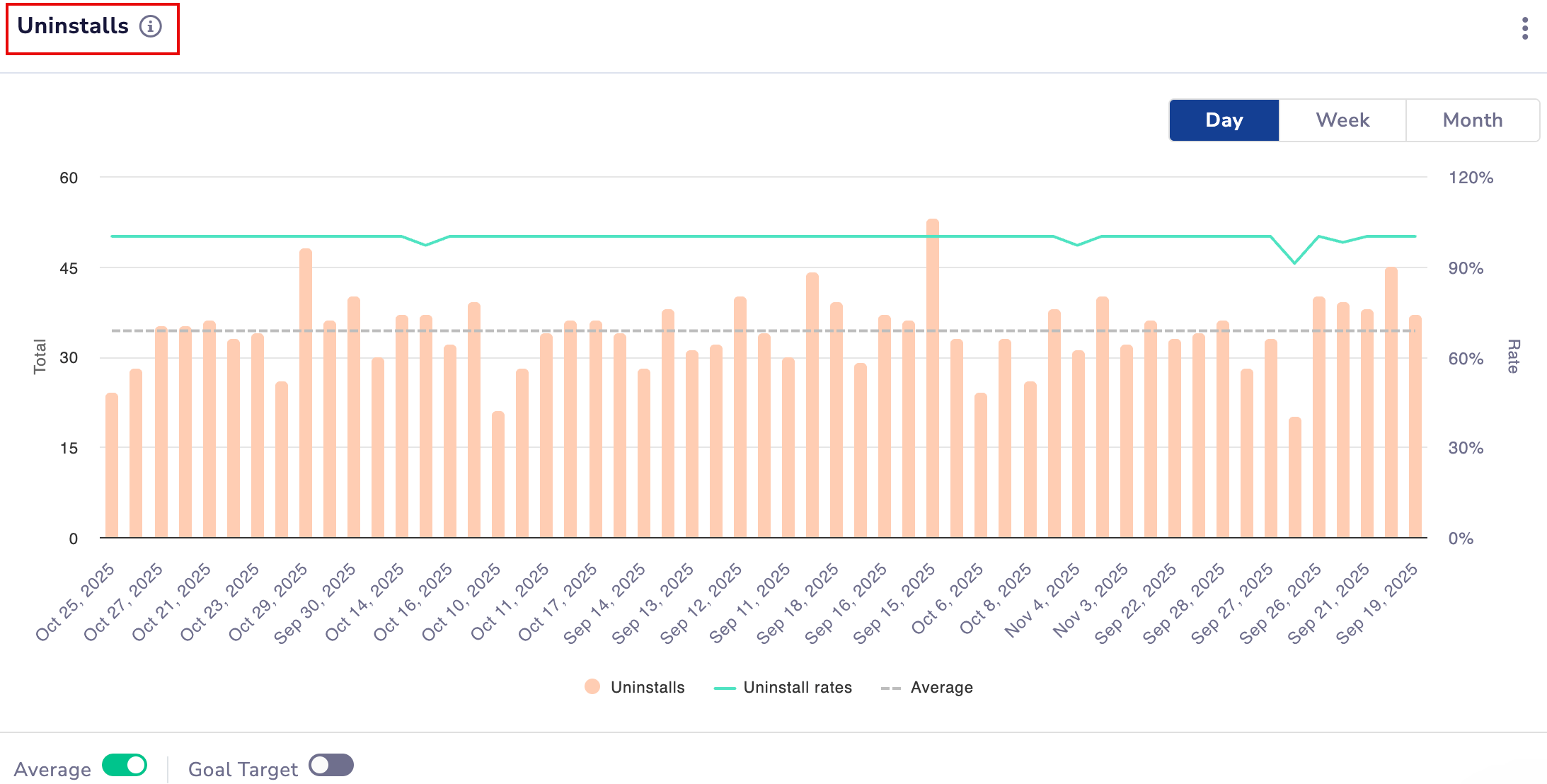
Uninstalls
Tracks how many users removed the app during the selected period and the corresponding uninstall rate.
View App Uninstalls
Understanding the Graph
- Orange bars represent total daily, weekly, or monthly uninstalls.
- A gray dashed line shows the average uninstall count.
- The green line represents the uninstall rate (percentage) for each time unit.
- Switch between Day/Week/Month using the granularity toggle.
At the bottom of the chart, you can toggle the following:
- Average: Show or hide the average uninstall line.
- Goal Target: Compare uninstall counts against your defined limit.
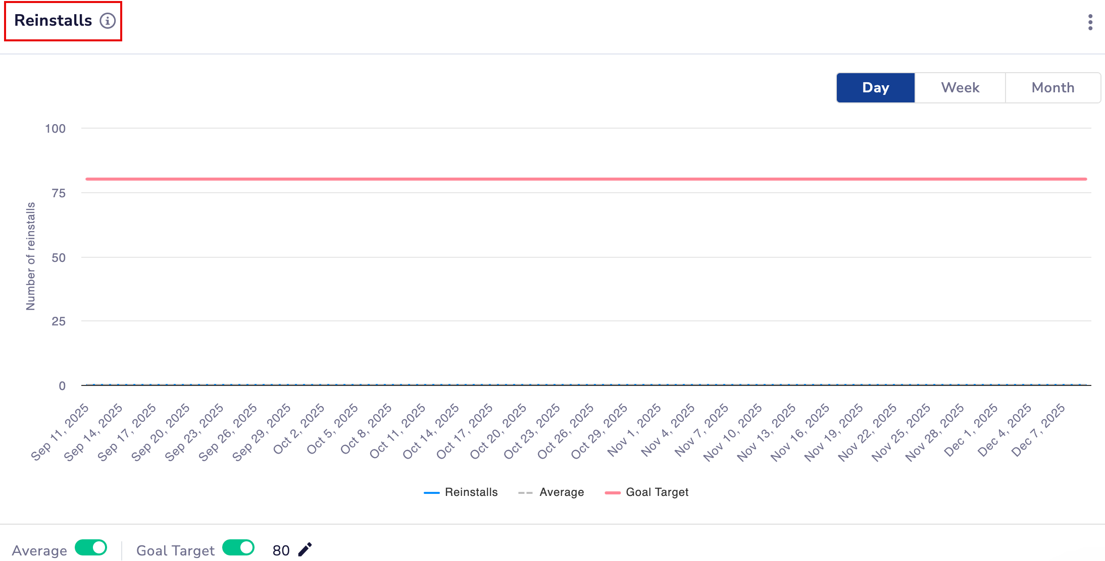
Reinstalls
Shows how many users reinstalled the app after uninstalling it.
VIew App Reinstalls
Understanding the Graph
- The blue line displays reinstall counts across the selected timeline.
- A gray dashed line indicates the average reinstalls.
At the bottom of the chart, you can toggle the following:
- Average: Show or hide the average line.
- Goal Target: Enable if you want to track reinstalls against a desired benchmark.
Updated about 1 month ago