
Small Image
Learn to create an App push template using the small image on template.
The Small Image template displays a compact image alongside the notification content, offering a clean and informative layout without overwhelming the user. Ideal for transactional messages, product alerts, or feature announcements, this layout provides visual context while maintaining focus on the title and description. Unlike rich media templates, the collapsed state is automatically handled, and customization is not offered.
Best used when you want to support the message with an icon or thumbnail without a full-width image layout.
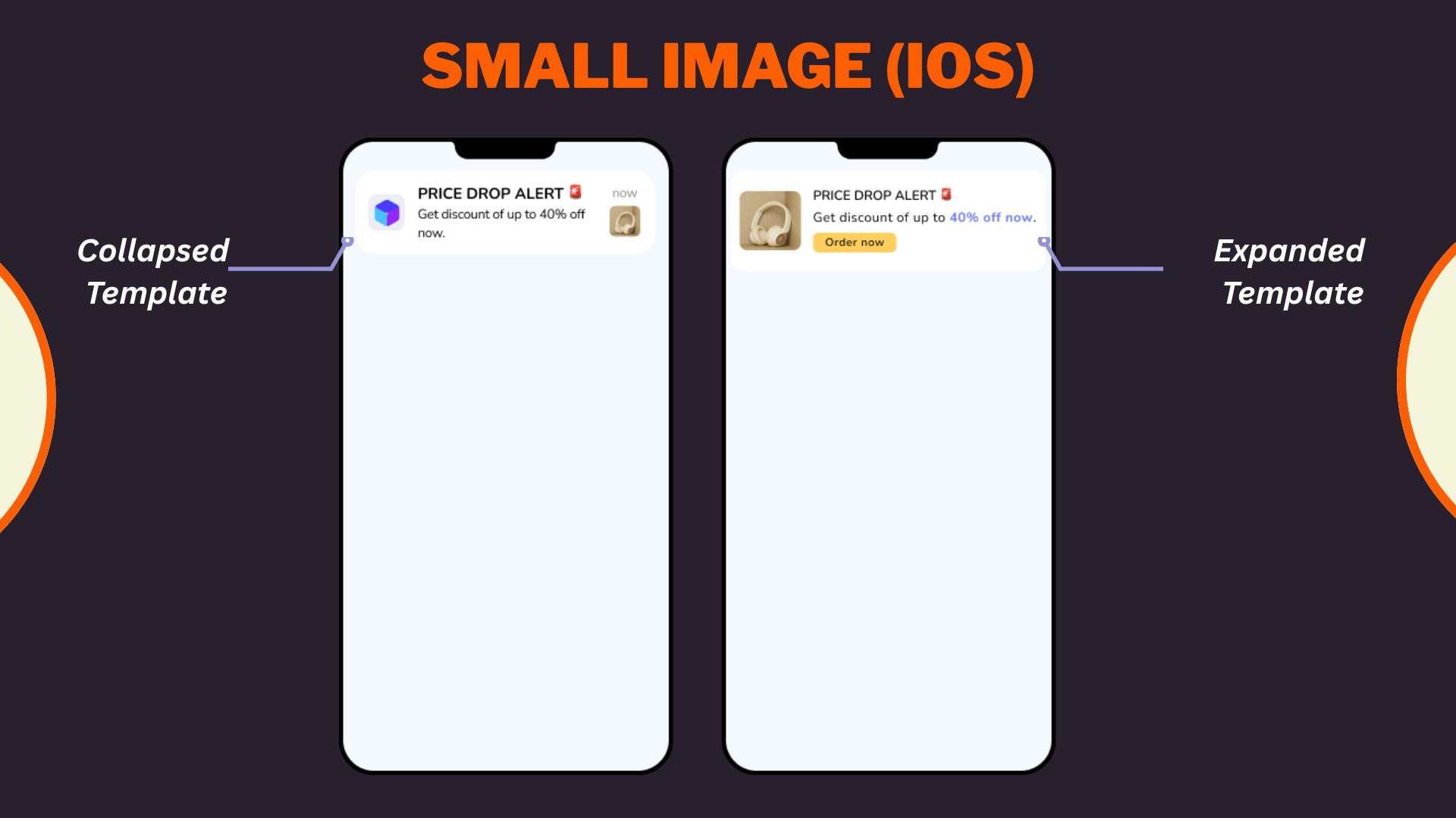
Samll Image iOS Template
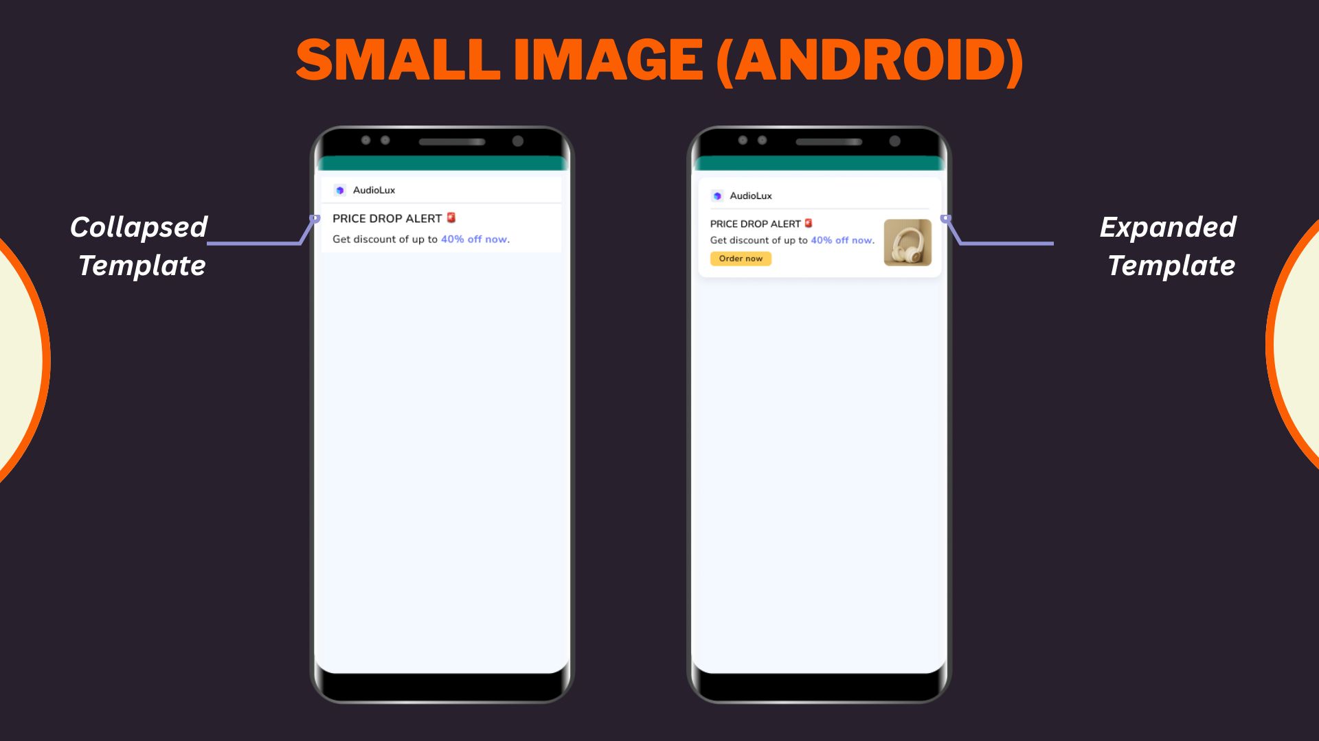
Small Image Android Template
Select Small image layout from the Content section when creating or editing any app push template.
- Configure Content
Configure Content
Configure the following content and design elements to personalize the template's layout.
| Options | Description |
|---|---|
| Title | Add a concise and attention-grabbing title for your notifications. You can apply text formatting: Note: Text formatting in only supported on Android. iOS will display plain text. Ensure you have a Brandkit enabled and active to use it while styling your Title. Refer here to enable and set up a Brandkit. |
| Description | Provide the main message or supporting text to communicate your intent. This appears overlaid on the image. Note: Supported on both Android and iOS. |
| Landing Page | Set the redirection behavior when users interact with the notification: Note: These options support deep personalization and can be tracked via analytics |
- Enable APN Interactins
Enable APN Interactions
This includes all image-related and design-enhancing options that control how the push notification looks. These settings help create high-impact visuals while ensuring readability and brand consistency.
| Options | Descriptions |
|---|---|
| Subtitle | Add supporting text to complement the title and description of your notification. This appears in a secondary position and helps convey additional context. Ensure you have a Brandkit enabled and active to use it while styling your subtitle. Refer here to learn how to enable and setup Brandkit. Note: Even if subtitle is disabled for editing, a placeholder or instructional comment may appear in the preview. |
| Rich Media | Upload or link an image that forms the background of the notifications. Available options: Note: For iOS, you can choose between the recommended 2:1 crop or uploading the image at its original dimensions without making any change. This is ONLY available for iOS apps. Android setup remains unchanged. https://).jpg, .jpeg, .png and Max size: 500 KB and Min size: 40 KB |
| Overlay Color | Allows you to customise the color applied to the background overlay behind an app push. Ensure you have a Brandkit enabled and active to use it while styling your Overlay color. |
| Background color | Define a solid or gradient background behind the overlay image block. This is useful as a fallback or design enhancement. Ensure you have a Brandkit enabled and active to use it while styling your Background color. |
| Brand logo in preview | Brand logos appear automatically in previews based on platform: |
| Customize collapsed state | Allows you to define how a push notification appears in its minimized form on Android devices. Marketers can upload a separate image or reuse the rich media asset with tailored layout controls when enabled. Availability Available on Android only. |
| Enable sticky notification | Make your notifications persistent by preventing swipe dismissal. |
| Sound | Define the tone played when a notification arrives on the device. You can choose between the default device sound or a custom sound. Here are the requirements for setting a custom sound:
|
| Carousel Type | This option allows you to select between Manual and Automatic carousel transitions. In Automatic, set the timer for image transitions between 2 and 10 seconds. Note:
|
| Progress Bar Settings |
Add-on Options
Add-on Options
Use the following enhancements to add controls and personalization to your push notification logic:
Overwrite Content with Collapse Key
Use this feature to manage notification replacement behavior in the user’s tray. Only the most recent one is displayed when multiple notifications share the same collapse key.
- Applicable for: All templates using FCM or APNS
- Use Case: Send score updates, countdowns, or stock changes without cluttering the tray.
- Example:
- Collapse Key: promo_alert
- Behavior: Only the latest “promo_alert” notification appears.
Custom Key-Value Pairs
Add up to 49 OS-specific key-value pairs to control in-app behavior when the notification is clicked. These values are passed to the app and can be used for deep personalization or routing.
- Key Example: category
- Value Example: electronics
- Use Case: When a user taps the push, the app opens the Electronics section directly.
Note
- At least one platform (Android or iOS) must be selected for each key-value pair.
- These values must be handled in your app’s SDK to trigger specific actions.
Once you've configured all the content and design elements for the Overlay on Image layout, you can:
- Save Template: To use it in future campaigns
- Use in Campaign: To apply it directly to a new or existing push campaign
Your template is now ready to deliver visually compelling, high-engagement push notifications.
To learn how to create an app push campaign step-by-step, check out this document.
Updated 29 days ago