
Rating
Learn to create an App push template using the Rating template.
The Rating template allows you to collect quick user feedback directly from a push notification by displaying tappable rating options—using text or emojis. This layout is perfect for gauging user sentiment, collecting product feedback, or measuring satisfaction after a feature release or in-app experience. You can customize the number of rating levels (2, 3, or 5), choose between emojis or text labels, and personalize follow-up actions based on user responses.
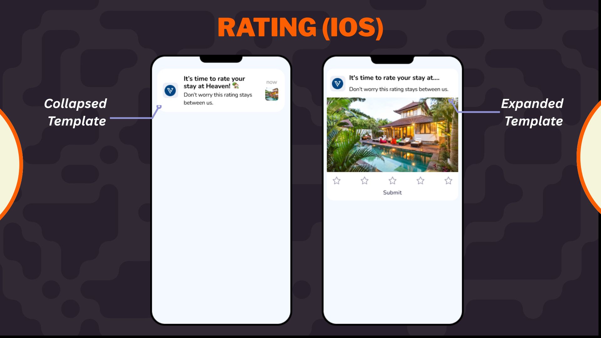
Ratings iOS Template
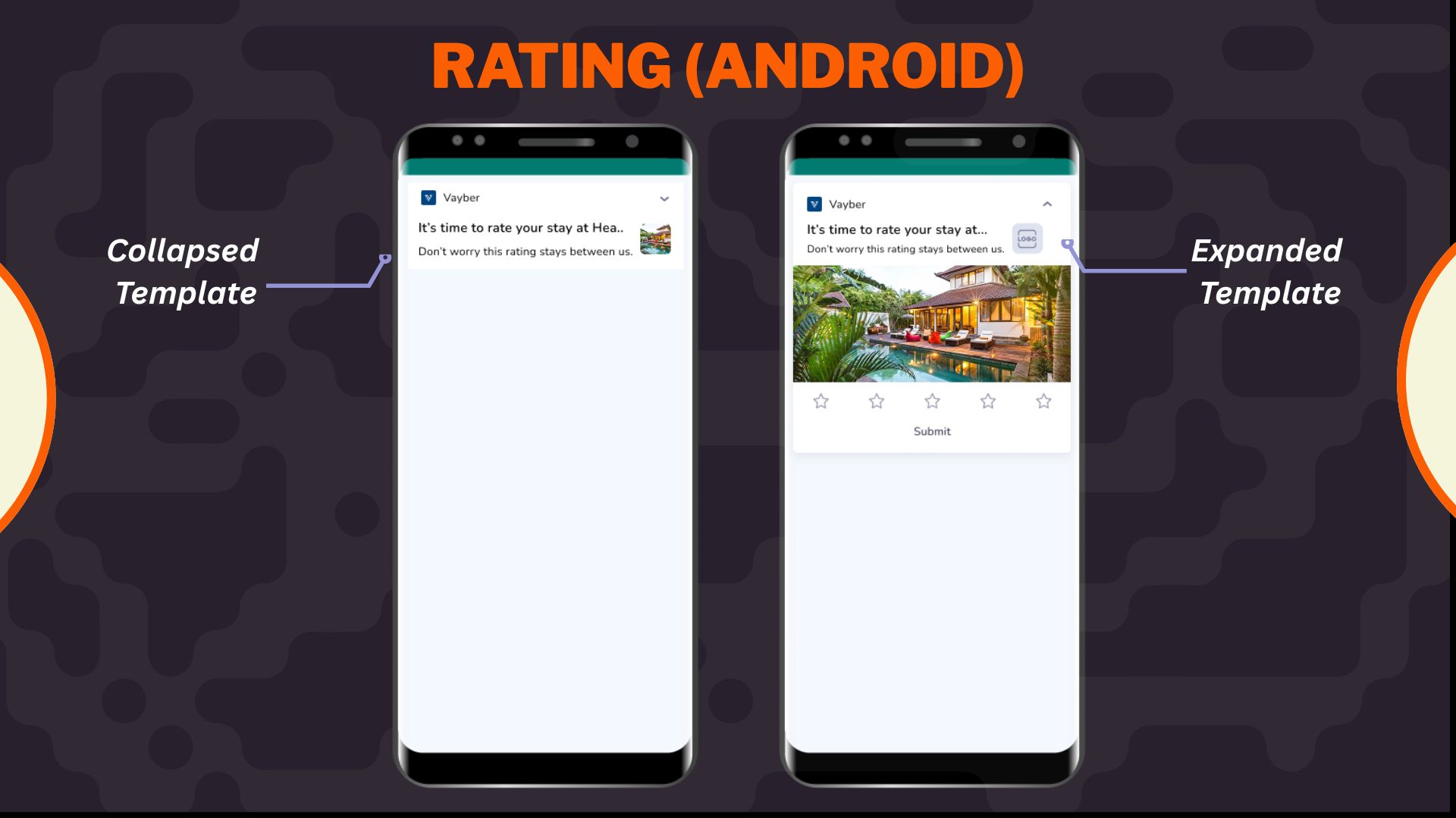
Ratings Android Template
Select Rating layout from the Content section when creating or editing any app push template.
- Configure Content
Configure Content
Configure the following content and design elements to personalize the template's layout.
| Options | Description |
|---|---|
| Title | Add a concise and attention-grabbing title for your notifications. You can apply text formatting: Note: Text formatting in only supported on Android. iOS will display plain text. Ensure you have a Brandkit enabled and active to use it while styling your Title. Refer here to enable and set up a Brandkit. |
| Description | Provide the main message or supporting text to communicate your intent. This appears overlaid on the image. Note: Supported on both Android and iOS. |
| Landing Page | Set the redirection behavior when users interact with the notification: Note: These options support deep personalization and can be tracked via analytics |
- Enable APN Interactins
Enable APN Interactions
This includes all image-related and design-enhancing options that control how the push notification looks. These settings help create high-impact visuals while ensuring readability and brand consistency.
| Options | Descriptions |
|---|---|
| Subtitle | Add supporting text to complement the title and description of your notification. This appears in a secondary position and helps convey additional context. Ensure you have a Brandkit enabled and active to use it while styling your subtitle. Refer here to learn how to enable and setup Brandkit. Note: Even if subtitle is disabled for editing, a placeholder or instructional comment may appear in the preview. |
| Rich Media | Upload or link an image that forms the background of the notifications. Available options: Note: For iOS, you can choose between the recommended 2:1 crop or uploading the image at its original dimensions without making any change. This is ONLY available for iOS apps. Android setup remains unchanged. https://).jpg, .jpeg, .png and Max size: 500 KB and Min size: 40 KB |
| Overlay Color | Allows you to customise the color applied to the background overlay behind an app push. Ensure you have a Brandkit enabled and active to use it while styling your Overlay color. |
| Background color | Define a solid or gradient background behind the overlay image block. This is useful as a fallback or design enhancement. Ensure you have a Brandkit enabled and active to use it while styling your Background color. |
| Brand logo in preview | Brand logos appear automatically in previews based on platform: |
| Customize collapsed state | Allows you to define how a push notification appears in its minimized form on Android devices. Marketers can upload a separate image or reuse the rich media asset with tailored layout controls when enabled. Availability Available on Android only. |
| Enable sticky notification | Make your notifications persistent by preventing swipe dismissal. |
| Sound | Define the tone played when a notification arrives on the device. You can choose between the default device sound or a custom sound. Here are the requirements for setting a custom sound:
|
| Carousel Type | This option allows you to select between Manual and Automatic carousel transitions. In Automatic, set the timer for image transitions between 2 and 10 seconds. Note:
|
| Progress Bar Settings |
- Rating Settings
Rating Settings
Use the Rating Configuration section to set up how users can submit feedback directly from the notification. You can customize the format, scale, and action behavior triggered by the user’s selection.
- Choose how the rating options are displayed:
- Text/Emoji: Show short text labels (e.g., “Good”, “Okay”, “Poor”) or display graphical emojis (e.g., 😍 😐 😡) for a more visual response.
- Icon: Display custom-designed icons to represent each rating option. You can upload separate images for selected and unselected states, allowing complete control over the visual feedback and branding.
-
Define how many options you want to present:
- 2-point scale – Ideal for binary feedback (e.g., Yes/No, Like/Dislike)
- 3-point scale – Offers low, medium, and high sentiment options
- 5-point scale – Enables more granular responses (e.g., full sentiment range)
-
If you have selected Icon option in the Rating setting section, then you have to configure the following:
Option Description Unselected icon Upload the icon that represents the inactive state of a rating option, which is shown before the user taps it.
💡 Recommended: Use muted or outline versions of your icons for unselected states.
Selected icon Upload the icon that appears after the user taps the rating. This reflects the active or chosen state.
Ensure the visual difference between selected and unselected icons is clear (e.g., color-filled vs. outline).CTA label Provide a short action-oriented label that appears below or beside the icon. This helps users understand the meaning behind each rating option (e.g., “Loved it”, “Okay”, “Not for me”).
Keep it concise—ideally 2–3 words.Deeplink Define the deeplink that will be triggered when a user selects this icon. This can open a specific app screen based on the rating level.
For example: Users who rate 4–5 stars can be redirected to a review prompt, while lower ratings could lead to a feedback form.
Rich Media
The Rich Media section allows you to enhance your push notification with visual or audio elements. These assets make your notification more engaging, improve click-through rates, and support use cases like product promotions, alerts, reminders, or limited-time offers.
Depending on your layout, you can choose from Image, Carousel, GIF, and Audio formats.
| Media Type | Description |
|---|---|
| Image | A single banner image that appears in the expanded view of the notification. Ideal for promotions, announcements, or brand imagery. |
| Carousel | Allows users to swipe through multiple images in a single notification. Best for showcasing numerous products or steps. |
| Audio | It plays a custom sound clip when the notification is delivered. This is useful for alerts, event triggers, or emotional cues. |
| GIF | It adds animated visual content for more dynamic and playful messaging. It is effective for celebrations, feedback, or feature highlights. |
Image
When Image is selected, you’ll be prompted to add your media using one of two methods:
- Upload File: Select an image from your device
- URL: Enter the hosted image’s link (must start with https://)
Points to Remembers
- Supported Formats: .jpg, .jpeg, .png
- Max Size: 500 KB
- Recommended Aspect Ratio: 2:1
Carousel
When Carousel is selected, select your layout, and you can upload multiple images (minimum 2, maximum 5):
- Upload File: Add images from your device
- URL: Provide hosted image URLs
Points to Remember
- Supported Formats: .jpg, .jpeg, .png
- Max Size per Image: 100 KB
- Required Aspect Ratio: 2:1
- Transition Type: Manual or automatic (with timing between 2–10 seconds)
- Ensure each image is visually self-contained, as carousel cards don’t support per-image titles or descriptions.
Audio
When Audio is selected:
- You must provide a hosted URL to the audio file (e.g., https://example.com/alert.mp3)
- Supported Format: .mp3
- Recommended Use Case: Timers, reminders, or celebratory sounds
Note: Ensure the file is lightweight and hosted over a secure HTTPS connection.
GIF
When GIF is selected:
- Only URL upload is supported, and no local file upload option is available.
- Supported Format: .gif
- Recommended Use Case: Visual feedback, feature launches, or celebration animations
Add-on Options
Use the following enhancements to add controls and personalization to your push notification logic:
Overwrite Content with Collapse Key
Use this feature to manage notification replacement behavior in the user’s tray. Only the most recent one is displayed when multiple notifications share the same collapse key.
- Applicable for: All templates using FCM or APNS
- Use Case: Send score updates, countdowns, or stock changes without cluttering the tray.
- Example:
- Collapse Key: promo_alert
- Behavior: Only the latest “promo_alert” notification appears.
Custom Key-Value Pairs
Add up to 49 OS-specific key-value pairs to control in-app behavior when the notification is clicked. These values are passed to the app and can be used for deep personalization or routing.
- Key Example: category
- Value Example: electronics
- Use Case: When a user taps the push, the app opens the Electronics section directly.
Note
- At least one platform (Android or iOS) must be selected for each key-value pair.
- These values must be handled in your app’s SDK to trigger specific actions.
Once you've configured all the content and design elements for the Overlay on Image layout, you can:
- Save Template: To use it in future campaigns
- Use in Campaign: To apply it directly to a new or existing push campaign
Your template is now ready to deliver visually compelling, high-engagement push notifications.
To learn how to create an app push campaign step-by-step, check out this document.
Troubleshoot and FAQs
Where can I view user responses for Rating push notifications?
A: Responses for these notification types are tracked as custom events and can be viewed in the nc_product_rnd panel.
- Quick Reply Push- Event:
nc_apn_reply_submitted
Includes parameters like repliedtext (user’s selected/entered response) - Rating Push- Event:
smt_pn_rating
You can search for these events in the panel and inspect the event payload to analyse user interactions.
Updated 29 days ago