
Progress Bar
Learn to create an App push template using your timer with progress bar template.
The Progress Bar template allows you to visually represent time-sensitive or goal-oriented progress directly within a push notification. Ideal for use cases like limited-time offers, countdowns to an event, order tracking, or challenge completions, this layout helps create a sense of urgency and encourages user action by showing how much time or progress remains.
The notification includes a real-time progress bar, an optional countdown timer, and a post-completion message. It's designed to engage users visually and contextually, making it perfect for engagement-driven campaigns across both Android and iOS.
Combine progress visualization with strong CTAs to drive timely conversions.
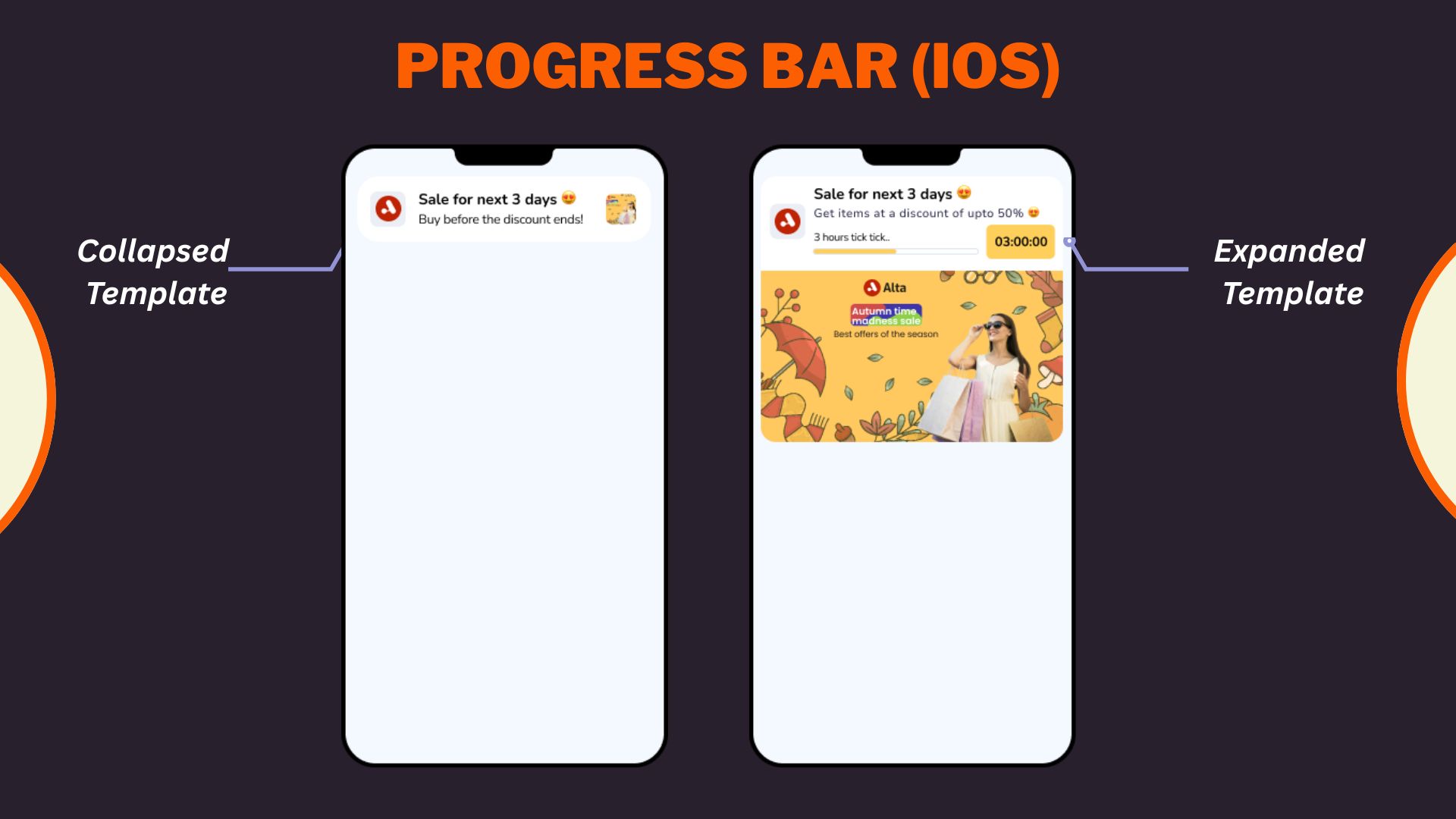
Progress Bar iOS Template
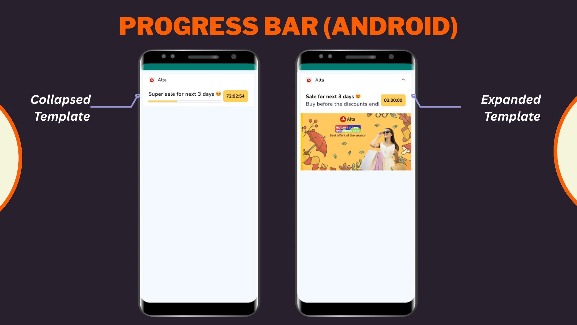
Progress Bar Android Template
Select Progress bar layout from the Content section when creating or editing any app push template.
- Configure Content
Configure Content
Configure the following content and design elements to personalize the template's layout.
| Options | Description |
|---|---|
| Title | Add a concise and attention-grabbing title for your notifications. You can apply text formatting: Note: Text formatting in only supported on Android. iOS will display plain text. Ensure you have a Brandkit enabled and active to use it while styling your Title. Refer here to enable and set up a Brandkit. |
| Description | Provide the main message or supporting text to communicate your intent. This appears overlaid on the image. Note: Supported on both Android and iOS. |
| Landing Page | Set the redirection behavior when users interact with the notification: Note: These options support deep personalization and can be tracked via analytics |
- Enable APN Interactions
Enable APN Interactions
This includes all image-related and design-enhancing options that control how the push notification looks. These settings help create high-impact visuals while ensuring readability and brand consistency.
| Options | Descriptions |
|---|---|
| Subtitle | Add supporting text to complement the title and description of your notification. This appears in a secondary position and helps convey additional context. Ensure you have a Brandkit enabled and active to use it while styling your subtitle. Refer here to learn how to enable and setup Brandkit. Note: Even if subtitle is disabled for editing, a placeholder or instructional comment may appear in the preview. |
| Rich Media | Upload or link an image that forms the background of the notifications. Available options: Note: For iOS, you can choose between the recommended 2:1 crop or uploading the image at its original dimensions without making any change. This is ONLY available for iOS apps. Android setup remains unchanged. https://).jpg, .jpeg, .png and Max size: 500 KB and Min size: 40 KB |
| Overlay Color | Allows you to customise the color applied to the background overlay behind an app push. Ensure you have a Brandkit enabled and active to use it while styling your Overlay color. |
| Background color | Define a solid or gradient background behind the overlay image block. This is useful as a fallback or design enhancement. Ensure you have a Brandkit enabled and active to use it while styling your Background color. |
| Brand logo in preview | Brand logos appear automatically in previews based on platform: |
| Customize collapsed state | Allows you to define how a push notification appears in its minimized form on Android devices. Marketers can upload a separate image or reuse the rich media asset with tailored layout controls when enabled. Availability Available on Android only. |
| Enable sticky notification | Make your notifications persistent by preventing swipe dismissal. |
| Sound | Define the tone played when a notification arrives on the device. You can choose between the default device sound or a custom sound. Here are the requirements for setting a custom sound:
|
| Carousel Type | This option allows you to select between Manual and Automatic carousel transitions. In Automatic, set the timer for image transitions between 2 and 10 seconds. Note:
|
| Progress Bar Settings |
- Timer Settings
Timer Settings
This section allows you to configure how the countdown appears and behaves in your push notification. You can choose whether the timer ends at a specific date/time or after a fixed duration and define what should happen once it expires.
Choose and select timer mode from the following two options:
- Specific date and time: Set the exat end date and time for the countdown. This is useful for scheduled events like flash sales, product launches, or campaign deadlines.
- Select Duration: Defines a countdown based on the timer that has elapsed since the notification is delivered. You can set Days, Hours, Minutes, and Seconds. Duration Range : Minimum should be 1 hour and Maximum should be 28 days
Message After timer EndsEnter a message that will be shown after the timer reaches zero. This replaces the countdown in the notification view and helps maintain engagement post-expiry.
- Character Limit: 50 characters
- This is a mandatory field.
Use the See Preview toggle to visualize how the message will look post-expiry.
Add URL (Optional)
Optionally, you can include an audio clip to enhance the timer experience.
- Provide a hosted URL to an audio file (e.g., .mp3)
- Ensure the URL is accessible over HTTPS. This audio plays during the timer and can add urgency or thematic context (e.g., countdown ticking, event music).
Timer Styling
Customize the visual appearance of the timer to match your design needs:
- Background Color: Set a solid color for the timer block background (e.g., #FFCF5C)
- Text Color: Define the color of the timer text (e.g., #000000)
Note
- Ensure you have a Brandkit enabled and active to use it while styling your Background and Text color.
- Use high-contrast color combinations to ensure readability.
- Rich Media
Rich Media
The Rich Media section allows you to enhance your push notification with visual or audio elements. These assets make your notification more engaging, improve click-through rates, and support use cases like product promotions, alerts, reminders, or limited-time offers.
Depending on your layout, you can choose from Image, Carousel, GIF, and Audio formats.
| Media Type | Description |
|---|---|
| Image | A single banner image that appears in the expanded view of the notification. Ideal for promotions, announcements, or brand imagery. |
| Carousel | Allows users to swipe through multiple images in a single notification. Best for showcasing numerous products or steps. |
| Audio | It plays a custom sound clip when the notification is delivered. This is useful for alerts, event triggers, or emotional cues. |
| GIF | It adds animated visual content for more dynamic and playful messaging. It is effective for celebrations, feedback, or feature highlights. |
Image
When Image is selected, you’ll be prompted to add your media using one of two methods:
- Upload File: Select an image from your device
- URL: Enter the hosted image’s link (must start with https://)
Points to Remembers
- Supported Formats: .jpg, .jpeg, .png
- Max Size: 500 KB
- Recommended Aspect Ratio: 2:1
Carousel
When Carousel is selected, select your layout, and you can upload multiple images (minimum 2, maximum 5):
- Upload File: Add images from your device
- URL: Provide hosted image URLs
Points to Remember
- Supported Formats: .jpg, .jpeg, .png
- Max Size per Image: 100 KB
- Required Aspect Ratio: 2:1
- Transition Type: Manual or automatic (with timing between 2–10 seconds)
- Ensure each image is visually self-contained, as carousel cards don’t support per-image titles or descriptions.
Audio
When Audio is selected:
- You must provide a hosted URL to the audio file (e.g., https://example.com/alert.mp3)
- Supported Format: .mp3
- Recommended Use Case: Timers, reminders, or celebratory sounds
Note: Ensure the file is lightweight and hosted over a secure HTTPS connection.
GIF
When GIF is selected:
- Only URL upload is supported, and no local file upload option is available.
- Supported Format: .gif
- Recommended Use Case: Visual feedback, feature launches, or celebration animations
- Action Button
Action Button
Add interactive buttons to your push notification to direct users toward specific actions, such as visiting a page, opening a section of the app, or triggering a deep link.
You can configure the following options:
-
Action title: Define the text that appears on the button (e.g., “Shop Now”, “Check Offer”, “Know More”). Keep it concise and action-oriented to maximize engagement.
-
Call to action: Select the action behavior that should be triggered when the user taps the button. You can choose from the following options:
Option Description Open within app Launches a specific screen in the app via a deeplink. Ideal for driving engagement to in-app features or offers. Open in browser Opens a web page in the device’s default browser using a URL. Useful for linking to landing pages, product pages, or external content. Close Dismisses the notification without taking further action. Suitable for “No Thanks” or passive dismissals. Remind me later Triggers a reminder notification later. Best used in time-sensitive scenarios or when giving users the option to postpone. Copy text Copies predefined text (e.g., a promo code) to the user’s clipboard. Great for coupon-based campaigns or referral codes.
NoteSome options like “Open within app” require a valid deeplink to be configured in your app.
- Add-On Options
Add-on Options
Use the following enhancements to add controls and personalization to your push notification logic:
Overwrite Content with Collapse Key
Use this feature to manage notification replacement behavior in the user’s tray. Only the most recent one is displayed when multiple notifications share the same collapse key.
- Applicable for: All templates using FCM or APNS
- Use Case: Send score updates, countdowns, or stock changes without cluttering the tray.
- Example:
- Collapse Key: promo_alert
- Behavior: Only the latest “promo_alert” notification appears.
Custom Key-Value Pairs
Add up to 49 OS-specific key-value pairs to control in-app behavior when the notification is clicked. These values are passed to the app and can be used for deep personalization or routing.
- Key Example: category
- Value Example: electronics
- Use Case: When a user taps the push, the app opens the Electronics section directly.
Note
- At least one platform (Android or iOS) must be selected for each key-value pair.
- These values must be handled in your app’s SDK to trigger specific actions.
Once you've configured all the content and design elements for the Overlay on Image layout, you can:
- Save Template: To use it in future campaigns
- Use in Campaign: To apply it directly to a new or existing push campaign
Your template is now ready to deliver visually compelling, high-engagement push notifications.
To learn how to create an app push campaign step-by-step, check out this document.
Updated 29 days ago