
Quick Reply
Learn to create an App push template using the Quick Reply template
The Quick Reply template allows users to respond directly from the push notification without opening the app. It mimics a chat-like interface, enabling real-time feedback collection, quick surveys, or customer support replies. Available across both Android and iOS, this layout drives faster user interaction and simplifies response capture.
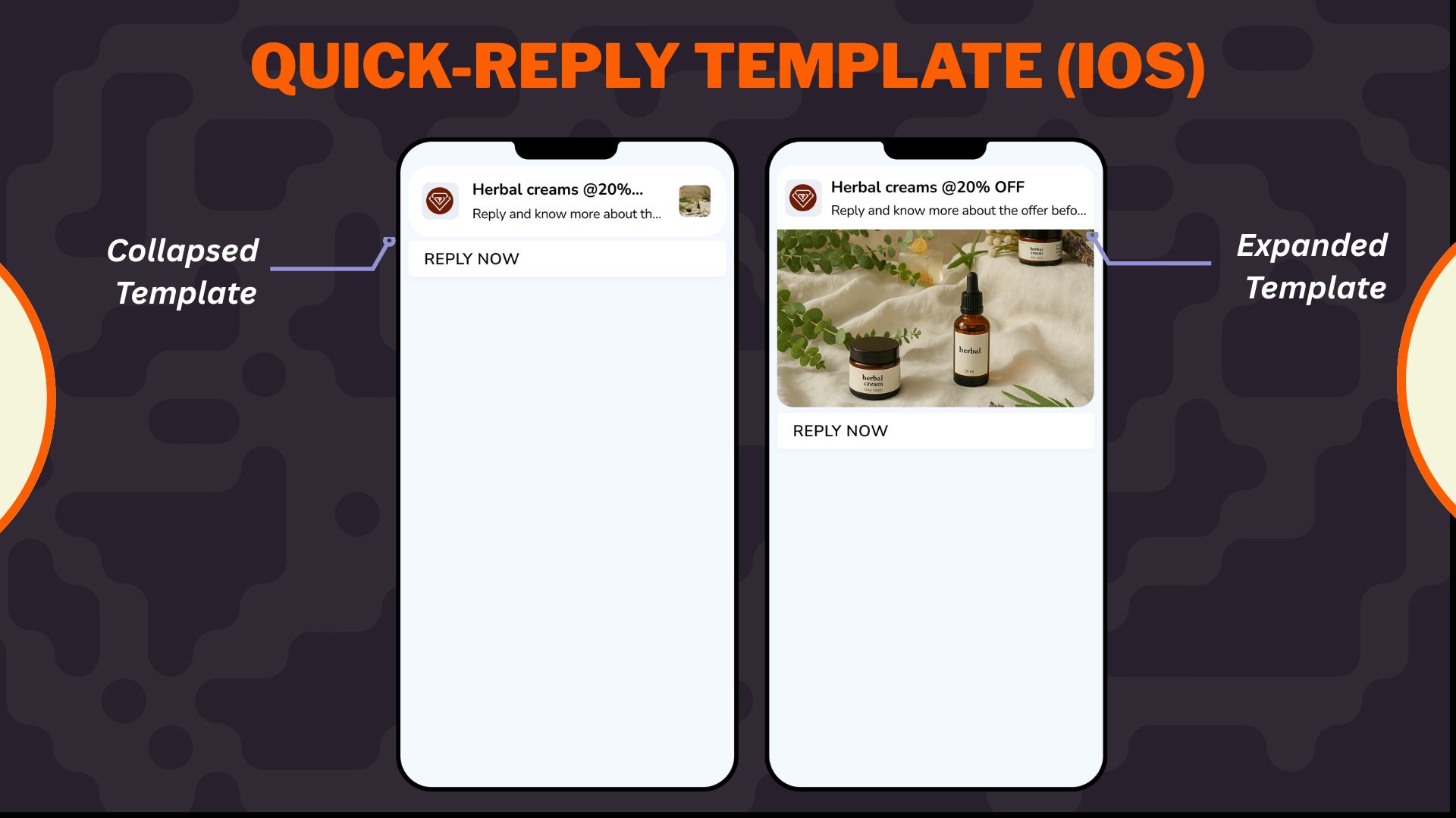
Quick-Reply Template for iOS
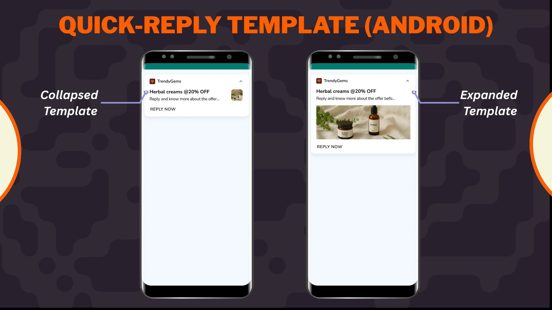
Quick-Reply Template for Android
Important Points to Remember
- Customization of the collapsed state is not supported in this template.
- Inline reply from collapsed view is only supported on Android (device-dependent); iOS does not support reply in collapsed view.
- Post-submission text and placeholder text are only available on Android. These fields are not supported on iOS.
- SDK v3.7.4 (Android) & v3.7.2 (iOS is required to use this template. Older SDKs will not support the reply functionality and will fallback to basic text based APN
- This template is not compatible with action buttons—only a single CTA (“Reply”) is available.
- Only alphanumeric characters, emojis, punctuation, and Unicode are allowed in replies.
When to use
Use the Quick Reply template for:
- One-question surveys: For example, "How was your delivery?".
- Feedback prompts: For example, "Was this helpful?".
- Support responses: For example, "Tell us your issue".
- Content engagement: For example, "What did you think of today's article?"
Select Overlay on Image layout from the Content section when creating or editing any app push template.
- Configure
Configure Content
Configure the following content and design elements to personalize the template's layout.
| Options | Description |
|---|---|
| Title | Add a concise and attention-grabbing title for your notifications. You can apply text formatting: Note: Text formatting in only supported on Android. iOS will display plain text. Ensure you have a Brandkit enabled and active to use it while styling your Title. Refer here to enable and set up a Brandkit. |
| Description | Provide the main message or supporting text to communicate your intent. This appears overlaid on the image. Note: Supported on both Android and iOS. |
| Landing Page | Set the redirection behavior when users interact with the notification: Note: These options support deep personalization and can be tracked via analytics |
- Enable APN Interactions
Enable APN Interactions
This includes all image-related and design-enhancing options that control how the push notification looks. These settings help create high-impact visuals while ensuring readability and brand consistency.
| Options | Descriptions |
|---|---|
| Subtitle | Add supporting text to complement the title and description of your notification. This appears in a secondary position and helps convey additional context. Note: Even if thesubtitle is disabled for editing, a placeholder or instructional comment may appear in the preview. |
| Rich Media | Upload or link an image that forms the background of the notifications. Available options:https://)Supported format: .jpg, .jpeg, .pngMax size: 200 KB Aspect ratio: 1:1 Note: Important content should not be placed at the bottom of the image due to cropping behavior. Only available for SDK 3.4.0 and above. |
| Background color | Define a solid or gradient background behind the overlay image block. This is useful as a fallback or design enhancement. |
| Enable sticky notification | Make your notifications persistent by preventing swipe dismissal. |
| Sound | Define the tone played when a notification arrives on the device. You can choose between the default device sound or a custom sound. Here are the requirements for setting a custom sound:
|
- Action Button
Action Button
The Action Button in the Quick Reply template enables users to respond directly from the notification using a chat-like input field. This is not a traditional CTA button—instead, it acts as a trigger for user response submission.
You can configure the following fields:
- Button text: Define the label for the reply button shown in the notification (e.g., “Shop Now”, “Check Offer”, “Know More”). Keep it concise and action-oriented to maximize engagement. This is the primary action that initiates the reply input.
- Placeholder text for response: Enter the text displayed inside the reply input field before the user types.
For Example, “Type your message here.” This helps guide users on what kind of response is expected. This is only available for Android only. - Message submission text: Define the confirmation message shown after the user submits their response.
Example: “Thanks for your feedback!” Acts as visual feedback to confirm the reply was received. This is only available for Android only.
ImportantThese settings are specific to Android. iOS does not support custom placeholder or submission text fields in notifications
4.Add-on Options
Add-on Options
Use the following enhancements to add controls and personalization to your push notification logic:
Overwrite Content with Collapse Key
Use this feature to manage notification replacement behavior in the user’s tray. Only the most recent one is displayed when multiple notifications share the same collapse key.
- Applicable for: All templates using FCM or APNS
- Use Case: Send score updates, countdowns, or stock changes without cluttering the tray.
- Example:
- Collapse Key: promo_alert
- Behavior: Only the latest “promo_alert” notification appears.
Custom Key-Value Pairs
Add up to 49 OS-specific key-value pairs to control in-app behavior when the notification is clicked. These values are passed to the app and can be used for deep personalization or routing.
- Key Example: category
- Value Example: electronics
- Use Case: When a user taps the push, the app opens the Electronics section directly.
Note
- At least one platform (Android or iOS) must be selected for each key-value pair.
- These values must be handled in your app’s SDK to trigger specific actions.
Once you've configured all the content and design elements for the Overlay on Image layout, you can:
- Save Template: To use it in future campaigns
- Use in Campaign: To apply it directly to a new or existing push campaign
Your template is now ready to deliver visually compelling, high-engagement push notifications.
To learn how to create an app push campaign step-by-step, check out this document.
Troubleshoot and FAQs
Where can I view user responses for Quick Reply notifications?
A: Responses for these notification types are tracked as custom events and can be viewed in the nc_product_rnd panel.
- Quick Reply Push- Event:
nc_apn_reply_submitted
Includes parameters like repliedtext (user’s selected/entered response) - Rating Push- Event:
smt_pn_rating
You can search for these events in the panel and inspect the event payload to analyse user interactions.
Updated 29 days ago