
What's New: Drag & Drop Editor
What's New: Explore Netcore Drag & Drop Editor's newest capabilities in this document
Stay updated with Netcore Drag & Drop Editor's usability refinements and visual consistency improvements shipped to give your team faster workflows and cleaner outputs across every campaign.
July 2026
08 updatesMay 2026
04 updatesJuly 2026
08 updatesDrag and Drop Image Upload, System to Canvas
You can now drag an image file straight from your desktop onto the UCE canvas to upload and place it, skipping the upload picker entirely.
- Drop an image straight onto an existing Image block to fill it instantly.
- Drop an image onto an empty canvas area to auto-create a new Image block at that spot.
- Skip the upload picker entirely; the file uploads and renders automatically.
- Get clear visual feedback (highlighted drop zone, upload progress, retry on failure) throughout the process.
Default Crop Mode Set to Custom (Free-Form) in Image Editor
When editing an image on the UCE canvas, the Crop tool now opens in Custom (free-form) mode by default, so you can resize the crop area immediately with zero extra clicks.
- Start cropping freely the moment you open the tool, with no extra clicks.
- Switch to any fixed preset ratio whenever precise dimensions are needed.
- Get a consistent free-form default across every image block on the canvas.
Persistent Selection Border While Editing via the Side Panel
The selection border around a selected element now stays visible while you edit its properties in the right-hand panel, so you never lose track of what's selected mid-edit.
- Always tell which element is selected, even while adjusting its style or content.
- Rely on a clearly visible bounding box for thin elements like Divider and Spacer.
- Trust the selection border and drag handle to always stay in sync.
Alignment & Justify Now Enabled for Bulleted and Numbered Lists
Left, Center, Right, Justify, and Link are no longer disabled when your selection is inside a bulleted or numbered list. This brings UCE's list editing in line with the BEE editor.
- Align or justify bulleted and numbered list content, just like plain paragraph text.
- Use Link/unlink inside list items without it appearing disabled.
- See the active alignment state reflected on the toolbar button.
- Get list-editing behavior consistent with the BEE editor.
Stack on Mobile for Side-by-Side Form Fields
Side-by-side form field rows now include a Stack on mobile toggle, so multi-column form rows can collapse into a clean vertical stack on small screens instead of staying cramped side by side.
- On the canvas, select a row containing side-by-side form fields.
- In the right pane, open the General tab and locate the Responsive section.
- Toggle Stack on mobile ON to make the fields stack vertically on mobile, or OFF to keep them side by side.
- Switch the editor to Mobile view to preview the result before saving.
- Keep multi-column form rows compact on desktop while making them mobile friendly.
- Control stacking independently for each side-by-side row in the same form.
- Preview the stacked layout live in Mobile view before publishing.
- Improve mobile form completion by avoiding cramped, hard-to-tap fields.
Indent Controls in Text Editor
You can now indent and outdent paragraph and table text directly from the editor toolbar, giving you more control over text hierarchy and structure.
- On the canvas, select a Paragraph or Table block and place your cursor in, or select, the text.
- In the floating text toolbar that appears, locate the Decrease Indent and Increase Indent icons, next to the bulleted/numbered list icons.
- Click Increase Indent to shift the text right, or Decrease Indent to shift it back. Click repeatedly to move through indent levels, up to a maximum of 360px.

- Create nested, hierarchical text layouts without manual spacing.
- Indent quotes, callouts, or key information to visually separate them.
- Improve readability of long-form content like instructions and feature descriptions.
- Match indentation expectations when pasting content from Docs or Word.
Configurable Preferred Country Codes for Phone Input
The Code + Phone form field now lets you configure up to 5 preferred country codes, plus a more consistent, searchable dropdown experience for your subscribers.
- Drag and drop any Form block onto the canvas.
- Within the form, drag and drop the Phone + Code input field.
- In the right-side configuration panel, go to General and scroll down to Select Preferred Countries (Max: 5).
- Click the dropdown to open the country list. Search for a country using either its country code (for example, 91) or its name (for example, India).
- Select up to five preferred countries by checking the box next to each one, then click Apply.

- Surface the country codes most relevant to your audience at the top of the list.
- Reorder preferred countries and set the first one as the default fallback.
- Save your preferred country configuration for reuse across future forms.
- Give subscribers a consistent, easy-to-navigate dropdown across all form blocks.
Line Height and Letter Spacing Moved to the Style Panel
Line height and letter spacing controls have moved out of the floating text toolbar and into the right-hand Style panel, where they now apply consistently to the entire Heading, Paragraph, or Button block instead of just the selected text.
- On the canvas, select a Heading, Paragraph, or Button block.
- In the right pane, switch to the Style tab.
- Under Font Style, use the Line Height dropdown to choose a value (1 through 5, in fixed steps), and the Letter Spacing field to set a value in px (0 to 99).
- The entire block updates immediately to reflect your changes.

- Keep spacing consistent across an entire block instead of fixing uneven fragments.
- Set typography once per block rather than reselecting text repeatedly.
- Match block-level spacing conventions used by editors like Mailchimp and Klaviyo.
- Maintain predictable, reusable styling across templates.
May 2026
04 updatesFlexible Divider Styling
You can now fully customize dividers in the Unified Content Editor, giving you greater control over layout and visual structure.
- On the Drag & Drop editor canvas, drop the Divider block.
- On the right pane under General settings, locate Height (px) and Width (px). Edit these values to set divider dimensions.
- To create a vertical divider, set Height = 100 and Width = 1. Under Style settings, open Divider style and select a Line type — Solid, Dash, or Dotted.
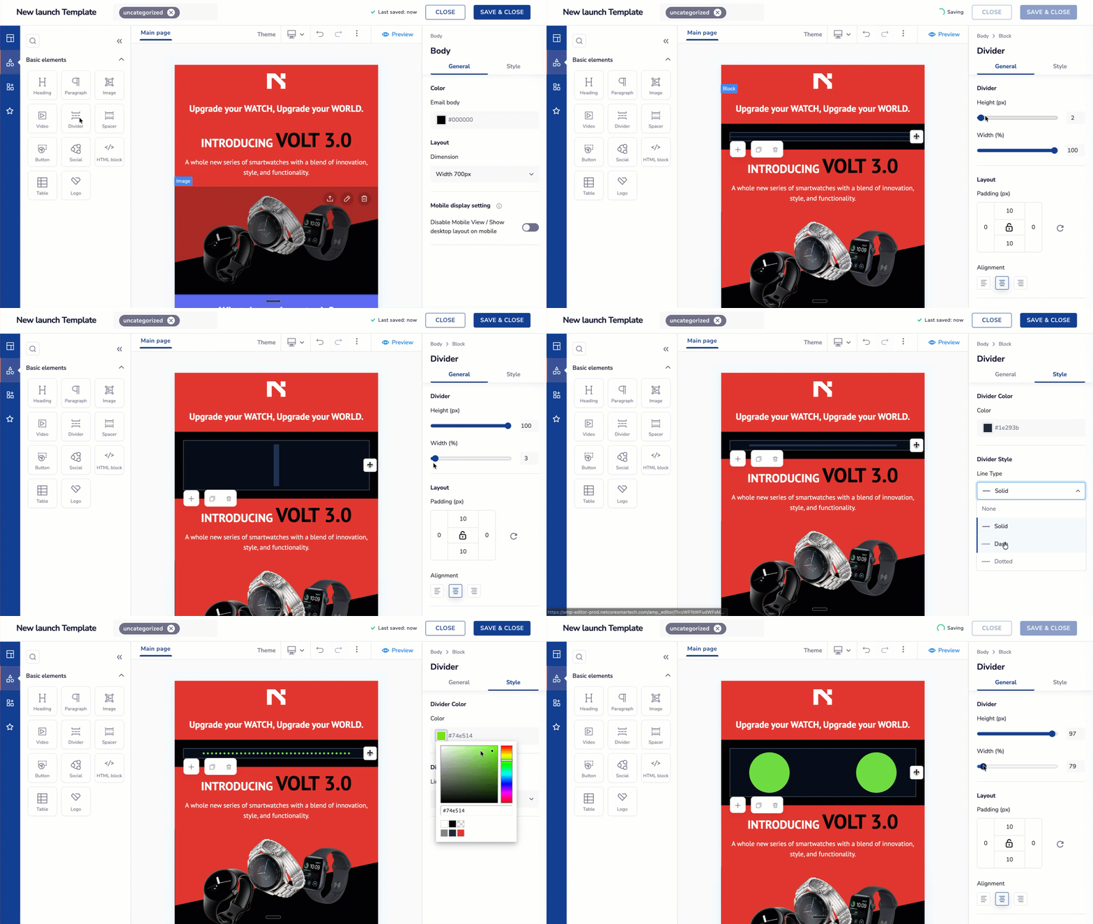
- Create vertical dividers by adjusting height and width.
- Customize divider dimensions for precise layout control.
- Choose from styles like solid, dashed, and dotted.
- Align the divider appearance with your overall design.
Standardized Mandatory Field Indicator in Forms
Mandatory fields are now more consistent and aligned with industry standards.
- On the Drag & Drop editor canvas, drop any type of Form.
- Observe the red asterisk (*) next to fields that are currently mandatory.
- Select a field, then under General settings check or uncheck the Mandatory box to change the field's required state.
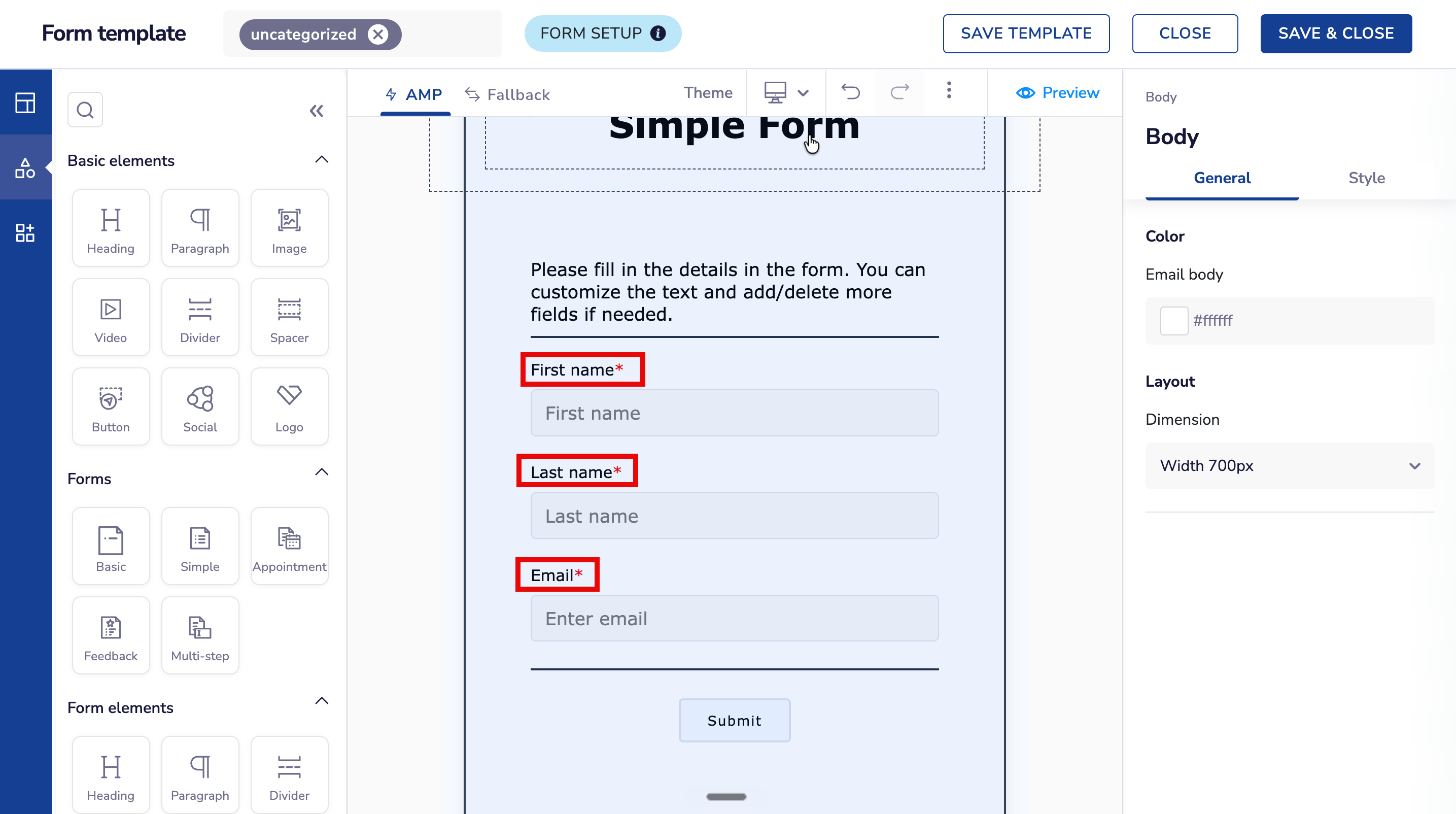
- A consistent red asterisk (*) across all forms.
- Improved visual clarity for end users.
- Elimination of inconsistent or incorrect styling.
Improved Spacer Block Visibility
Spacer blocks now behave as true spacing elements on the canvas.
- On the Drag & Drop editor canvas, drop the Spacer block.
- Review the visible space. This is exactly the gap your end user will see in the rendered output.
- Adjust the Spacer's height from the right pane to fine-tune the gap as needed.
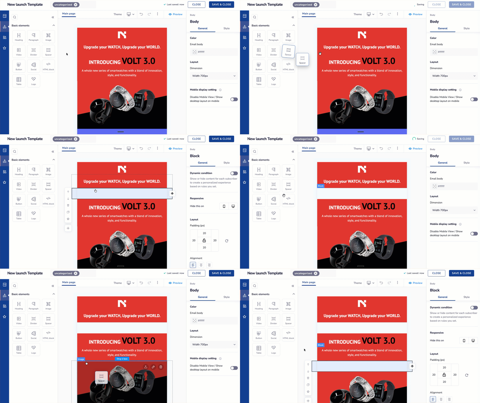
- View spacers as actual blank space.
- Accurately gauge spacing between elements.
- Avoid confusion between spacers and dividers.
- Design layouts with better precision.
Standardized Font Size Dropdown
Font size selection is now cleaner and more consistent.
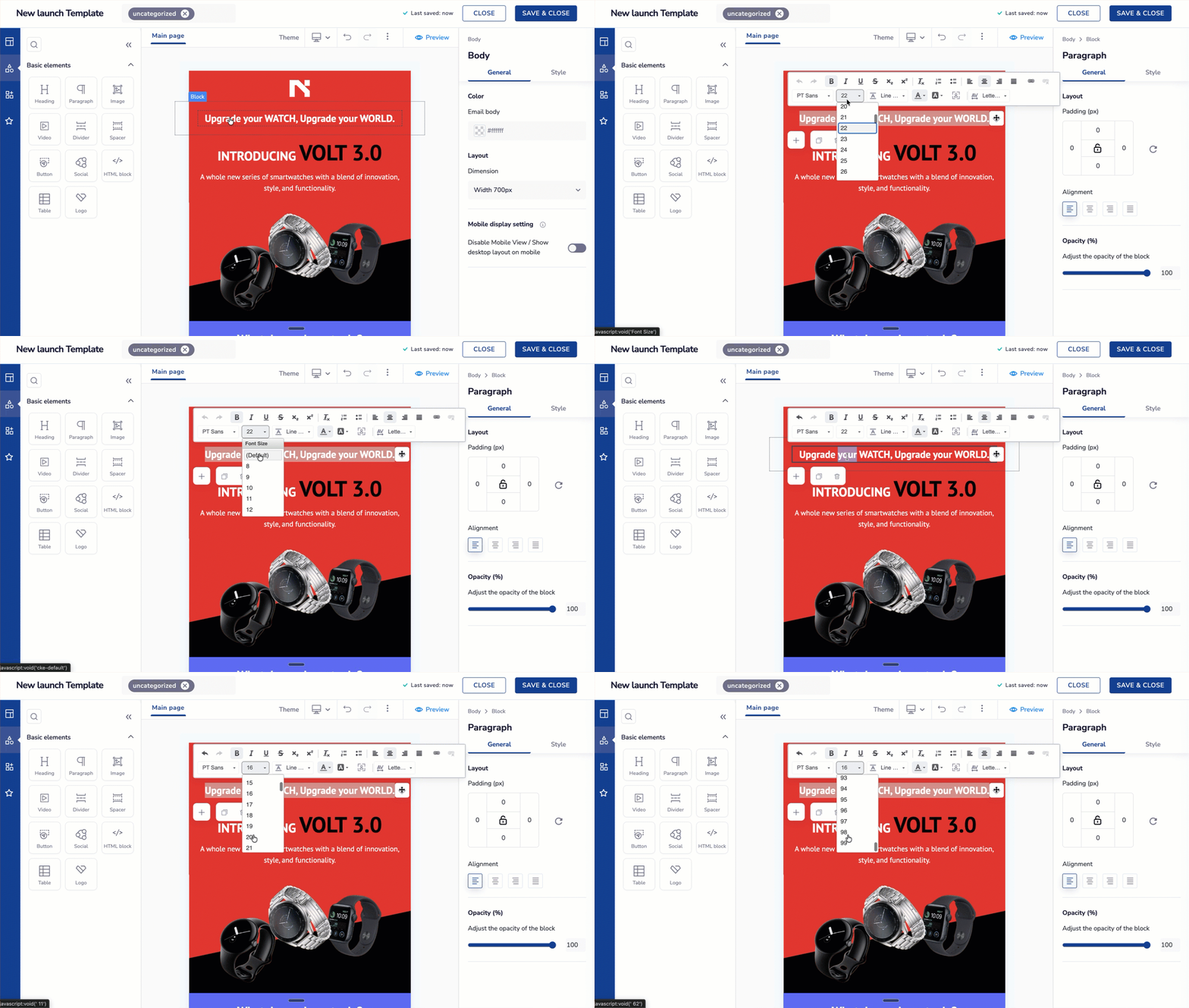
- Browse font sizes in a uniform, easy-to-read list.
- Avoid visual inconsistency in the dropdown.
- Start with a default font size of 10px.
- Select sizes more efficiently.
April 2026
05 updatesSmart Repositioning of Dropdowns and Popovers
Dropdowns and popovers now adapt dynamically to available screen space.
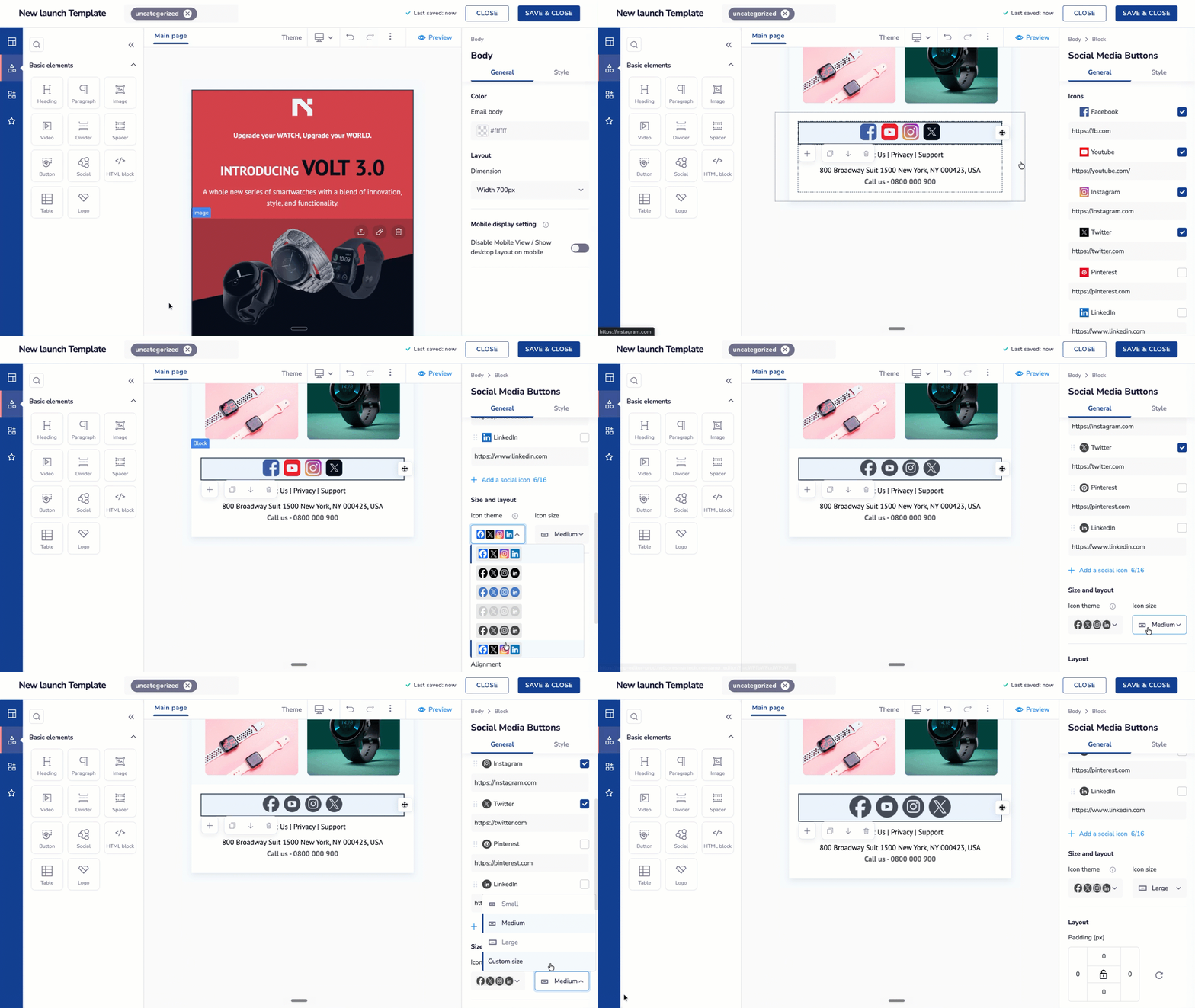
- See menus automatically open upwards when needed.
- Access all options without additional scrolling.
- Experience consistent dropdown behavior.
- Have menus reposition dynamically based on viewport.
Improved Element Selection & Layer Visibility
Selecting elements is now more precise, even in complex nested layouts.
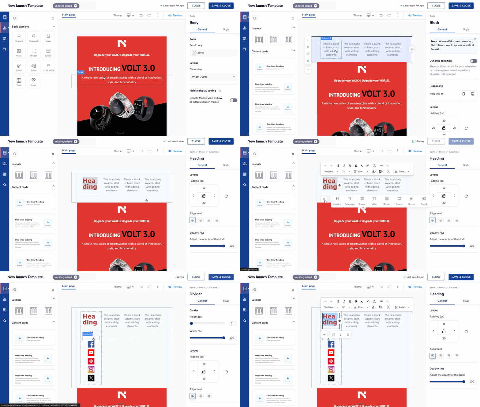
- See clear dotted outlines for each selectable element.
- Understand hierarchy and nesting at a glance.
- Select elements accurately without errors.
- Work confidently within complex layouts.
Improved Image Actions
Image editing actions are now clearer with added tooltips.
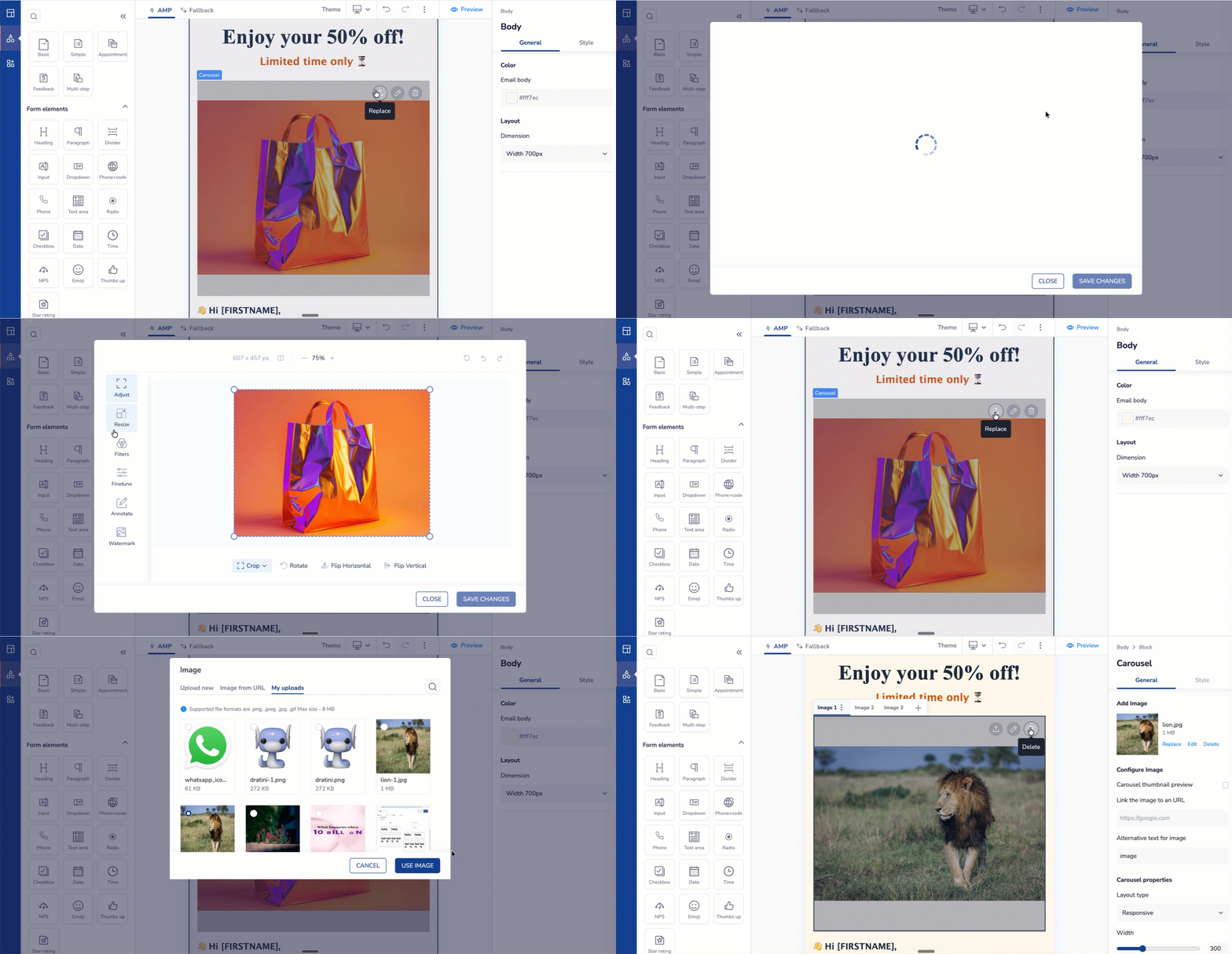
- View tooltips on hover for all image actions.
- Quickly understand each action's purpose.
- Experience consistent interaction patterns.
- Edit images with greater confidence.
Multi-Column Form Layouts (Side-by-Side Fields)
You can now create more compact forms by placing fields side by side.
- Arrange up to four fields in a single row.
- Reduce vertical scrolling and form length.
- Design mobile-friendly, space-efficient forms.
- Improve form usability and completion experience.
Drag-and-Drop Reordering of Elements
Reordering elements is now faster with drag-and-drop functionality.
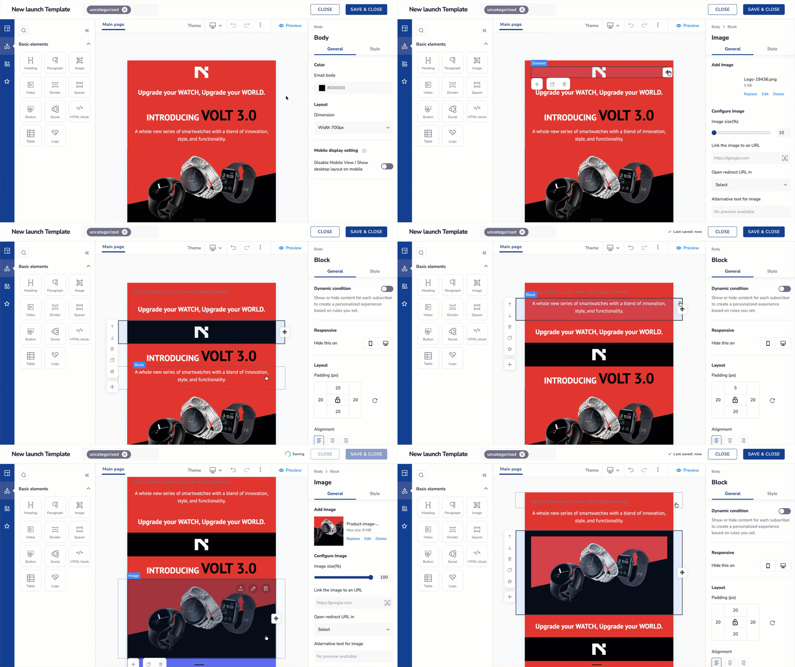
- Drag and move elements across sections (header, body, footer).
- Reorder content instantly and intuitively.
- Preview placement in real time.
- Build layouts more efficiently.
Updated 4 days ago