
Stats: Analyze Path Optimizer Performance
Understand how to make the most of your Journey with Path Optimizer experiment.
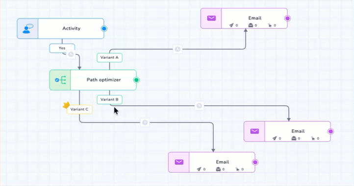
Reporting(Analytics on Path Optimizer Node)
Once your journey is published, the Path Optimizer node will display the following metrics in the node-wise view (on hover or in expanded analytics):
| Metric | Description |
|---|---|
| Distribution | Shows the number of users routed to each variant. Helps you understand traffic distribution over time. |
| Clicks/Conversions | Displays success performance for each branch based on the selected success metric (e.g., Clicks or Conversions). |
| Winning Variant Indicator | Highlights the branch currently performing best based on real-time data. Typically shown with an icon (e.g., star or crown). |
| Variant Names | Displayed as Variant 1, Variant 2, etc., as defined during setup. |
Real-Time Stats
Note
- These metrics update in near real time based on ongoing user interactions.
- The displayed success metric (Clicks or Conversions) corresponds to the one selected in configuration.
If you change the metric mid-journey, the analytics update accordingly, but only new user entries are considered under the new metric.
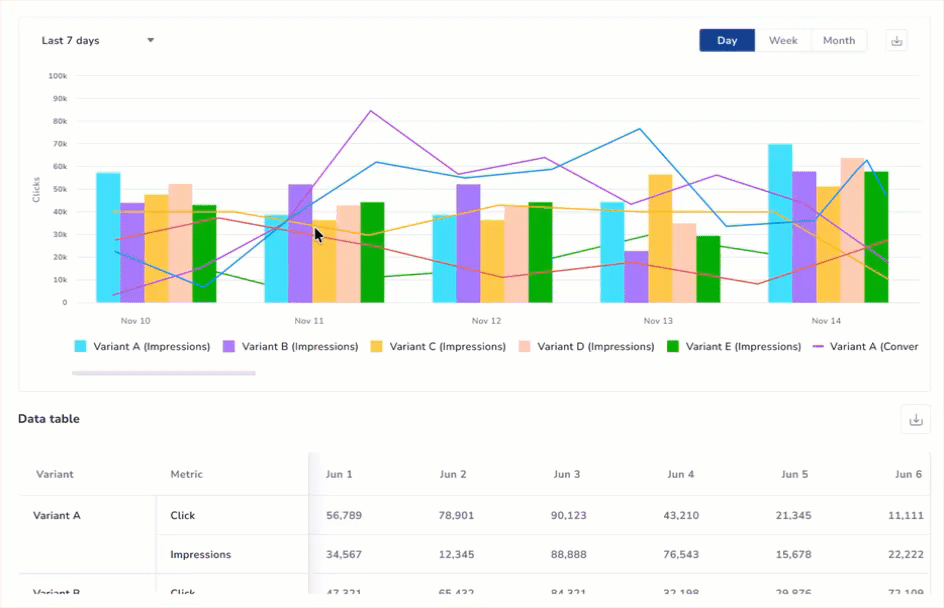
Advanced Visual Analytics
For a deep dive into how the system is learning, click View Detailed Performance Graph to open the side drawer.
The Performance Graph
This visualization allows you to correlate traffic shifts with performance:
- Performance Line: Tracks the Click/Conversion % trend over time.
- Traffic Bars: Shows how the system redistributed impressions (traffic) between variants.
- Smart Tooltip: Hover over any date bucket to see precise counts and percentages for that period.
Advanced Stats
Time Range & Data Aggregation
You can analyze the optimizer’s history for up to 90 days. The graph automatically adapts its granularity based on your selected range:
- 0–45 Days: Choose between Day, Week, or Month views using the manual toggle.
- 46–90 Days: The graph is automatically aggregated by Month to provide a clear view of long-term trends.
- Granular Data Table: Regardless of the graph’s aggregation (Weekly or Monthly), the data table below the chart always provides a daily, row-by-row breakdown for maximum precision.
Export Insights & Reports
To share performance data with stakeholders or conduct external audits, use the export options located within the side drawer:
- Download the Unified Performance Graph in PNG, PDF, or JPEG formats.
- Export the complete daily performance breakdown as a CSV file.